Tableau display
May 26, 2021 Tableau
Table of contents
As an advanced data visualization tool, Tableau makes data analysis easy to implement by providing many analytics techniques without writing any custom code. /b11> With it, we only need to apply a required view to the existing data in the worksheet. /b12> These views can be pie, scatter, or line charts.
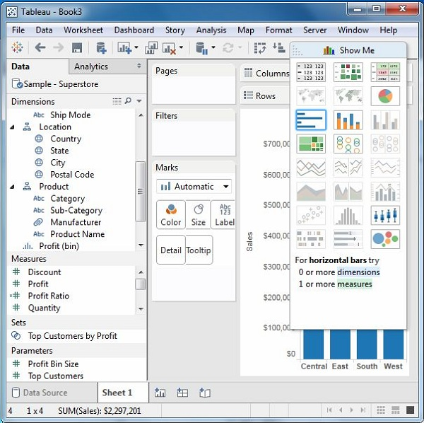
Whenever you create a worksheet with data, it appears in the upper right corner, as shown below. /b10> Some view options appear gray, depending on the nature of the selection in the data pane.
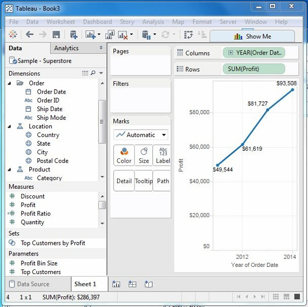
Two fields are displayed
The relationship between the two fields can be easily visualized by using the various charts and charts that show me. /b10> In this case, we select two fields and apply a line chart. The steps are:
- Step 1: Select the two fields (order date and profit) that you want to analyze by holding down the control key.
- Step 2: Click Show Me bar and select a line chart.
- Step 3: Click the marker label button on the scroll bar.
The following image shows a line chart created using the steps above.
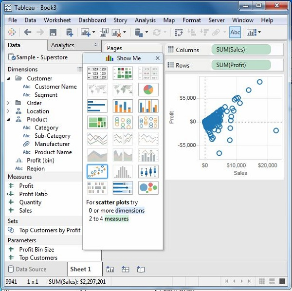
Multiple fields are displayed
We can use similar techniques to analyze more than 2 fields. /b10> In this case, the only difference is that there are fewer views in the active form. /b11> Tableau automatic graying is not suitable for analyzing views of selected fields.
In our case, we select the field product name, customer name, sales and profit by holding down the control key. /b10> As you can see, most of the views in Show Me are gray. /b11> From the active view, we choose the scattered view.
The following image shows the scattering view created.