Tableau bullet map
May 26, 2021 Tableau
Table of contents
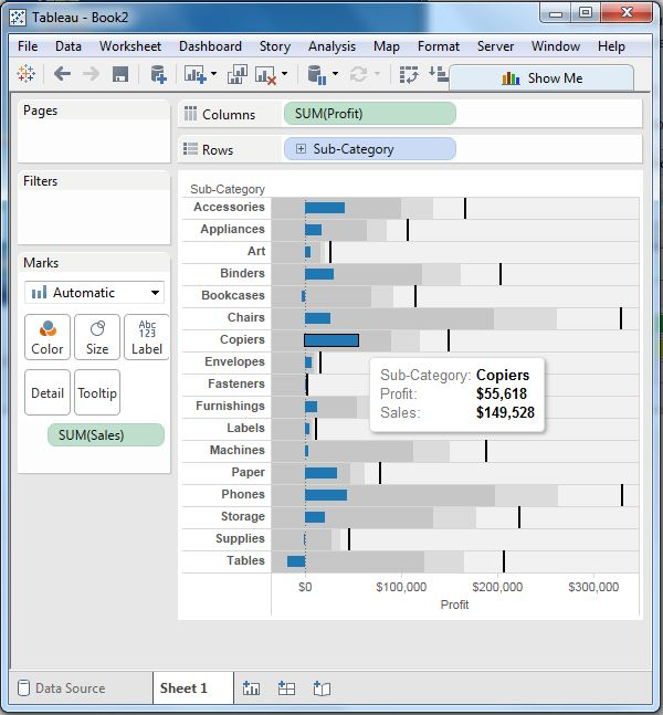
A bullet map is a variant of a bar chart. /b10>In this chart, we compare the value of one measurement with another measurement in the context of finding the change of the first measurement in the range of changes in the second measurement. /b11> It is similar to drawing two bars on each other to indicate their values at the same location in the figure. /b12> You can think of combining two diagrams into one to make it easy to see the comparison results.
Create a bubble chart
Using TheAmple-Superstore, we plan to find out the profit size of each sales in each subcategory. /b10> To achieve this, we follow these steps.
Step 1
Drag and drop the widget category from the data pane into the column box.
Step 2
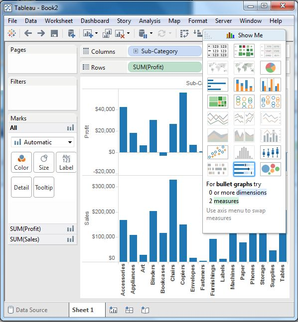
Drag and drop measured revenue and sales onto the shelf.
The following chart is displayed, showing two measures as two separate categories of the bar chart, each representing the value of the subcategory.
Step 3
Drag the sales measure to the tag card. /b10> Use show me to select the bullet map option. /b11> The following image shows the bulleted graph.