Tableau dynamic chart
May 26, 2021 Tableau
Table of contents
Dynamic charts display data using the x and y axes to show changes over time by showing the movement of data points within the defined space and changes in line color. /b10>The main advantage of dynamic graphs is to see the entire trajectory of the data over time, not just a snapshot of the data.
Tableau needs a time peacekeeping and a measure to create dynamic charts.
Create a dynamic chart
With The Ample-Superstore, we plan to find a few months of profit changes. /b10> To achieve this, we follow these steps.
Step 1
Drag the dimension order date to the column shelf. /b10> Drag it to Pages Shelf again. /b11> On the page shelf, right-click the order date and select the month. /b12> Then drag the measured profit to the row shelf. /b13> The following chart is displayed.
Step 2
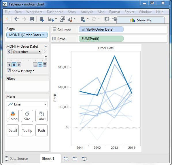
Place the check mark on the box next to the display history, and then click the down arrow next to it. /b10> For Marks that show history, select All. /b11> Then, under Show, select both. /b12> Select Mark to show only points, and Track to show only lines. /b13> Click the play button. /b14> The following chart is displayed.
Step 3
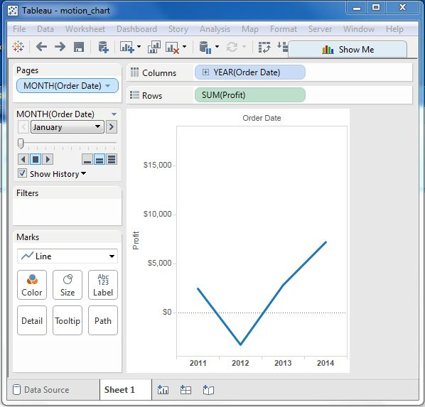
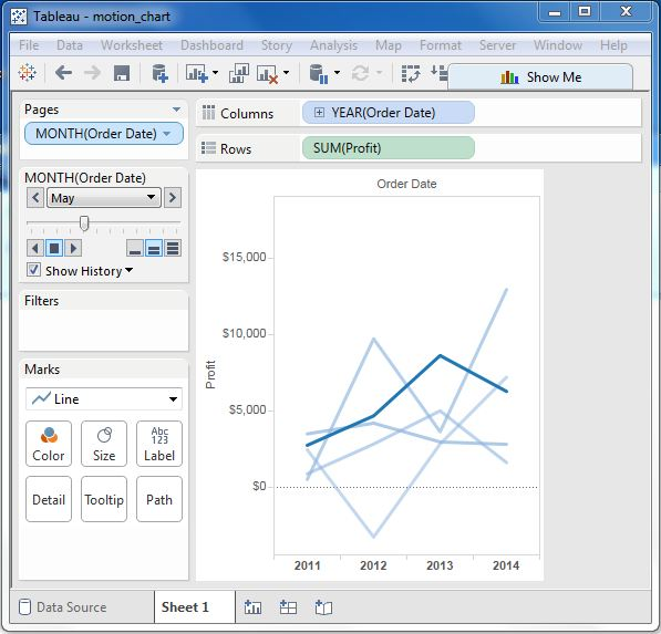
Allowing the chart to run from January to December will create a chart showing how profits have changed each month over the years. /b10> Note that as the data changes, the colors have darkened in recent months and the historical data has become lighter.
Below is a chart after a dynamic chart is played in all months of the year.