Tableau bar chart
May 26, 2021 Tableau
Table of contents
A bar chart represents the data in a rectangular bar, the length of which is proportional to the value of a variable. /b10> Tableau automatically generates a bar chart when you drag dimensions to a row shelf and measure them to a column shelf. /b11> We can also use the bar chart option displayed in the Show Me button. /b12> This option automatically grays out if the data does not fit into the bar chart.
In Tableau, you can create various types of bar charts by using peacekeeping metrics.
Simple bar chart
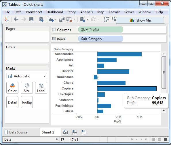
From TheAmple-Superstore, we select dimensions, and we take the shelves and subcategories of columns to the shelf. /b10> It automatically generates a horizontal bar chart, as shown below. /b11> If not, you can select the chart type from the display tool to get the following results.
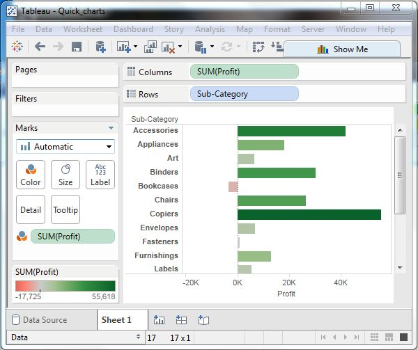
A long bar chart with a color range
We can apply colors to colors based on their range. /b10> Longer bars become darker, while smaller bars become lighter. /b11> To do this, we drag the profit field into the color palette under Marker Pane. /b12> Also note that it produces different colors for negative bars.
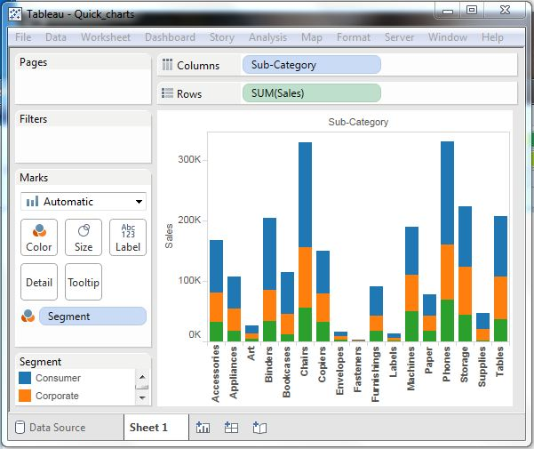
Stacked bar charts
We can add another dimension to the bar chart above to create a stacked bar chart with different colors displayed in each bar. /b10> We drag a dimension field named segment into the Marks pane and drag and drop it into the color. /b11> The chart below shows the distribution of each segment in each bar.