Tableau display board
May 26, 2021 Tableau
Table of contents
Dashboards combine many of the worksheets and related information displayed in a single location. /b10> It is used to compare and monitor a variety of data at the same time. /b11> Different views of the data are displayed at once. /b12> Dashboards appear as tabs at the bottom of workbooks, which are typically updated with the most recent data from the data source. /b13> When we create a dashboard, we can add views and many supporting objects, such as text areas, Web pages, and images, from any sheet in the workbook.
Each view you add to the dashboard is connected to its corresponding worksheet. /b10> Therefore, when you modify the worksheet, the dashboard is updated, and when the view is modified in the dashboard, the worksheet is updated.
Create a dashboard
Using Ample-superstore, we plan to create an information center that shows sales and profits for different segments and subcategories of products in all states. /b10> To achieve this, we follow these steps.
Step 1
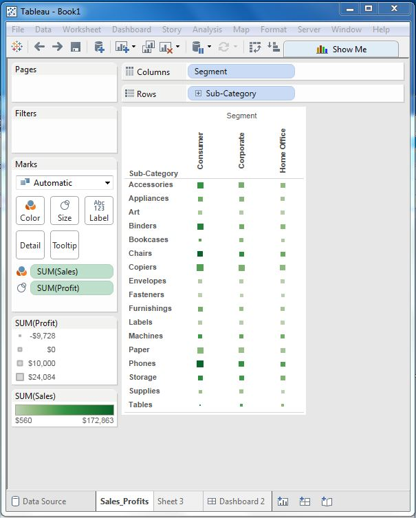
Create a blank sheet by using the Add Sheet icon at the bottom of the workbook. /b10> Drag the dimension segment to the column shelf and the dimension subcategory to the row shelf. /b11> Drag and drop the measure Sales to the color holder, and drag and drop the measure profit to the size holder. /b12> This worksheet is called the primary worksheet. /b13> Right-click the worksheet and rename it Sales_Profit. /b14> The following image appears.
Step 2
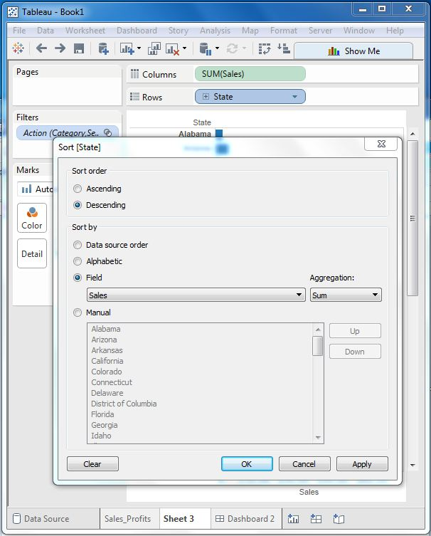
Next, let's create another worksheet to hold sales details for each U.S. state. /b10> To do this, we drag the dimension state to the Rows shelf and the metric Sales to the Coolums shelf. /b11> Next, we apply filters to state fields to order sales in descending order. /b12> Right-click the worksheet and rename it Sales_state. /b13> Create this worksheet as shown below.
Step-3
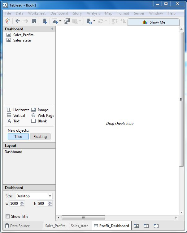
Next, create a blank dashboard by clicking the Create a new dashboard link at the bottom of the workbook. /b10> Right-click and rename the dashboard to Fit-Dashboard.
Step-4
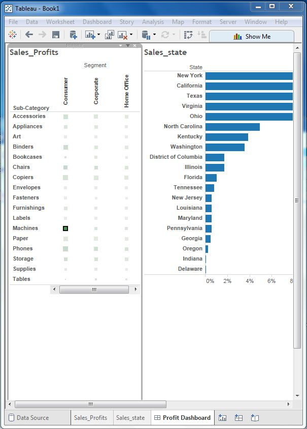
Drag the two worksheets to the dashboard. /b10> You can see three small icons near the top boundary line of the Sales Profit worksheet. /b11> Click on the middle one and display the prompt to use the mouse above it as a filter to hover over it.
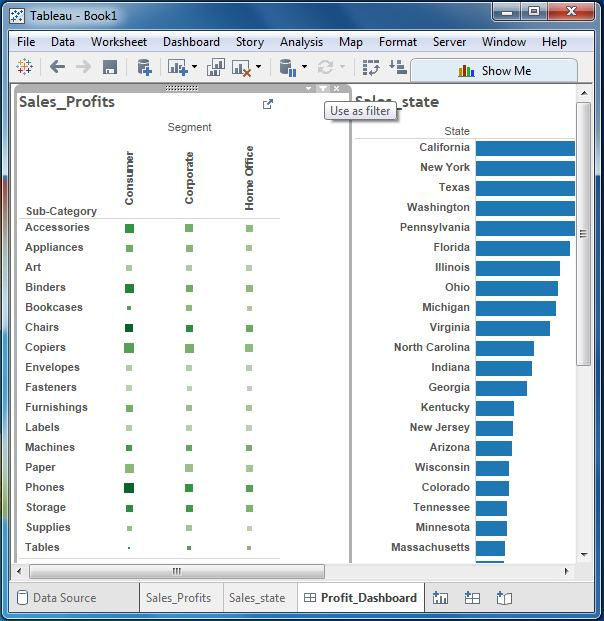
Step-5
Now click the box in the dashboard that represents segments named Machines and Consumer for subcategories.
You can notice that in Sales_state pane called The Net, only the sales status of that profit is filtered out. /b10> Therefore, this explains how to link worksheets in a dashboard.