Tableau bubble chart
May 26, 2021 Tableau
Table of contents
The bubble chart displays the data as a circular cluster. /b10> Each value in the dimension field represents a circle, and the measure represents the size of those circles. /b11> Because the values do not appear in any rows or columns, we drag the required fields to different shelves under the tag card.
Simple bubble chart
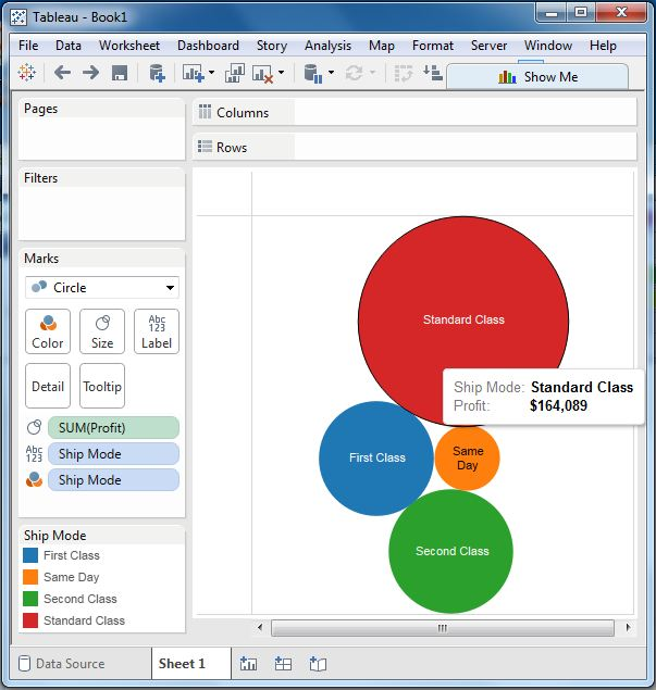
Using the Ample-superstore, we plan to find the profit sizes of different ship models. /b10> To achieve this, we follow these steps.
- Step 1 Drag and drop the measured profit onto the dimension rack under the marker card.
- Step 2 Drag and drop the dimension shipping mode onto the label rack under the marker card.
- Step 3 Pull the dimension shipping mode to the color Shell under the marker card.
The following image appears.
A bubble chart with measurements
We can also display the values of the measure fields that determine the size of the circle. /b10> To do this, we drag the sales measure to the Label shelf. /b11> The following image appears.
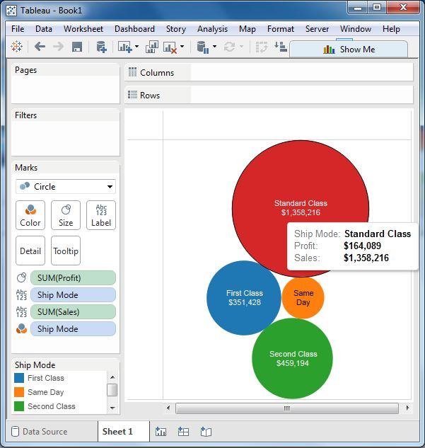
Bubble map with measure color
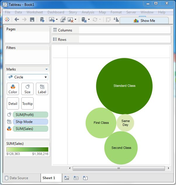
Instead of coloring each circle with a different color, we can use a single color of different colors. /b10> To do this, we drag metric sales into the color shelf. /b11> A higher value represents a darker shadow, while a smaller value represents a lighter shadow.