SAS Bland Altman Analysis
May 27, 2021 SAS
Table of contents
Bland-Altman analysis is the process of verifying the degree of consistency or insanity between two methods designed to measure the same parameters. T he high correlation between the methods indicates that a good enough sample was selected in the data analysis. I n SAS, we create a Bland-Altman graph by calculating the average, upper, and lower limits of variable values. T hen we use PROC SGPLOT to create the Brand-Altman diagram.
Syntactic
The basic syntax for applying PROC SGPLOT in SAS is:
PROC SGPLOT DATA = dataset;
SCATTER X=variable Y=Variable;
REFLINE value;
The following is a description of the parameters used:
- Dataset is the name of the dataset.
- The SCATTER statement represents a scatter chart of values provided in the form of X and Y.
- REFLINE creates horizontal or vertical guides.
Cases
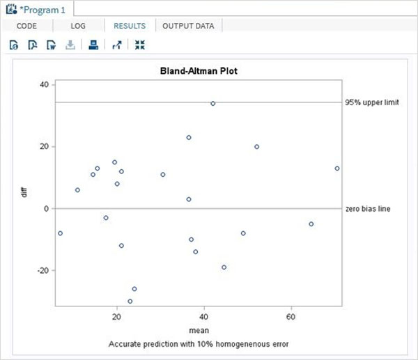
In the following example, we take the results of two experiments generated by two methods called new and old. W e calculate the difference in variable values and the average of variables with the same observations. W e also calculate the standard deviation values to be used in the upper and lower limits of the calculation.
The results show that the Bland-Altman graph is a scatter chart.
data mydata;
input new old;
datalines;
31 45
27 12
11 37
36 25
14 8
27 15
3 11
62 42
38 35
20 9
35 54
62 67
48 25
77 64
45 53
32 42
16 19
15 27
22 9
8 38
24 16
59 25
;

data diffs ;
set mydata ;
/* calculate the difference */
diff=new-old ;
/* calculate the average */
mean=(new+old)/2 ;
run ;
proc print data=diffs;
run;

proc sql noprint ;
select mean(diff)-2*std(diff),  mean(diff)+2*std(diff)
into   :lower,  :upper
from diffs ;
quit;

proc sgplot data=diffs ;
scatter x=mean y=diff;
refline 0 &upper &lower / LABEL =  ("zero bias line" "95% upper limit" "95%
lower limit") ;
TITLE 'Bland-Altman Plot';
footnote 'Accurate prediction with 10% homogeneous error';
run ;
quit ;
When we execute the code above, we get the following results:
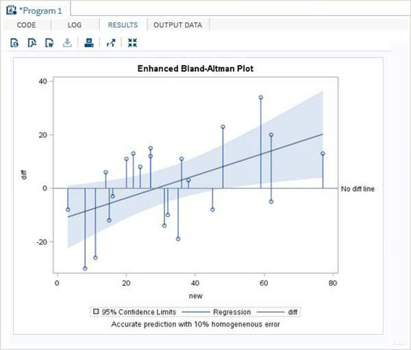
Enhanced
In the enhanced model of the above program, we get 95% confidence level curve fit.
proc sgplot data=diffs ;
reg x = new y = diff/clm clmtransparency= .5;
needle x= new y=diff/baseline=0;
refline 0 / LABEL =  ('No diff line');
TITLE 'Enhanced Bland-Altman Plot';
footnote 'Accurate prediction with 10% homogeneous error';
run ;
quit ;
When we execute the code above, we get the following results: