Bootstrap panel
May 04, 2021 Bootstrap
Table of contents
Bootstrap Panels
This chapter explains bootstrap panels. P anel components are used to insert DOM components into a box. To create a basic panel, you only need to add class .panel and class .panel-default to the element, as shown in the following example:
<!DOCTYPE html><html><head>
<title>Bootstrap 实例 - 默认的面板</title>
<link href="//cdn.bootcss.com/bootstrap/3.3.6/css/bootstrap.min.css" rel="external nofollow" target="_blank" rel="external nofollow" target="_blank" rel="external nofollow" target="_blank" rel="external nofollow" target="_blank" rel="external nofollow" target="_blank" rel="external nofollow" target="_blank" rel="stylesheet">
<script src="//cdn.bootcss.com/jquery/2.1.1/jquery.min.js" rel="external nofollow" rel="external nofollow" rel="external nofollow" rel="external nofollow" rel="external nofollow" rel="external nofollow" ></script>
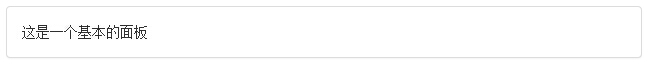
<script src="//cdn.bootcss.com/bootstrap/3.3.6/js/bootstrap.min.js" rel="external nofollow" rel="external nofollow" rel="external nofollow" rel="external nofollow" rel="external nofollow" rel="external nofollow" ></script></head><body><div class="panel panel-default">
<div class="panel-body">
这是一个基本的面板 </div></div></body></html>The result is as follows:
Panel title
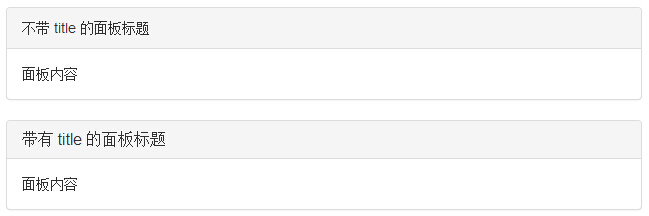
We can add panel titles in two ways:
-
Using .panel-heading class, you can simply add a title container to the panel.
The following example demonstrates both approaches:
<!DOCTYPE html><html><head>
   <title>Bootstrap 实例 - 面板标题</title>
   <link href="//cdn.bootcss.com/bootstrap/3.3.6/css/bootstrap.min.css" rel="external nofollow" target="_blank"  rel="external nofollow" target="_blank"  rel="external nofollow" target="_blank"  rel="external nofollow" target="_blank"  rel="external nofollow" target="_blank"  rel="external nofollow" target="_blank"  rel="stylesheet">
   <script src="//cdn.bootcss.com/jquery/2.1.1/jquery.min.js" rel="external nofollow"  rel="external nofollow"  rel="external nofollow"  rel="external nofollow"  rel="external nofollow"  rel="external nofollow" ></script>
   <script src="//cdn.bootcss.com/bootstrap/3.3.6/js/bootstrap.min.js" rel="external nofollow"  rel="external nofollow"  rel="external nofollow"  rel="external nofollow"  rel="external nofollow"  rel="external nofollow" ></script></head><body><div class="panel panel-default">
   <div class="panel-heading">
      不带 title 的面板标题   </div>
   <div class="panel-body">
      面板内容   </div></div><div class="panel panel-default">
   <div class="panel-heading">
      <h3 class="panel-title">
         带有 title 的面板标题      </h3>
   </div>
   <div class="panel-body">
      面板内容   </div></div></body></html>
The result is as follows:
Panel footnotes
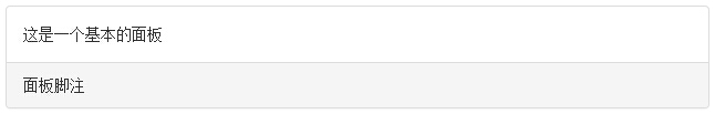
We can add footnotes to the panel, just put the buttons or sub-text in the slt;div> with class .panel-footer. The following example demonstrates this:
<!DOCTYPE html><html><head>
   <title>Bootstrap 实例 - 面板脚注</title>
   <link href="//cdn.bootcss.com/bootstrap/3.3.6/css/bootstrap.min.css" rel="external nofollow" target="_blank"  rel="external nofollow" target="_blank"  rel="external nofollow" target="_blank"  rel="external nofollow" target="_blank"  rel="external nofollow" target="_blank"  rel="external nofollow" target="_blank"  rel="stylesheet">
   <script src="//cdn.bootcss.com/jquery/2.1.1/jquery.min.js" rel="external nofollow"  rel="external nofollow"  rel="external nofollow"  rel="external nofollow"  rel="external nofollow"  rel="external nofollow" ></script>
   <script src="//cdn.bootcss.com/bootstrap/3.3.6/js/bootstrap.min.js" rel="external nofollow"  rel="external nofollow"  rel="external nofollow"  rel="external nofollow"  rel="external nofollow"  rel="external nofollow" ></script></head><body><div class="panel panel-default">
   <div class="panel-body">
      这是一个基本的面板   </div>
   <div class="panel-footer">面板脚注</div></div></body></html>
The result is as follows:
Layout footnotes do not inherit colors and borders from contextual panels because they are not foreground content.
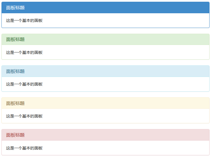
A panel with contextual color
Use contextual state classes panel-primary, panel-success, panel-info, panel-warning, panel-danger to set up panels with contextual colors, as follows:
<!DOCTYPE html><html><head>
   <title>Bootstrap 实例 - 带语境色彩的面板</title>
   <link href="//cdn.bootcss.com/bootstrap/3.3.6/css/bootstrap.min.css" rel="external nofollow" target="_blank"  rel="external nofollow" target="_blank"  rel="external nofollow" target="_blank"  rel="external nofollow" target="_blank"  rel="external nofollow" target="_blank"  rel="external nofollow" target="_blank"  rel="stylesheet">
   <script src="//cdn.bootcss.com/jquery/2.1.1/jquery.min.js" rel="external nofollow"  rel="external nofollow"  rel="external nofollow"  rel="external nofollow"  rel="external nofollow"  rel="external nofollow" ></script>
   <script src="//cdn.bootcss.com/bootstrap/3.3.6/js/bootstrap.min.js" rel="external nofollow"  rel="external nofollow"  rel="external nofollow"  rel="external nofollow"  rel="external nofollow"  rel="external nofollow" ></script></head><body><div class="panel panel-primary">
   <div class="panel-heading">
      <h3 class="panel-title">面板标题</h3>
   </div>
   <div class="panel-body">
      这是一个基本的面板   </div></div><div class="panel panel-success">
   <div class="panel-heading">
      <h3 class="panel-title">面板标题</h3>
   </div>
   <div class="panel-body">
      这是一个基本的面板   </div></div><div class="panel panel-info">
   <div class="panel-heading">
      <h3 class="panel-title">面板标题</h3>
   </div>
   <div class="panel-body">
      这是一个基本的面板   </div></div><div class="panel panel-warning">
   <div class="panel-heading">
      <h3 class="panel-title">面板标题</h3>
   </div>
   <div class="panel-body">
      这是一个基本的面板   </div></div><div class="panel panel-danger">
   <div class="panel-heading">
      <h3 class="panel-title">面板标题</h3>
   </div>
   <div class="panel-body">
      这是一个基本的面板   </div></div></body></html>
The result is as follows:
Panels with tables
In order to create a borderless table in the panel, we can use class .table in the panel. L et's say we have a .lt;div> that contains .panel-body, and we can add an extra border to the top of the table to separate it. If there is no .panel-body-containing .lt;div;, the component moves from the head of the panel to the table without interruption.
The following example demonstrates this:
<!DOCTYPE html><html><head>
   <title>Bootstrap 实例 - 带表格的面板</title>
   <link href="//cdn.bootcss.com/bootstrap/3.3.6/css/bootstrap.min.css" rel="external nofollow" target="_blank"  rel="external nofollow" target="_blank"  rel="external nofollow" target="_blank"  rel="external nofollow" target="_blank"  rel="external nofollow" target="_blank"  rel="external nofollow" target="_blank"  rel="stylesheet">
   <script src="//cdn.bootcss.com/jquery/2.1.1/jquery.min.js" rel="external nofollow"  rel="external nofollow"  rel="external nofollow"  rel="external nofollow"  rel="external nofollow"  rel="external nofollow" ></script>
   <script src="//cdn.bootcss.com/bootstrap/3.3.6/js/bootstrap.min.js" rel="external nofollow"  rel="external nofollow"  rel="external nofollow"  rel="external nofollow"  rel="external nofollow"  rel="external nofollow" ></script></head><body><div class="panel panel-default">
   <div class="panel-heading">
      <h3 class="panel-title">面板标题</h3>
   </div>
   <div class="panel-body">
      这是一个基本的面板   </div>
   <table class="table">
      <th>产品</th><th>价格 </th>
      <tr><td>产品 A</td><td>200</td></tr>
      <tr><td>产品 B</td><td>400</td></tr>
   </table></div><div class="panel panel-default">
   <div class="panel-heading">面板标题</div>
   <table class="table">
      <th>产品</th><th>价格 </th>
      <tr><td>产品 A</td><td>200</td></tr>
      <tr><td>产品 B</td><td>400</td></tr>
   </table></div></body></html>
The result is as follows:
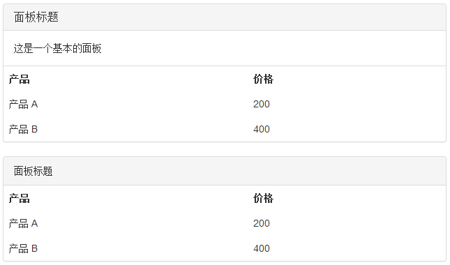
Tip: In the Bootstrap Forms section, you can learn more about Bootstrap creating tables!
Panels with list groups
We can include a list group in any panel, create a panel by adding the .panel and .panel-default classes to the element, and add a list group to the panel. You can learn how to create a list group from the List Group chapter.
<!DOCTYPE html><html><head>
<title>Bootstrap 实例 - 带列表组的面板</title>
<link href="//cdn.bootcss.com/bootstrap/3.3.6/css/bootstrap.min.css" rel="external nofollow" target="_blank" rel="external nofollow" target="_blank" rel="external nofollow" target="_blank" rel="external nofollow" target="_blank" rel="external nofollow" target="_blank" rel="external nofollow" target="_blank" rel="stylesheet">
<script src="//cdn.bootcss.com/jquery/2.1.1/jquery.min.js" rel="external nofollow" rel="external nofollow" rel="external nofollow" rel="external nofollow" rel="external nofollow" rel="external nofollow" ></script>
<script src="//cdn.bootcss.com/bootstrap/3.3.6/js/bootstrap.min.js" rel="external nofollow" rel="external nofollow" rel="external nofollow" rel="external nofollow" rel="external nofollow" rel="external nofollow" ></script></head><body><div class="panel panel-default">
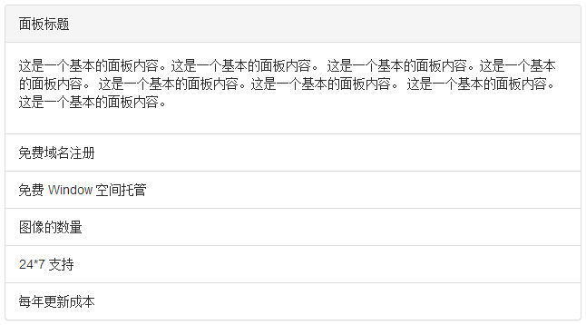
<div class="panel-heading">面板标题</div>
<div class="panel-body">
<p>这是一个基本的面板内容。这是一个基本的面板内容。
这是一个基本的面板内容。这是一个基本的面板内容。
这是一个基本的面板内容。这是一个基本的面板内容。
这是一个基本的面板内容。这是一个基本的面板内容。 </p>
</div>
<ul class="list-group">
<li class="list-group-item">免费域名注册</li>
<li class="list-group-item">免费 Window 空间托管</li>
<li class="list-group-item">图像的数量</li>
<li class="list-group-item">24*7 支持</li>
<li class="list-group-item">每年更新成本</li>
</ul></div></body></html>The result is as follows: