If you want to refer to the functionality of the plug-in separately,
you need to refer .js.
T
ransition plug-ins also need to be referenced in
If you want to refer to the functionality of the plug-in separately,
you need to refer .js.
T
ransition plug-ins also need to be referenced in
-
The result is as follows:
-
Data-toggle"collapse" is added to the link to the component you want to expand or collapse.
-
The href or data-target property is added to the parent component, and its value is the id of the child component.
-
The data-parent property adds the id of the collapsed panel to the link of the component to be expanded or collapsed.
Create a simple collapsible component without the accordion tag, as follows:
<!DOCTYPE html><html><head>
<title>Bootstrap 实例 - 简单的可折叠组件</title>
<link href="//cdn.bootcss.com/bootstrap/3.3.6/css/bootstrap.min.css" rel="external nofollow" target="_blank" rel="external nofollow" target="_blank" rel="external nofollow" target="_blank" rel="external nofollow" target="_blank" rel="stylesheet">
<script src="//cdn.bootcss.com/jquery/2.1.1/jquery.min.js" rel="external nofollow" rel="external nofollow" rel="external nofollow" rel="external nofollow" ></script>
<script src="//cdn.bootcss.com/bootstrap/3.3.6/js/bootstrap.min.js" rel="external nofollow" rel="external nofollow" rel="external nofollow" rel="external nofollow" ></script></head><body><button type="button" class="btn btn-primary" data-toggle="collapse"
data-target="#demo">
简单的可折叠组件</button><div id="demo" class="collapse in">
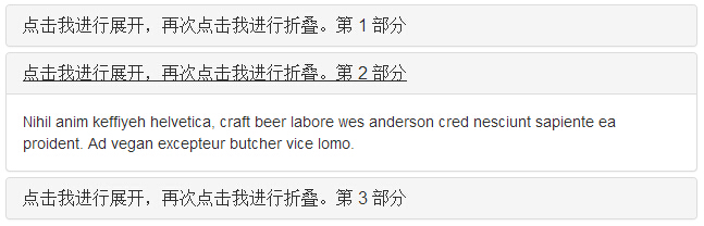
Nihil anim keffiyeh helvetica, craft beer labore wes anderson
cred nesciunt sapiente ea proident. Ad vegan excepteur butcher
vice lomo.</div></body></html>-
The result is as follows:
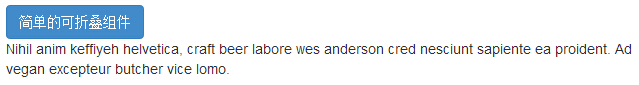
As you can see in the example, we created a collapsible component, and unlike the collapse panel, we didn't add the property data-parent.
Usage
The following table lists the classes that collapse plug-ins use to handle heavy scaling:
| Class | 描述 | 实例 |
|---|---|---|
| .collapse | 隐藏内容。 | 尝试一下 |
| .collapse.in | 显示内容。 | 尝试一下 |
| .collapsing | 当过渡效果开始时被添加,当过渡效果完成时被移除。 |
|
You can use the Collapse plug-in in two ways:
-
Control of collapsible elements is automatically assigned by adding data-toggle"collapse" and data-target to the element through the data property: rget property accepts a CSS selector and applies a collapse effect to it. B e sure to add class .collapse to the collapsible element. If you want it to be turned on by default, add an additional class .in.
To add a group management similar to a collapsed panel to a collapsible control, add the data property data-parent #selector.
-
With JavaScript: The collapse method can be activated with JavaScript, as follows:
$('.collapse').collapse()
Options
Some options are passed through the data property or JavaScript. The following table lists these options:
| 选项名称 | 类型/默认值 | Data 属性名称 | 描述 |
|---|---|---|---|
| parent |
selector
默认值:false |
data-parent | 如果提供了一个选择器,当可折叠项目显示时,指定父元素下的所有可折叠的元素将被关闭。这与创痛的折叠面板(accordion)的行为类似 - 这依赖于 accordion-group 类。 |
| toggle |
boolean
默认值:true |
data-toggle | 切换调用可折叠元素。 |
Method
Here are some useful ways to collapse plug-ins:
| 方法 | 描述 | 实例 |
|---|---|---|
| Options: .collapse(options) | 激活内容为可折叠元素。接受一个可选的 options 对象。 |
$('#identifier').collapse({
  toggle: false})
|
| Toggle: .collapse('toggle') | 切换显示/隐藏可折叠元素。 |
$('#identifier').collapse('toggle')
|
| Show: .collapse('show') | 显示可折叠元素。 |
$('#identifier').collapse('show')
|
| Hide: .collapse('hide') | 隐藏可折叠元素。 |
$('#identifier').collapse('hide')
|
Instance
The following example demonstrates the use of the method:
<!DOCTYPE html><html><head>
<title>Bootstrap 实例 - 折叠(Collapse)插件方法</title>
<link href="//cdn.bootcss.com/bootstrap/3.3.6/css/bootstrap.min.css" rel="external nofollow" target="_blank" rel="external nofollow" target="_blank" rel="external nofollow" target="_blank" rel="external nofollow" target="_blank" rel="stylesheet">
<script src="//cdn.bootcss.com/jquery/2.1.1/jquery.min.js" rel="external nofollow" rel="external nofollow" rel="external nofollow" rel="external nofollow" ></script>
<script src="//cdn.bootcss.com/bootstrap/3.3.6/js/bootstrap.min.js" rel="external nofollow" rel="external nofollow" rel="external nofollow" rel="external nofollow" ></script></head><body><div class="panel-group" id="accordion">
<div class="panel panel-default">
<div class="panel-heading">
<h4 class="panel-title">
<a data-toggle="collapse" data-parent="#accordion"
href="#collapseOne">
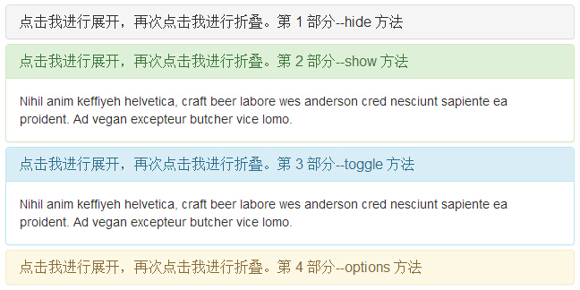
点击我进行展开,再次点击我进行折叠。第 1 部分--hide 方法 </a>
</h4>
</div>
<div id="collapseOne" class="panel-collapse collapse in">
<div class="panel-body">
Nihil anim keffiyeh helvetica, craft beer labore wes anderson cred
nesciunt sapiente ea proident. Ad vegan excepteur butcher vice
lomo. </div>
</div>
</div>
<div class="panel panel-success">
<div class="panel-heading">
<h4 class="panel-title">
<a data-toggle="collapse" data-parent="#accordion"
href="#collapseTwo">
点击我进行展开,再次点击我进行折叠。第 2 部分--show 方法 </a>
</h4>
</div>
<div id="collapseTwo" class="panel-collapse collapse">
<div class="panel-body">
Nihil anim keffiyeh helvetica, craft beer labore wes anderson cred
nesciunt sapiente ea proident. Ad vegan excepteur butcher vice
lomo. </div>
</div>
</div>
<div class="panel panel-info">
<div class="panel-heading">
<h4 class="panel-title">
<a data-toggle="collapse" data-parent="#accordion"
href="#collapseThree">
点击我进行展开,再次点击我进行折叠。第 3 部分--toggle 方法 </a>
</h4>
</div>
<div id="collapseThree" class="panel-collapse collapse">
<div class="panel-body">
Nihil anim keffiyeh helvetica, craft beer labore wes anderson cred
nesciunt sapiente ea proident. Ad vegan excepteur butcher vice
lomo. </div>
</div>
</div>
<div class="panel panel-warning">
<div class="panel-heading">
<h4 class="panel-title">
<a data-toggle="collapse" data-parent="#accordion"
href="#collapseFour">
点击我进行展开,再次点击我进行折叠。第 4 部分--options 方法 </a>
</h4>
</div>
<div id="collapseFour" class="panel-collapse collapse">
<div class="panel-body">
Nihil anim keffiyeh helvetica, craft beer labore wes anderson cred
nesciunt sapiente ea proident. Ad vegan excepteur butcher vice
lomo. </div>
</div>
</div></div><script type="text/javascript">
$(function () { $('#collapseFour').collapse({
toggle: false
})});
$(function () { $('#collapseTwo').collapse('show')});
$(function () { $('#collapseThree').collapse('toggle')});
$(function () { $('#collapseOne').collapse('hide')});</script> </body></html>The result is as follows:
Event
The following table lists the events to use in the Collapse plug-in. These events can be used as hooks in functions.
| 事件 | 描述 | 实例 |
|---|---|---|
| show.bs.collapse | 在调用 show 方法后触发该事件。 |
$('#identifier').on('show.bs.collapse', function () {
  // 执行一些动作...})
|
| shown.bs.collapse | 当折叠元素对用户可见时触发该事件(将等待 CSS 过渡效果完成)。 |
$('#identifier').on('shown.bs.collapse', function () {
  // 执行一些动作...})
|
| hide.bs.collapse | 当调用 hide 实例方法时立即触发该事件。 |
$('#identifier').on('hide.bs.collapse', function () {
  // 执行一些动作...})
|
| hidden.bs.collapse | 当折叠元素对用户隐藏时触发该事件(将等待 CSS 过渡效果完成)。 |
$('#identifier').on('hidden.bs.collapse', function () {
  // 执行一些动作...})
|
Instance
The following example demonstrates the use of events:
<!DOCTYPE html><html><head>
<title>Bootstrap 实例 - 折叠(Collapse)插件事件</title>
<link href="//cdn.bootcss.com/bootstrap/3.3.6/css/bootstrap.min.css" rel="external nofollow" target="_blank" rel="external nofollow" target="_blank" rel="external nofollow" target="_blank" rel="external nofollow" target="_blank" rel="stylesheet">
<script src="//cdn.bootcss.com/jquery/2.1.1/jquery.min.js" rel="external nofollow" rel="external nofollow" rel="external nofollow" rel="external nofollow" ></script>
<script src="//cdn.bootcss.com/bootstrap/3.3.6/js/bootstrap.min.js" rel="external nofollow" rel="external nofollow" rel="external nofollow" rel="external nofollow" ></script></head><body><div class="panel-group" id="accordion">
<div class="panel panel-info">
<div class="panel-heading">
<h4 class="panel-title">
<a data-toggle="collapse" data-parent="#accordion"
href="#collapseexample">
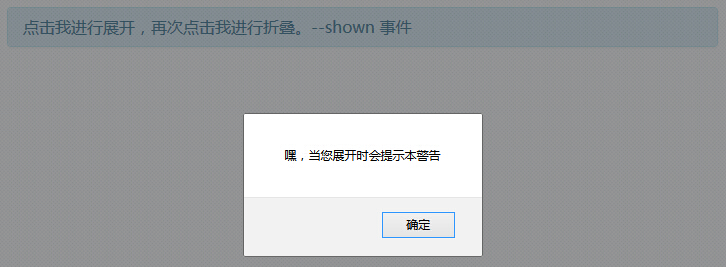
点击我进行展开,再次点击我进行折叠。--shown 事件 </a>
</h4>
</div>
<div id="collapseexample" class="panel-collapse collapse">
<div class="panel-body">
Nihil anim keffiyeh helvetica, craft beer labore wes anderson
cred nesciunt sapiente ea proident.
Ad vegan excepteur butcher vice lomo. </div>
</div>
</div></div><script type="text/javascript">
$(function () {
$('#collapseexample').on('show.bs.collapse', function () {
alert('嘿,当您展开时会提示本警告');})
});</script> </body></html>The result is as follows: