Bootstrap form
May 04, 2021 Bootstrap
Table of contents
Bootstrap form
In this chapter, we'll learn how to create forms using Bootstrap. Bootstrap creates different styles of forms with simple HTML tags and extended classes.
The layout of the form
Bootstrap provides the following types of form layouts:
-
Vertical form (default)
-
Inline form
-
Horizontal form
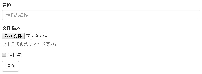
Vertical or basic forms
The basic form structure is bootstrap-owned, and individual form controls automatically receive some global styles. Here are the steps to create a basic form:
-
Add a role-"form" to the parent element.
-
Place the labels and controls in a slt;div> with class .form-group. This is necessary to get the best spacing.
<!DOCTYPE html><html><head>
   <title>Bootstrap 实例 - 基本表单</title>
   <link rel="stylesheet" href="//apps.bdimg.com/libs/bootstrap/3.3.0/css/bootstrap.min.css" rel="external nofollow" target="_blank"  rel="external nofollow" target="_blank"  rel="external nofollow" target="_blank"  rel="external nofollow" target="_blank"  rel="external nofollow" target="_blank"  rel="external nofollow" target="_blank"  rel="external nofollow" target="_blank"  rel="external nofollow" target="_blank"  rel="external nofollow" target="_blank"  rel="external nofollow" target="_blank"  rel="external nofollow" target="_blank" >
   <script src="//apps.bdimg.com/libs/jquery/2.1.1/jquery.min.js" rel="external nofollow"  rel="external nofollow"  rel="external nofollow"  rel="external nofollow"  rel="external nofollow"  rel="external nofollow"  rel="external nofollow"  rel="external nofollow"  rel="external nofollow"  rel="external nofollow"  rel="external nofollow" ></script>
   <script src="//apps.bdimg.com/libs/bootstrap/3.3.0/js/bootstrap.min.js" rel="external nofollow"  rel="external nofollow"  rel="external nofollow"  rel="external nofollow"  rel="external nofollow"  rel="external nofollow"  rel="external nofollow"  rel="external nofollow"  rel="external nofollow"  rel="external nofollow"  rel="external nofollow" ></script></head><body><form role="form">
   <div class="form-group">
      <label for="name">名称</label>
      <input type="text" class="form-control" id="name"
         placeholder="请输入名称">
   </div>
   <div class="form-group">
      <label for="inputfile">文件输入</label>
      <input type="file" id="inputfile">
      <p class="help-block">这里是块级帮助文本的实例。</p>
   </div>
   <div class="checkbox">
      <label>
      <input type="checkbox"> 请打勾      </label>
   </div>
   <button type="submit" class="btn btn-default">提交</button></form></body></html>
The result is as follows:
Inline form
If you need to create a form where all its elements are inline, aligned to the left, and the labels are side-by-side, add class .form-inline to the label.
<!DOCTYPE html><html><head>
   <title>Bootstrap 实例 - 内联表单</title>
   <link rel="stylesheet" href="//apps.bdimg.com/libs/bootstrap/3.3.0/css/bootstrap.min.css" rel="external nofollow" target="_blank"  rel="external nofollow" target="_blank"  rel="external nofollow" target="_blank"  rel="external nofollow" target="_blank"  rel="external nofollow" target="_blank"  rel="external nofollow" target="_blank"  rel="external nofollow" target="_blank"  rel="external nofollow" target="_blank"  rel="external nofollow" target="_blank"  rel="external nofollow" target="_blank"  rel="external nofollow" target="_blank" >
   <script src="//apps.bdimg.com/libs/jquery/2.1.1/jquery.min.js" rel="external nofollow"  rel="external nofollow"  rel="external nofollow"  rel="external nofollow"  rel="external nofollow"  rel="external nofollow"  rel="external nofollow"  rel="external nofollow"  rel="external nofollow"  rel="external nofollow"  rel="external nofollow" ></script>
   <script src="//apps.bdimg.com/libs/bootstrap/3.3.0/js/bootstrap.min.js" rel="external nofollow"  rel="external nofollow"  rel="external nofollow"  rel="external nofollow"  rel="external nofollow"  rel="external nofollow"  rel="external nofollow"  rel="external nofollow"  rel="external nofollow"  rel="external nofollow"  rel="external nofollow" ></script></head><body><form class="form-inline" role="form">
   <div class="form-group">
      <label class="sr-only" for="name">名称</label>
      <input type="text" class="form-control" id="name"
         placeholder="请输入名称">
   </div>
   <div class="form-group">
      <label class="sr-only" for="inputfile">文件输入</label>
      <input type="file" id="inputfile">
   </div>
   <div class="checkbox">
      <label>
      <input type="checkbox"> 请打勾      </label>
   </div>
   <button type="submit" class="btn btn-default">提交</button></form></body></html>
The result is as follows:

-
By default, input, select, and textarea in Bootstrap are 100% wide. When you use inline forms, you need to set a width on the form control.
-
With class .sr-only, you can hide the labels of inline forms.
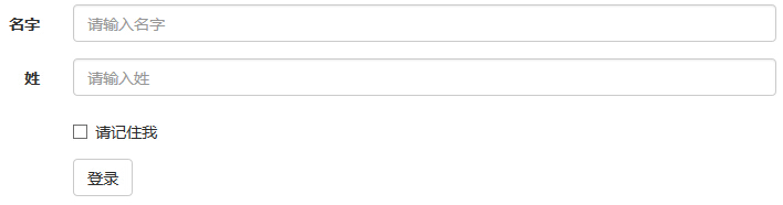
Horizontal form
Horizontal forms are not only different from other forms in the number of tags, but also in their presentation. To create a horizontal layout of the form, follow these steps:
-
Add class .form-horizontal to the parent element.
-
Place the labels and controls in a slt;div> with class .form-group.
-
Add class .control-label to the label.
<!DOCTYPE html><html><head>
   <title>Bootstrap 实例 - 水平表单</title>
   <link rel="stylesheet" href="//apps.bdimg.com/libs/bootstrap/3.3.0/css/bootstrap.min.css" rel="external nofollow" target="_blank"  rel="external nofollow" target="_blank"  rel="external nofollow" target="_blank"  rel="external nofollow" target="_blank"  rel="external nofollow" target="_blank"  rel="external nofollow" target="_blank"  rel="external nofollow" target="_blank"  rel="external nofollow" target="_blank"  rel="external nofollow" target="_blank"  rel="external nofollow" target="_blank"  rel="external nofollow" target="_blank" >
   <script src="//apps.bdimg.com/libs/jquery/2.1.1/jquery.min.js" rel="external nofollow"  rel="external nofollow"  rel="external nofollow"  rel="external nofollow"  rel="external nofollow"  rel="external nofollow"  rel="external nofollow"  rel="external nofollow"  rel="external nofollow"  rel="external nofollow"  rel="external nofollow" ></script>
   <script src="//apps.bdimg.com/libs/bootstrap/3.3.0/js/bootstrap.min.js" rel="external nofollow"  rel="external nofollow"  rel="external nofollow"  rel="external nofollow"  rel="external nofollow"  rel="external nofollow"  rel="external nofollow"  rel="external nofollow"  rel="external nofollow"  rel="external nofollow"  rel="external nofollow" ></script></head><body><form class="form-horizontal" role="form">
   <div class="form-group">
      <label for="firstname" class="col-sm-2 control-label">名字</label>
      <div class="col-sm-10">
         <input type="text" class="form-control" id="firstname"
            placeholder="请输入名字">
      </div>
   </div>
   <div class="form-group">
      <label for="lastname" class="col-sm-2 control-label">姓</label>
      <div class="col-sm-10">
         <input type="text" class="form-control" id="lastname"
            placeholder="请输入姓">
      </div>
   </div>
   <div class="form-group">
      <div class="col-sm-offset-2 col-sm-10">
         <div class="checkbox">
            <label>
               <input type="checkbox"> 请记住我            </label>
         </div>
      </div>
   </div>
   <div class="form-group">
      <div class="col-sm-offset-2 col-sm-10">
         <button type="submit" class="btn btn-default">登录</button>
      </div>
   </div></form></body></html>
The result is as follows:
Tip: At this point, I'm sure you'll have the flexibility to use Bootstrap forms, so practice using Bootstrap horizontally through the programming practice section of this site!
Supported form controls
Bootstrap supports the most common form controls, primarily input, textarea, checkbox, radio, and select.
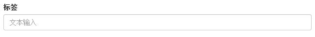
Input box
The most common form text field is the input box input. U sers can enter most of the necessary form data in it. B ootstrap provides support for all native HTML5 input types, including: text, password, datetime, datetime-local, date, month, time, week, number, email, url, search, tel, and color. An appropriate type declaration is required to give input a complete style.
<!DOCTYPE html><html><head>
   <title>Bootstrap 实例 - 输入框</title>
   <link rel="stylesheet" href="//apps.bdimg.com/libs/bootstrap/3.3.0/css/bootstrap.min.css" rel="external nofollow" target="_blank"  rel="external nofollow" target="_blank"  rel="external nofollow" target="_blank"  rel="external nofollow" target="_blank"  rel="external nofollow" target="_blank"  rel="external nofollow" target="_blank"  rel="external nofollow" target="_blank"  rel="external nofollow" target="_blank"  rel="external nofollow" target="_blank"  rel="external nofollow" target="_blank"  rel="external nofollow" target="_blank" >
   <script src="//apps.bdimg.com/libs/jquery/2.1.1/jquery.min.js" rel="external nofollow"  rel="external nofollow"  rel="external nofollow"  rel="external nofollow"  rel="external nofollow"  rel="external nofollow"  rel="external nofollow"  rel="external nofollow"  rel="external nofollow"  rel="external nofollow"  rel="external nofollow" ></script>
   <script src="//apps.bdimg.com/libs/bootstrap/3.3.0/js/bootstrap.min.js" rel="external nofollow"  rel="external nofollow"  rel="external nofollow"  rel="external nofollow"  rel="external nofollow"  rel="external nofollow"  rel="external nofollow"  rel="external nofollow"  rel="external nofollow"  rel="external nofollow"  rel="external nofollow" ></script></head><body><form role="form">
  <div class="form-group">
    <label for="name">标签</label>
    <input type="text" class="form-control" placeholder="文本输入">
  </div>
 </form></body></html>
The result is as follows:
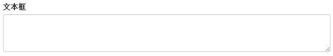
Textarea
You can use the text box textarea when you need to enter multiple lines. If necessary, you can change the rows property (fewer rows - smaller boxes, more rows - larger boxes).
<!DOCTYPE html><html><head>
   <title>Bootstrap 实例 - 文本框</title>
   <link rel="stylesheet" href="//apps.bdimg.com/libs/bootstrap/3.3.0/css/bootstrap.min.css" rel="external nofollow" target="_blank"  rel="external nofollow" target="_blank"  rel="external nofollow" target="_blank"  rel="external nofollow" target="_blank"  rel="external nofollow" target="_blank"  rel="external nofollow" target="_blank"  rel="external nofollow" target="_blank"  rel="external nofollow" target="_blank"  rel="external nofollow" target="_blank"  rel="external nofollow" target="_blank"  rel="external nofollow" target="_blank" >
   <script src="//apps.bdimg.com/libs/jquery/2.1.1/jquery.min.js" rel="external nofollow"  rel="external nofollow"  rel="external nofollow"  rel="external nofollow"  rel="external nofollow"  rel="external nofollow"  rel="external nofollow"  rel="external nofollow"  rel="external nofollow"  rel="external nofollow"  rel="external nofollow" ></script>
   <script src="//apps.bdimg.com/libs/bootstrap/3.3.0/js/bootstrap.min.js" rel="external nofollow"  rel="external nofollow"  rel="external nofollow"  rel="external nofollow"  rel="external nofollow"  rel="external nofollow"  rel="external nofollow"  rel="external nofollow"  rel="external nofollow"  rel="external nofollow"  rel="external nofollow" ></script></head><body><form role="form">
  <div class="form-group">
    <label for="name">文本框</label>
    <textarea class="form-control" rows="3"></textarea>
  </div></form></body></html>
The result is as follows:
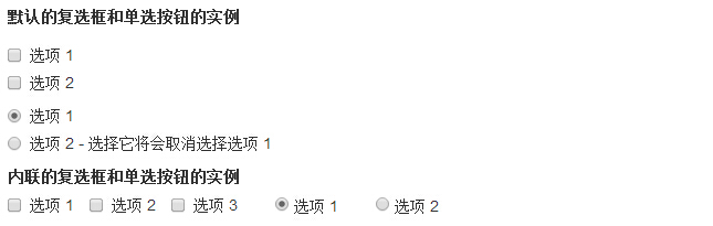
Checkbox and Radio
Check boxes and turn buttons are used to allow users to choose from a range of pre-set options.
-
When you create a form, use checkbox if you want users to select several options from the list. Use radio if you restrict users to only one option.
-
Use .checkbox-inline or .radio-inline class for a series of check boxes and radio-inlines to control how they appear on the same line.
The following example demonstrates both types (default and inline):
<!DOCTYPE html><html><head>
   <title>Bootstrap 实例 - 复选框和单选按钮</title>
   <link rel="stylesheet" href="//apps.bdimg.com/libs/bootstrap/3.3.0/css/bootstrap.min.css" rel="external nofollow" target="_blank"  rel="external nofollow" target="_blank"  rel="external nofollow" target="_blank"  rel="external nofollow" target="_blank"  rel="external nofollow" target="_blank"  rel="external nofollow" target="_blank"  rel="external nofollow" target="_blank"  rel="external nofollow" target="_blank"  rel="external nofollow" target="_blank"  rel="external nofollow" target="_blank"  rel="external nofollow" target="_blank" >
   <script src="//apps.bdimg.com/libs/jquery/2.1.1/jquery.min.js" rel="external nofollow"  rel="external nofollow"  rel="external nofollow"  rel="external nofollow"  rel="external nofollow"  rel="external nofollow"  rel="external nofollow"  rel="external nofollow"  rel="external nofollow"  rel="external nofollow"  rel="external nofollow" ></script>
   <script src="//apps.bdimg.com/libs/bootstrap/3.3.0/js/bootstrap.min.js" rel="external nofollow"  rel="external nofollow"  rel="external nofollow"  rel="external nofollow"  rel="external nofollow"  rel="external nofollow"  rel="external nofollow"  rel="external nofollow"  rel="external nofollow"  rel="external nofollow"  rel="external nofollow" ></script></head><body><label for="name">默认的复选框和单选按钮的实例</label><div class="checkbox">
   <label><input type="checkbox" value="">选项 1</label></div><div class="checkbox">
   <label><input type="checkbox" value="">选项 2</label></div><div class="radio">
   <label>
      <input type="radio" name="optionsRadios" id="optionsRadios1"
         value="option1" checked> 选项 1   </label></div><div class="radio">
   <label>
      <input type="radio" name="optionsRadios" id="optionsRadios2"
         value="option2">
         选项 2 - 选择它将会取消选择选项 1   </label></div><label for="name">内联的复选框和单选按钮的实例</label><div>
   <label class="checkbox-inline">
      <input type="checkbox" id="inlineCheckbox1" value="option1"> 选项 1
    </label>
   <label class="checkbox-inline">
      <input type="checkbox" id="inlineCheckbox2" value="option2"> 选项 2
    </label>
   <label class="checkbox-inline">
      <input type="checkbox" id="inlineCheckbox3" value="option3"> 选项 3
    </label>
   <label class="checkbox-inline">
      <input type="radio" name="optionsRadiosinline" id="optionsRadios3"
         value="option1" checked> 选项 1
    </label>
   <label class="checkbox-inline">
      <input type="radio" name="optionsRadiosinline" id="optionsRadios4"
         value="option2"> 选项 2
    </label>
</div></body></html>
The result is as follows:
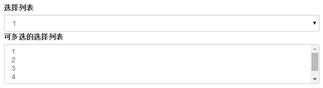
Select box
Use the selection box when you want users to choose from multiple options, but only one option can be selected by default.
-
Use the show list option, which is usually a list of choices that users are familiar with, such as states or numbers.
-
The user is allowed to select multiple options using multiple."multiple".
The following example demonstrates both types (select and multiple):
<!DOCTYPE html><html><head>
   <title>Bootstrap 实例 - 选择框</title>
   <link rel="stylesheet" href="//apps.bdimg.com/libs/bootstrap/3.3.0/css/bootstrap.min.css" rel="external nofollow" target="_blank"  rel="external nofollow" target="_blank"  rel="external nofollow" target="_blank"  rel="external nofollow" target="_blank"  rel="external nofollow" target="_blank"  rel="external nofollow" target="_blank"  rel="external nofollow" target="_blank"  rel="external nofollow" target="_blank"  rel="external nofollow" target="_blank"  rel="external nofollow" target="_blank"  rel="external nofollow" target="_blank" >
   <script src="//apps.bdimg.com/libs/jquery/2.1.1/jquery.min.js" rel="external nofollow"  rel="external nofollow"  rel="external nofollow"  rel="external nofollow"  rel="external nofollow"  rel="external nofollow"  rel="external nofollow"  rel="external nofollow"  rel="external nofollow"  rel="external nofollow"  rel="external nofollow" ></script>
   <script src="//apps.bdimg.com/libs/bootstrap/3.3.0/js/bootstrap.min.js" rel="external nofollow"  rel="external nofollow"  rel="external nofollow"  rel="external nofollow"  rel="external nofollow"  rel="external nofollow"  rel="external nofollow"  rel="external nofollow"  rel="external nofollow"  rel="external nofollow"  rel="external nofollow" ></script></head><body><form role="form">
   <div class="form-group">
      <label for="name">选择列表</label>
      <select class="form-control">
         <option>1</option>
         <option>2</option>
         <option>3</option>
         <option>4</option>
         <option>5</option>
      </select>

      <label for="name">可多选的选择列表</label>
      <select multiple class="form-control">
         <option>1</option>
         <option>2</option>
         <option>3</option>
         <option>4</option>
         <option>5</option>
      </select>
   </div></form></body></html>
The result is as follows:
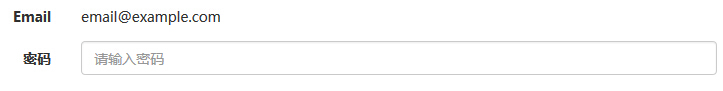
Static control
When you need to place plain text behind a form label within a horizontal form, use class .form-control-static on .
<!DOCTYPE html><html><head>
   <title>Bootstrap 实例 - 静态控件</title>
   <link rel="stylesheet" href="//apps.bdimg.com/libs/bootstrap/3.3.0/css/bootstrap.min.css" rel="external nofollow" target="_blank"  rel="external nofollow" target="_blank"  rel="external nofollow" target="_blank"  rel="external nofollow" target="_blank"  rel="external nofollow" target="_blank"  rel="external nofollow" target="_blank"  rel="external nofollow" target="_blank"  rel="external nofollow" target="_blank"  rel="external nofollow" target="_blank"  rel="external nofollow" target="_blank"  rel="external nofollow" target="_blank" >
   <script src="//apps.bdimg.com/libs/jquery/2.1.1/jquery.min.js" rel="external nofollow"  rel="external nofollow"  rel="external nofollow"  rel="external nofollow"  rel="external nofollow"  rel="external nofollow"  rel="external nofollow"  rel="external nofollow"  rel="external nofollow"  rel="external nofollow"  rel="external nofollow" ></script>
   <script src="//apps.bdimg.com/libs/bootstrap/3.3.0/js/bootstrap.min.js" rel="external nofollow"  rel="external nofollow"  rel="external nofollow"  rel="external nofollow"  rel="external nofollow"  rel="external nofollow"  rel="external nofollow"  rel="external nofollow"  rel="external nofollow"  rel="external nofollow"  rel="external nofollow" ></script></head><body><form class="form-horizontal" role="form">
  <div class="form-group">
    <label class="col-sm-2 control-label">Email</label>
    <div class="col-sm-10">
      <p class="form-control-static">[email protected]</p>
    </div>
  </div>
  <div class="form-group">
    <label for="inputPassword" class="col-sm-2 control-label">密码</label>
    <div class="col-sm-10">
      <input type="password" class="form-control" id="inputPassword"
         placeholder="请输入密码">
    </div>
  </div></form></body></html>
The result is as follows:
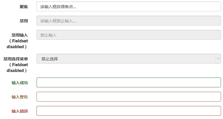
The status of the form control
In addition to the :focus state (that is, the user taps input or focuses on input using the tab key), Bootstrap defines styles for disabled input boxes and provides a class for form validation.
Enter the box focus
When input box input receives :focus, the outline of the input box is removed and box-shadow is applied.
The disabled input box input
If you want to disable an input box input, you simply add the disabled property, which not only disables the input box, but also changes the style of the input box and the style of the mouse pointer when it hovers over the element.
The disabled field set fieldset
Add the disabled property to the slt;fieldset and add the disabled property to disable all controls within the slt;fieldset.
Verify the status
Bootstrap contains validation styles for errors, warnings, and success messages. You only need to simply add the appropriate class (.has-warning, .has-error, or .has-success) to the parent element to use the validation state.
The following example demonstrates all control states:
<!DOCTYPE html><html><head>
   <title>Bootstrap 实例 - 表单控件状态</title>
   <link rel="stylesheet" href="//apps.bdimg.com/libs/bootstrap/3.3.0/css/bootstrap.min.css" rel="external nofollow" target="_blank"  rel="external nofollow" target="_blank"  rel="external nofollow" target="_blank"  rel="external nofollow" target="_blank"  rel="external nofollow" target="_blank"  rel="external nofollow" target="_blank"  rel="external nofollow" target="_blank"  rel="external nofollow" target="_blank"  rel="external nofollow" target="_blank"  rel="external nofollow" target="_blank"  rel="external nofollow" target="_blank" >
   <script src="//apps.bdimg.com/libs/jquery/2.1.1/jquery.min.js" rel="external nofollow"  rel="external nofollow"  rel="external nofollow"  rel="external nofollow"  rel="external nofollow"  rel="external nofollow"  rel="external nofollow"  rel="external nofollow"  rel="external nofollow"  rel="external nofollow"  rel="external nofollow" ></script>
   <script src="//apps.bdimg.com/libs/bootstrap/3.3.0/js/bootstrap.min.js" rel="external nofollow"  rel="external nofollow"  rel="external nofollow"  rel="external nofollow"  rel="external nofollow"  rel="external nofollow"  rel="external nofollow"  rel="external nofollow"  rel="external nofollow"  rel="external nofollow"  rel="external nofollow" ></script></head><body><form class="form-horizontal" role="form">
   <div class="form-group">
      <label class="col-sm-2 control-label">聚焦</label>
      <div class="col-sm-10">
         <input class="form-control" id="focusedInput" type="text"
            value="该输入框获得焦点...">
      </div>
   </div>
   <div class="form-group">
      <label for="inputPassword" class="col-sm-2 control-label">
         禁用      </label>
      <div class="col-sm-10">
         <input class="form-control" id="disabledInput" type="text"
            placeholder="该输入框禁止输入..." disabled>
      </div>
   </div>
   <fieldset disabled>
      <div class="form-group">
         <label for="disabledTextInput"  class="col-sm-2 control-label">
            禁用输入(Fieldset disabled)         </label>
         <div class="col-sm-10">
            <input type="text" id="disabledTextInput" class="form-control"
               placeholder="禁止输入">
         </div>
      </div>
      <div class="form-group">
         <label for="disabledSelect"  class="col-sm-2 control-label">
            禁用选择菜单(Fieldset disabled)         </label>
         <div class="col-sm-10">
            <select id="disabledSelect" class="form-control">
               <option>禁止选择</option>
            </select>
         </div>
      </div>
   </fieldset>
   <div class="form-group has-success">
      <label class="col-sm-2 control-label" for="inputSuccess">
         输入成功      </label>
      <div class="col-sm-10">
         <input type="text" class="form-control" id="inputSuccess">
      </div>
   </div>
   <div class="form-group has-warning">
      <label class="col-sm-2 control-label" for="inputWarning">
         输入警告      </label>
      <div class="col-sm-10">
         <input type="text" class="form-control" id="inputWarning">
      </div>
   </div>
   <div class="form-group has-error">
      <label class="col-sm-2 control-label" for="inputError">
         输入错误      </label>
      <div class="col-sm-10">
         <input type="text" class="form-control" id="inputError">
      </div>
   </div></form></body></html>
The result is as follows:
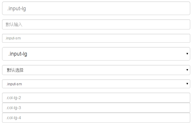
The size of the form control
You can use class .input-lg and .col-lg-,, respectively, to set the height and width of the form. The following example demonstrates this:
<!DOCTYPE html><html><head>
   <title>Bootstrap 实例 - 表单控件大小</title>
   <link rel="stylesheet" href="//apps.bdimg.com/libs/bootstrap/3.3.0/css/bootstrap.min.css" rel="external nofollow" target="_blank"  rel="external nofollow" target="_blank"  rel="external nofollow" target="_blank"  rel="external nofollow" target="_blank"  rel="external nofollow" target="_blank"  rel="external nofollow" target="_blank"  rel="external nofollow" target="_blank"  rel="external nofollow" target="_blank"  rel="external nofollow" target="_blank"  rel="external nofollow" target="_blank"  rel="external nofollow" target="_blank" >
   <script src="//apps.bdimg.com/libs/jquery/2.1.1/jquery.min.js" rel="external nofollow"  rel="external nofollow"  rel="external nofollow"  rel="external nofollow"  rel="external nofollow"  rel="external nofollow"  rel="external nofollow"  rel="external nofollow"  rel="external nofollow"  rel="external nofollow"  rel="external nofollow" ></script>
   <script src="//apps.bdimg.com/libs/bootstrap/3.3.0/js/bootstrap.min.js" rel="external nofollow"  rel="external nofollow"  rel="external nofollow"  rel="external nofollow"  rel="external nofollow"  rel="external nofollow"  rel="external nofollow"  rel="external nofollow"  rel="external nofollow"  rel="external nofollow"  rel="external nofollow" ></script></head><body><form role="form">
   <div class="form-group">
      <input class="form-control input-lg" type="text"
         placeholder=".input-lg">
   </div>

   <div class="form-group">
      <input class="form-control" type="text" placeholder="默认输入">
   </div>

   <div class="form-group">
      <input class="form-control input-sm" type="text"
         placeholder=".input-sm">
   </div>
   <div class="form-group">
   </div>
   <div class="form-group">
      <select class="form-control input-lg">
         <option value="">.input-lg</option>
      </select>
   </div>
   <div class="form-group">
      <select class="form-control">
         <option value="">默认选择</option>
      </select>
   </div>
   <div class="form-group">
      <select class="form-control input-sm">
         <option value="">.input-sm</option>
      </select>
   </div>

   <div class="row">
      <div class="col-lg-2">
         <input type="text" class="form-control" placeholder=".col-lg-2">
      </div>
      <div class="col-lg-3">
         <input type="text" class="form-control" placeholder=".col-lg-3">
      </div>
      <div class="col-lg-4">
         <input type="text" class="form-control" placeholder=".col-lg-4">
      </div>
   </div></form></body></html>
The result is as follows:
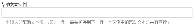
Form help text
Bootstrap form controls can have a block-level help text on the input box input. T o add a block of content that takes up the entire width, use .help-block after the .lt;input> The following example demonstrates this:
<!DOCTYPE html><html><head>
   <title>Bootstrap 实例 - 表单帮助文本</title>
   <link rel="stylesheet" href="//apps.bdimg.com/libs/bootstrap/3.3.0/css/bootstrap.min.css" rel="external nofollow" target="_blank"  rel="external nofollow" target="_blank"  rel="external nofollow" target="_blank"  rel="external nofollow" target="_blank"  rel="external nofollow" target="_blank"  rel="external nofollow" target="_blank"  rel="external nofollow" target="_blank"  rel="external nofollow" target="_blank"  rel="external nofollow" target="_blank"  rel="external nofollow" target="_blank"  rel="external nofollow" target="_blank" >
   <script src="//apps.bdimg.com/libs/jquery/2.1.1/jquery.min.js" rel="external nofollow"  rel="external nofollow"  rel="external nofollow"  rel="external nofollow"  rel="external nofollow"  rel="external nofollow"  rel="external nofollow"  rel="external nofollow"  rel="external nofollow"  rel="external nofollow"  rel="external nofollow" ></script>
   <script src="//apps.bdimg.com/libs/bootstrap/3.3.0/js/bootstrap.min.js" rel="external nofollow"  rel="external nofollow"  rel="external nofollow"  rel="external nofollow"  rel="external nofollow"  rel="external nofollow"  rel="external nofollow"  rel="external nofollow"  rel="external nofollow"  rel="external nofollow"  rel="external nofollow" ></script></head><body><form role="form">
   <span>帮助文本实例</span>
   <input class="form-control" type="text" placeholder="">
   <span class="help-block">一个较长的帮助文本块,超过一行,
   需要扩展到下一行。本实例中的帮助文本总共有两行。</span></form></body></html>
The result is as follows: