WeChat small program WeUI basic components
May 20, 2021 WeChat Mini Program Development Document
Table of contents
Badge badge
A number or status marker that appears near a button, icon, or icon.
Example code:
{
  "usingComponents": {
    "mp-cells": "../components/cells/cells",
    "mp-cell": "../components/cell/cell",
    "mp-badge": "../components/badge/badge"
  }
}
Gallery Gallery
For multiple photo presentations, similar to native wx.previewImage displays.
Example code:
{
  "usingComponents": {
    "mp-gallery": "../components/gallery/gallery"
  }
}
Loading loads
The loading effect when the data is loaded
Example code:
{
"usingComponents": {
"mp-loading": "../components/loading/loading"
},
"navigationBarTitleText": "UI组件库"
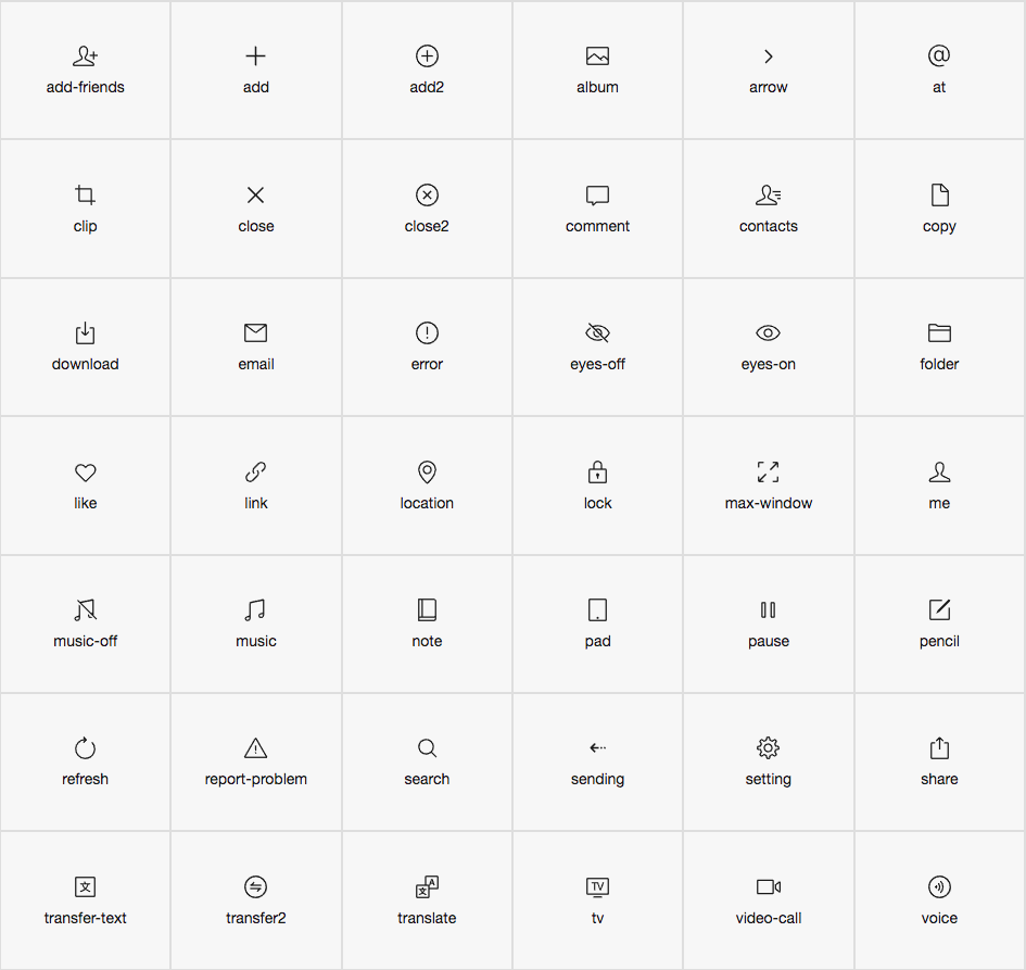
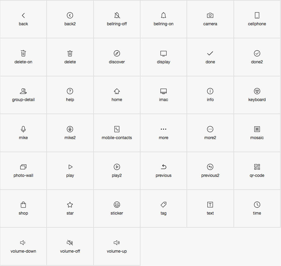
}Icon
Icon
Code introduction
Introduce components in page.json
{
  "usingComponents": {
    "mp-icon": "../../components/icon/icon"
  }
}
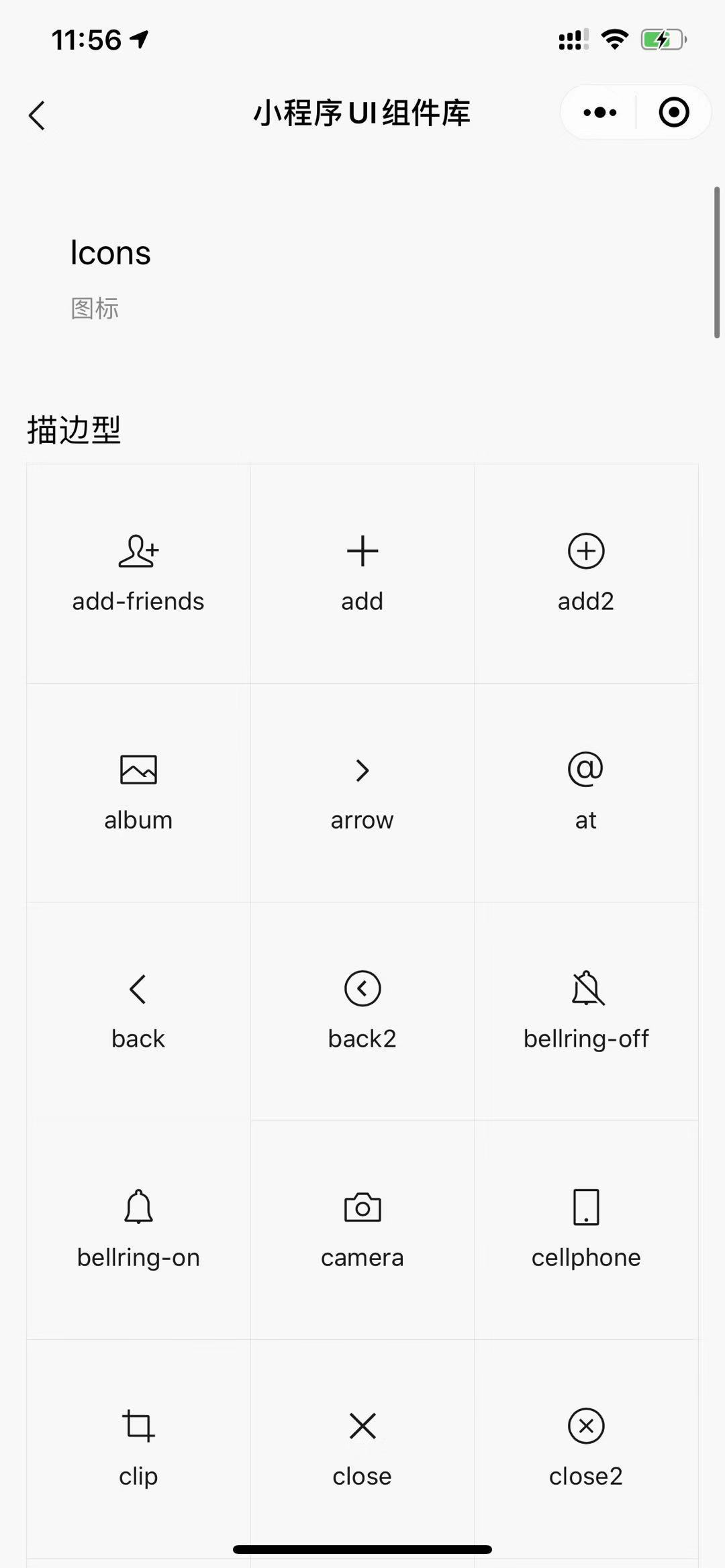
The sample code
<!--WXML示例代码-->
<mp-icon type="field" icon="add" color="black" size="{{25}}"></mp-icon>
<mp-icon icon="add" color="black" size="{{25}}"></mp-icon>
The effect is displayed
The list of properties
| Property | Type | The default | Description |
|---|---|---|---|
| extClass | string | The name of the component class | |
| type | string | outline | Icon type, optional value outline( stroke), field (fill) |
| icon | string | Icon's name | |
| size | number | 20 | Icon's size, px |
| color | string | black | Icon color, default black |
Icon list