WeChat Small Program Large Screen Fit Guide
May 18, 2021 WeChat Mini Program Development Document
Table of contents
1. 1. Under the same type of equipment, the dimensions are nuanced
2. 2. When the screen is allowed to rotate, it can be divided into horizontal and vertical screens
3. 3. Different types of devices or PC programs that can drag windows freely
A guide to large-screen fit
At present, the user devices on the market can be roughly divided into small screen mobile phone end, medium screen tablet, large screen PC side three categories, and in these three types of devices will have small size differences, also known as screen fragmentation.
As small programs can run on more and more device terminals, developers should also adapt to different screen sizes.
In accordance with the general principle of fit, combined with the characteristics of small procedures, it is usually necessary to adapt in three cases:
1. Under the same type of equipment, the dimensions are nuanced
Using the rpx units provided by the small program, the page layout is scaled equally with little difference in size.
2. When the screen is allowed to rotate, it can be divided into horizontal and vertical screens
The phone settings "pageOrientation": "auto" or "resizable" on the iPad: true allows the screen to rotate, and the onResize event or wx.onWindowResize method of Page allows you to monitor the operation to determine whether you are using a horizontal or vertical layout.
3. Different types of devices or PC programs that can drag windows freely
The widget is currently webview-based, using CSS media queries to monitor screen sizes in real time, presenting different UI layouts under different screens, and combining Flex elastic layouts with Grid grid layouts enables more responsive fit scenarios.
Matchmedia - abstract media query
小程序基础库基于 window.matchMedia API 新增了一组过程式与定义式接口 match-media 。开发者可以通过 <match-media></match-media> 和 wx.createMediaQueryObserver 来显式地使用媒体查询能力,对于多端适配来说,它有以下优势:
- Developers can easier and explicitly use Media Query capabilities, rather than coupling in CSS files, difficult to reuse.
- It is possible to dynamically use the data binding in WXML, which can not only make the display or hide of the component, but can be more plasticity in the process API, such as dynamically adding a Class class name, changing the style, but also dynamically based on dimensional changes.
- The MEDIA Query components can be nested, that is, the change in the layout style of the partial component layout is met.
- After the components, the encapsulation is stronger, can isolate the style, template, and the interactive events binding on the template, but also provide higher reusability.
- The browser has built-in API, which is available on all WebView-based applets, compatible.Match-Media specific usage method can be referred to API documentation 。
4. Adaptive layout
In order to make developers better adaptive large screens, the applet provides the ROW / COL component for developers.
The main feature of adaptive is:
- Only 24 copies of the whole line, the arrangement will automatically go downwards
- Each size setting does not affect the layout of other sizes
Design guidelines and code examples
About how to achieve better multi-end adaptation applets in design and user experience.
At the same time, we also provide a multi-end adaptation example applet, and a common adaptive scenario is simply implemented based on the ROW / COL component, for example:
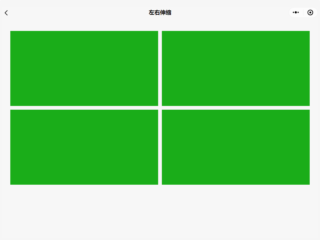
- The larger the screen, the layout is unchanged, and the module is stretched.
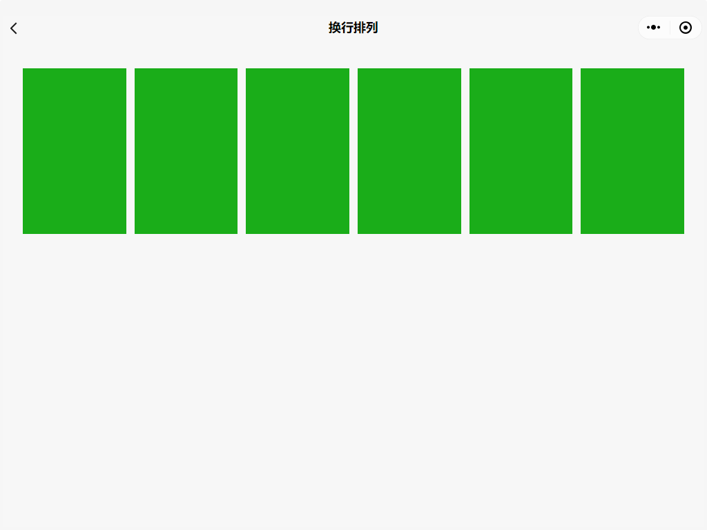
- The bigks the screen, the more the content, the module content is arranged
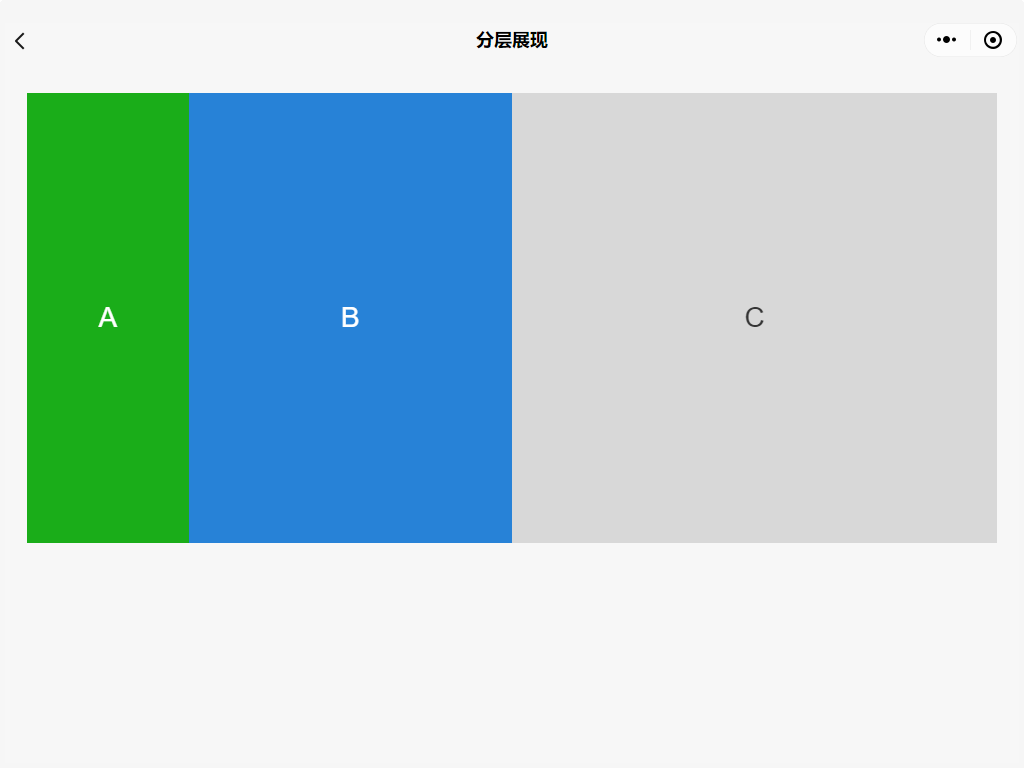
- The larger the screen, the layout changes, the module content can be folded / display
Experience path: "Extension capabilities" -> "multi-end adaptation (need to experience in PC)"