WeChat gadget WeUI top error prompt component
May 21, 2021 WeChat Mini Program Development Document
Table of contents
Toptips
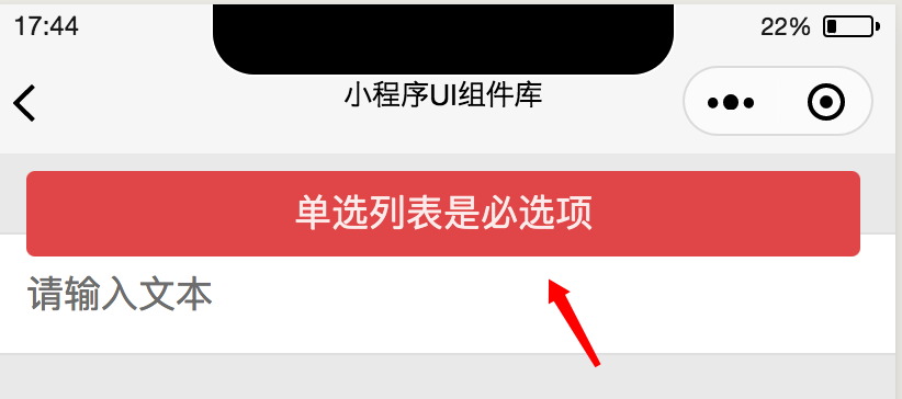
The top error prompt component of Toptips, which is often used for form validation or submitting a request to a background error prompt that succeeds or fails, is shown in the following illustration.
Introduce components
Introduce components in page.json
{
  "usingComponents": {
    "mp-toptips": "../../components/toptips/toptips"
  }
}
The sample code
<!--WXML示例代码-->
<mp-toptips msg="{{error}}" type="error" show="{{error}}"></mp-toptips>
// page.js示例代码
Page({
    data: {
        error: ''
    },
    onShow() {
        this.setData({
            error: '这是一个错误提示'
        })
    }
});
The list of properties
| Property | Type | The default | Required | Description |
|---|---|---|---|---|
| ext-class | string | Whether | A class added to the internal structure of a component that can be used to modify the style inside a component | |
| type | string | Whether | Tip type, which can be info, error, and success, represents three prompt colors | |
| show | boolean | false | Whether | Whether Toptips is displayed |
| msg | string | Is | The prompt content | |
| delay | number | 2000 | Whether | The ms value that is hidden after the prompt content is displayed |
| bindhide | eventhandler | Whether | The event triggered when the top prompt is hidden |