WeChat Gadget Extension Components - Imitation WeChat Emoji Components
May 21, 2021 WeChat Mini Program Development Document
Table of contents
emoji
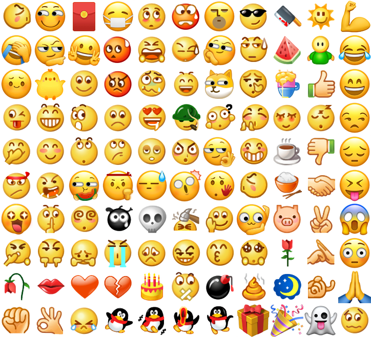
Imitation WeChat emoticon component. U pload the Emoji Sprite provided below the document to the CDN before using it, and then pass it in to the Emoji component. T o improve the performance of loading emoticons for the first time, Sprite downloads can be triggered in advance via the image component, taking advantage of the browser's caching mechanism. On pages that do not use the emoji panel, you can hide or move the emoji component off-screen, using only the parseEmoji feature.
The list of properties
| Property | Type | The default | Required | Description |
|---|---|---|---|---|
| source | string | Is | Emoji Sprite address | |
| height | number | 300 | Whether | Emoji disk height |
| background-color | string | #EDEDED | Whether | Emoji disc background color |
| show-send | boolean | true | Whether | Whether to display the send button |
| show-del | boolean | true | no | Whether to display the delete button |
| show-history | boolean | true | no | Whether to display recently used |
| bindinsertemoji | eventhandle | no | Insert the expression, e.detail = {emotionname} | |
| binddelemoji | eventhandle | no | Click the delete button | |
| bindsend | eventhandle | no | Click to send button |
Sample code:
{
  "disableScroll": true,
  "navigationBarTitleText": "",
  "usingComponents": {
    "mp-emoji": "../components/emoji/emoji"

  }
}
<scroll-view scroll-y style="height: {{layoutHeight}}px" scroll-into-view="{{historyList[historyList.length - 1].id}}">
<block wx:for="{{historyList}}" wx:for-index="idx" wx:for-item="historyItem">
<view class="record" hidden="{{historyItem.length === 0}}" id="{{historyItem.id}}">
<view class="avator"></view>
<view class="comment">
<block wx:for="{{historyItem.emoji}}" wx:key="*this">
<block wx:if="{{item.type === 1}}">{{item.content}}</block>
<view
wx:if="{{item.type === 2}}"
style="display: inline-block; width: {{lineHeight}}px; height: {{lineHeight}}px">
<view
class="{{item.imageClass}}"
style="background-image: url({{emojiSource}});transform-origin: 0 0; transform: scale({{lineHeight / 64}});"></view>
</view>
</block>
</view>
</view>
</block></scroll-view>
<view class="reply_wrp" style="bottom: {{keyboardHeight}}px">
<view class="reply_tool">
<view hover-class="active" class="reply_button replay_quick_button">
<image src="./images/reply_tool_keyboard.svg" mode='aspectFit' class="reply_tool_pic"></image>
</view>
<view class="reply_form_wrp">
<label for="" class="reply_label">
<input
class="reply_input"
cursor-spacing="8px"
confirm-type="send"
adjust-position="{{false}}"
confirm-hold value="{{comment}}"
cursor="{{cursor}}"
focus="{{focus}}"
bindblur="onBlur"
bindfocus="onFocus"
bindinput="onInput"
bindconfirm="onConfirm"
bindkeyboardheightchange="onkeyboardHeightChange"
/>
</label>
</view>
<view hover-class="active" class="reply_button replay_emotion_button" bindtap="showEmoji">
<image src="./images/reply_tool_emoji.svg" mode='aspectFit' class="reply_tool_pic"></image>
</view>
<view hover-class="active" class="reply_button replay_media_button" bindtap="showFunction">
<image src="./images/reply_tool_add.png" mode='aspectFit' class="reply_tool_pic"></image>
</view>
</view>
<view class="reply_panel_wrp" style="height: {{emojiShow ? 300 : 200}}px;" hidden="{{!emojiShow && !functionShow}}">
<view class="reply_panel {{emojiShow ? 'show': ''}}" hidden="{{!emojiShow}}">
<mp-emoji source="{{emojiSource}}" class="mp-emoji" bindinsertemoji="insertEmoji" binddelemoji="deleteEmoji" bindsend="onsend"></mp-emoji>
</view>
<view class="reply_panel {{functionShow ? 'show': ''}}" hidden="{{!functionShow}}">
<swiper indicator-dots="{{true}}" indicator-color="#bbbbbb" indicator-active-color="#8c8c8c">
<swiper-item>
<view class="function_list">
<view class="function_item" bindtap="chooseImage">
<image src="./images/reply_function_image.svg" class="reply_function_pic"></image>
</view>
</view>
</swiper-item>
</swiper>
</view>
</view>
</view>

How to use it
Clicking on an emoticon will give you Chinese meaning, such as ???? - Smile. In the actual input process, we usually only show Chinese meaning of the text.
Comments that mix text and emoticons need to be parsed before they can be displayed, and parseEmoji parseEmoji parse parsing functions are provided within the component, as follows:
// .mp-emoji 为表情组件的选择器
const emojiInstance = this.selectComponent('.mp-emoji')
const emojiNames = emojiInstance.getEmojiNames()
const parseEmoji = emojiInstance.parseEmoji
const comment = '测试[得意][偷笑]文本'
const parsedCommnet = parseEmoji(comment)
The parsed comment structure is as follows: an array of text and emoticons split, type=1 is plain text, type=2 is emoticon icon, and imageClass records the position of the emoticon on the Sprite chart. Note that the component turns on styleIsolation: 'page-shared', and the in-component style is shared with the page.
[
  {type: 1, content: '测试'},
  {type: 2, content: '[得意]', imageClass: 'smiley_4'},
  {type: 2, content: '[偷笑]', imageClass: 'smiley_20'},
  {type: 1, content: '文本'},
]
Since emoticon icons are generated from Sprite charts, the following structures can be used for presentation. It is important to note that the actual size of each icon is 64px, so scale in a paragraph at a scale scale of high / 64.
<view class="comment">
  <block wx:for="{{parsedComment}}" wx:key="*this">
    <block wx:if="{{item.type === 1}}">{{item.content}}</block>
    <view wx:if="{{item.type === 2}}" style="display: inline-block; width: {{lineHeight}}px; height: {{lineHeight}}px">
      <view
        class="{{item.imageClass}}"
        style="background-image: url({{emojiSource}});transform-origin: 0 0; transform: scale({{lineHeight / 64}});">
      </view>
    </view>
  </block>
</view>
.comment {
  font-size: 18px;
  display: flex;
  align-items: center;
  flex-wrap: wrap;
  line-height: 24px;
}
How to use it in conjunction with input, refer to the sample code.
Emoji Sprite