Responsive Web Design - Pictures
May 04, 2021 CSS
Table of contents
1. Responsive Web Design - Pictures
8.. Different devices display different pictures
Responsive Web Design - Pictures
Use the width property
If the width property is set to 100%, the picture implements responsive functionality based on the upper and lower ranges:
Note that in the above example, the picture will be bigger than its original picture.
We can use
max-width
to solve this problem very well.
Use the
max-width
If the
max-width
is set to 100%, the picture will never be larger than its original size:
Tip: For
max-width
properties, refer to the
CSS max-width properties section of this site's CSS reference
manual.
Add a picture to the page
Background picture
The background picture can respond to resizing or zooming.
Here are three different approaches:
1. If the
background-size
is
contain
the background picture will be proportionally adaptive to the content area.
The picture remains proportional:
This is the CSS code:
2. If the
background-size
property is set to "100% 100%", the background picture extends across the region:
3. If the
background-size
is
cover
the background image is extended to be large enough for the background image to completely cover the background area.
Note that this property maintains the scale of the picture so that parts of the background image cannot be displayed in the background positioning area.
This is the CSS code:
Different devices display different pictures
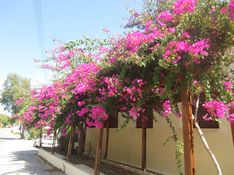
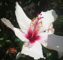
Large pictures can be displayed on the big screen, but they don't really look good on the small screen. W e don't have to load big pictures on the small screen, which affects the loading speed. So we can use media queries to display different pictures depending on the device.
The following large and small pictures will appear on different devices:
body {
background-image: url('img_smallflower.jpg');
}
/* For width 400px and larger: */
@media only screen and (min-width: 400px) {
body {
background-image: url('img_flowers.jpg'); } }
Try it out . . .
You can use the
min-device-width
min-width
property, which detects the width of the device rather than the width of the browser.
The picture size does not change when the browser size is reset.
body {
background-image: url('img_smallflower.jpg'); }
The device is greater than 400px (also equal to):
@media only screen and (min-device-width: 400px) {
body {
background-image: url('img_flowers.jpg'); } }
Try it out . . .
HTML5 and picture elements
HTML5's and picture's elements can set up multiple pictures.
Browser support
| Elements |

|

|

|

|

|
|---|---|---|---|---|---|
| < picture > | Not supported | 38.0 | 38.0 | Not supported | 25.0 |
<video>
<audio>
You can device different resources, and the first set of resources is preferred:
< source srcset= "img_smallflower.jpg" media= "(max-width: 400px)" >
< source srcset= "img_flowers.jpg" >
< img src= "img_flowers.jpg" alt= "Flowers" >
< /picture >
Try it out . . .
srcset
property is necessary to define the picture resource.
media
property is optional and can be viewed in
the CSS @media media
query for details.
For
browsers that do
not
support the
element, you can also define the
<img>
to replace it.
Extended reading
Responsive Pictures 101: Describes why responsive pictures are needed and how to choose the right responsive picture solution.