Flex basic control
May 25, 2021 Flex
Table of contents
Each user interface considers three main areas:
-
UI elements: These are the core visual elements that users eventually see and interact with. /b10> Flex provides a large list of widely used and common elements from basic to complex, which we'll cover in this tutorial.
-
Layout: They define how UI elements should be organized on the screen and provide the final look and feel for the GUI (graphical user interface). /b10> This section is discussed in the layout section.
-
Behavior: These are events that occur when a user interacts with a UI element. /b10> This section is discussed in the Incident Handling section.
Flex UI elements:
The Flex UI library provides classes in a well-defined class hierarchy to create complex Web-based user interfaces. All classes in this component hierarchy are derived from the EventDispatcher base class, as follows:
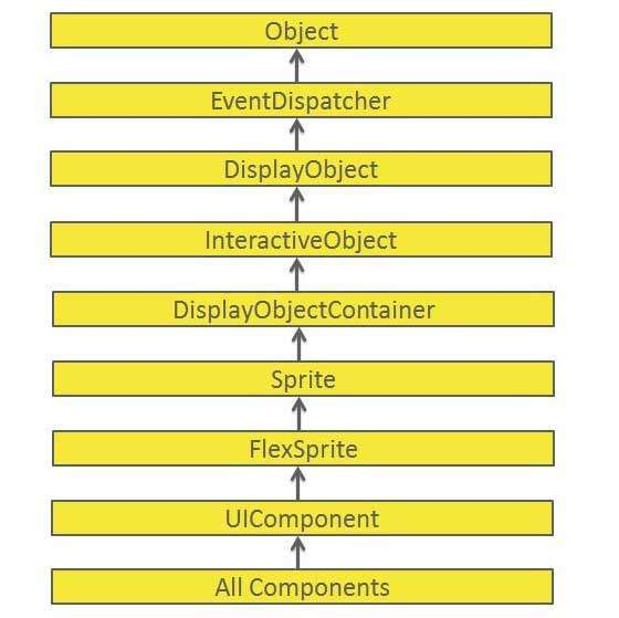
Each Basic UI control inherits properties from the UIComponent class and then from EventDispatcher and other top-level classes.
| S.N. | Control andamp; Describes |
|---|---|
| 1 |
The EventDispatcher class is the base class for all classes that can dispatch events. /b10> The EventDispatcher class allows any object on the display list to be the object of the event, so use the IEventDispatcher interface method. |
| 2 |
The UIComponent class is the base class for all visual components, both interactive and non-interactive. |
Basic control
Here are a few important basic controls :
| S.N. | Controls and instructions |
|---|---|
| 1 |
Label is a low-level UIComponent that renders one or more lines of uniform text. |
| 2 |
Text controls allow you to display HTML content and normal text in your application. |
| 3 |
Image controls allow you to import JPEG, PNG, GIF, and SWF files at runtime. |
| 4 |
The LinkButton control is a borderless button control whose contents are highlighted when the user moves the mouse over it. |