Foundation grid system
May 04, 2021 Foundation5
Table of contents
Foundation grid system
The Foundation grid system is 12 columns.
If you don't need 12 columns, you can merge some columns to create some columns that are larger and wider.
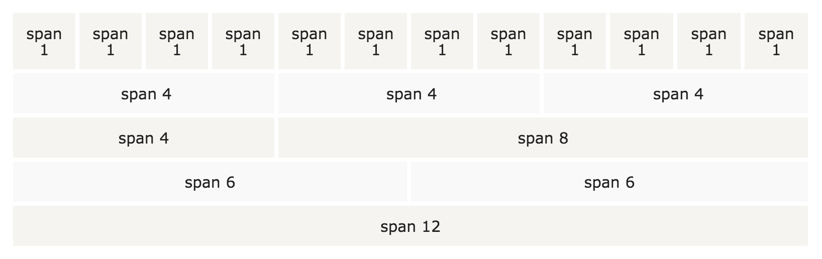
Foundation's grid system is responsive. C olumns are automatically resized based on screen size. On a large screen, it could be three columns, and on a small screen, it could be three single columns, in order.
Grid columns
The Foundation grid system has three columns:
-
.small(mobile) -
.medium(tablet) -
.large(computer equipment: notebook, desktop)
These classes can be used together to create a more flexible layout
The basic grid structure
Here are some basic examples of Foundation grid structures:
Instance
< div class= "small|medium|large- num columns" > < /div >
< /div >
< div class= "row" >
< div class= "small|medium|large- num columns" > < /div >
< div class= "small|medium|large- num columns" > < /div >
< div class= "small|medium|large- num columns" > < /div >
< /div >
< div class= "row" >
...
< /div >
First, create a line
<div class="row">
T
his is a horizontal vertical column. T
hen add the number of columns
      small-

       num
      medium-

       num
      large-

       num
Note: The number of
num
must add up to 12:
Instance
< div class= "small-12 columns" > .small-12 yellow < /div >
< /div >
< div class= "row" >
< div class= "small-8 columns" > .small-8 beige < /div >
< div class= "small-4 columns" > .small-4 gray < /div >
< /div >
< div class= "row" >
< div class= "large-9 small-8 columns" > .small-8 .large-9 pink < /div >
< div class= "large-3 small-4 columns" > .small-4 .large-3 orange < /div >
< /div >
Try it out . . .
In the instance, the first row of the class
.small-12
which creates 12 columns (100% width).
The second row creates two columns,
.small-4
with a width of 33.3%
.small-8
with a width of 66.6%.
In the third row we added two additional columns
.large-3
and
.large-9
T
his means that if you are at a large screen size, the columns become 25%
.large-3
and 75%
.large-9
W
e also specified a ratio of 33%
.small-4
and 66%
.small-8
screen.
This combination is very helpful for different screen displays.
Grid options
The following table summarizes the description of the Foundation grid system on multiple devices:
|
Small devices
Phones (<40.0625em (640px)) |
Medium device
Tablets (>=40.0625em (640px)) |
Large equipment
Laptops & Desktops (>=64.0625em (1025px)) |
|
|---|---|---|---|
| Grid behavior | has always been horizontal | Start with folding, above the break point is horizontal | Start with folding, above the break point is horizontal |
| Class prefix | .small-* | .medium-* | .large-* |
| The number of classes | 12 | 12 | 12 |
| Can be embedded | Yes | Yes | Yes |
| Offset | Yes | Yes | Yes |
| Column sorting | Yes | Yes | Yes |
Widescreen
The maximum
.row
width of the grid is 62.5rem. O
n a widescreen, when the width is greater than 62.5rem, the column does not span the width of the page, even if the width is set to 100%.
But you can reset max-width through CSS:
If you use the default max-width, but want the background color to span the entire page width,
.row
and specify the background color you need:
Instance
<div class="row">
<div class="small-6 columns" style="background-color:yellow;" >.small-6</div>
<div class="small-6 columns" style="background-color:pink; ">.small-6</div>
</div>
</div>
Try it out . . .