SWING control
May 15, 2021 SWING
Table of contents
SWING - Control
Each user interface considers three main areas:
-
UI elements: A core visual element that the user eventually sees and interacts with. GWT provides a large list of widely used and common elements that we will cover in this tutorial from basic to complex.
-
Layout: They define how UI elements should be organized on the screen and provide a final look and feel to the GUI (graphical user interface). This section will be covered in the layout chapter.
- Behavior: These events occur when a user interacts with a UI element. This section will be covered in this chapter on incident handling.
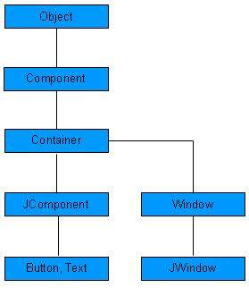
Each SWING control inherits properties from the hierarchy of the following component classes.
| Serial number | Class and description |
|---|---|
| 1 |
Component
Container is an abstract base class for SWING's non-menu user interface controls. A component represents an object that is graphically represented |
| 2 |
Container
Container is a component that can contain other SWING components. |
| 3 |
JComponent
JComponent is a base class for all swing UI components. In order to use a Swing component inherited from JComponent, the component must be an inclusive hierarchy whose root is a top-level Swing container. |
SWING UI elements:
The following is a list of controls that are commonly used when using SWING to design a GUI.
| Sr. No. | Control and description |
|---|---|
| 1 |
JLabel
The JLabel object is a component that places text in a container. |
| 2 |
JButton
The class creates a button with a label. |
| 3 |
JColorChooser
JColorChooser provides a control panel designed to allow users to manipulate and select colors. |
| 4 |
JCheck Box
JCheckBox is a graphical component with a state of either on (true) or off (false). |
| 5 |
JRadioButton
The JRadioButton class is a graphical component in which its state is either on (true) or off in a group. |
| 6 |
JList
The JList component presents the user with a scrolling list of text items. |
| 7 |
JComboBox
The JComboBox component presents the user with a selection of display menus. |
| 8 |
JTextField
The JTextField object is a text component that allows you to edit a single line of text. |
| 9 |
JPasswordField
The JPasswordField object is a text component dedicated to password entry. |
| 10 |
JTextArea
The JTextArea object is a text component that allows you to edit multiple lines of text. |
| 11 |
ImageIcon
The ImageIcon control is an implementation of an icon interface that depicts icons from an image |
| 12 |
JScrollbar
The Scrollbar control represents a scroll bar component that allows the user to select from a range of values. |
| 13 |
JOptionPane
JOptionPane provides a set of standard dialog boxes that prompt users to enter values, or notify them of something else. |
| 14 |
JFileChooser
The JFileChooser control represents a dialog window from which the user can select a file. |
| 15 |
JProgressBar
As the task progresses, the progress bar shows the percentage of tasks completed. |
| 16 |
JSlider
JSlider lets the user graphically select a value by sliding the knob within the bounded interval. |
| 17 |
JSpinner
JSpinner is a single-line input field that lets users select a number or an object value from an ordered sequence. |