ionic card
May 21, 2021 ionic
Table of contents
ionic card
In recent years, the use of cards has become more and more popular, and cards provide a tool for better organizing information display.
For mobile apps, cards adapt to the size of the screen.
We can have flexible control over the display of cards, and even achieve animation effects.
Cards are generally placed at the top of the page, of course, can also achieve the function of switching left and right.
<div class="card">
  <div class="item item-text-wrap">
    基本卡片,包含了文本信息。
  </div>
</div>
The card default style has a box-shadow, and for performance reasons, elements like list-inset have no shadows.
If you have many cards, each with many child elements, it is recommended to use an inline list.
The head and bottom of the card
We can add head and bottom to the card by adding the item-divider class:
<div class="card">
  <div class="item item-divider">
    卡片头部!
  </div>
  <div class="item item-text-wrap">
    基本卡片,包含了文本信息。
  </div>
  <div class="item item-divider">
    卡片底部!
  </div>
</div>
The list of cards
Use the list card class to set up a list of cards:
<div class="list card">

  <a href="#" class="item item-icon-left">
    <i class="icon ion-home"></i>
    Enter home address
  </a>

  <a href="#" class="item item-icon-left">
    <i class="icon ion-ios-telephone"></i>
    Enter phone number
  </a>

  <a href="#" class="item item-icon-left">
    <i class="icon ion-wifi"></i>
    Enter wireless password
  </a>

  <a href="#" class="item item-icon-left">
    <i class="icon ion-card"></i>
    Enter card information
  </a>

</div>
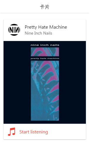
With picture card
The use of pictures in the card will work better, as follows:
<div class="list card">

  <div class="item item-avatar">
    <img src="avatar.jpg">
    <h2>Pretty Hate Machine</h2>
    <p>Nine Inch Nails</p>
  </div>

  <div class="item item-image">
    <img src="cover.jpg">
  </div>

  <a class="item item-icon-left assertive" href="#">
    <i class="icon ion-music-note"></i>
    Start listening
  </a>

</div>
Here's how it works:
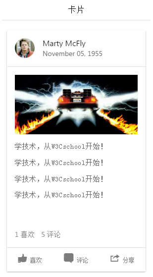
The card is displayed
The following examples use several different options for how cards are presented. Start with the list card element and use the item-avatar, item-body element for displaying pictures and text information, and the item-divider class at the bottom.
<div class="list card">

  <div class="item item-avatar">
    <img src="mcfly.jpg">
    <h2>Marty McFly</h2>
    <p>November 05, 1955</p>
  </div>

  <div class="item item-body">
    <img class="full-image" src="delorean.jpg">
    <p>
      W3Cschool在线教程 -- 学技术,从W3Cschool开始!<br>
      W3Cschool在线教程 -- 学技术,从W3Cschool开始!<br>
      W3Cschool在线教程 -- 学技术,从W3Cschool开始!<br>
      W3Cschool在线教程 -- 学技术,从W3Cschool开始!
    </p>
    <p>
      <a href="#" class="subdued">1 喜欢</a>
      <a href="#" class="subdued">5 评论</a>
    </p>
  </div>

  <div class="item tabs tabs-secondary tabs-icon-left">
    <a class="tab-item" href="#">
      <i class="icon ion-thumbsup"></i>
      喜欢
    </a>
    <a class="tab-item" href="#">
      <i class="icon ion-chatbox"></i>
      Comment
    </a>
    <a class="tab-item" href="#">
      <i class="icon ion-share"></i>
      分享
    </a>
  </div>

</div>
Here's how it works: