WeChat widget DarkMode fit guide
May 18, 2021 WeChat Mini Program Development Document
Table of contents
DarkMode Fit Guide
WeChat officially supports DarkMode starting with iOS client 7.0.12 and Android client 7.0.13, and the applet also provides developers with DarkMode fit capabilities within the applet, starting with the base library v2.11.0 and developer tool 1.03.2004271.
Turn on DarkMode
Configuring drarkmode as true in app.json means that the current applet is adapted to DarkMode, that all underlying components show different default styles depending on the system theme, and that navigation bar and tab bar automatically switch according to the configuration below.
The relevant configuration
When the darkmode is configured as true in app.json, the small program part of the configuration item can be configured as a variable to define colors or icons under different themes in the variable profile, as follows:
- Configure themeLocation in app.json, specify the variable profile theme.json path, e.g. add theme.json at root, need to configure "themeLocation": "theme.json"
- Define the relevant variables in theme.json;
- Refer to the variable in app.json, which starts with .
Properties that support configuration by variables:
- Globally configured window properties with page configuration properties NationalBarBackground ColornavigationBarTextStylebackgroundStylebackground Color Topbackground ColorBottom
- Global configuration window.tabBar properties colorselected Colorbackground Colorborder Stylisticon Pathselected IconPath
Variable profile theme.json
Theme.json is used for color theme-related variable definitions, you need to configure the time.json's path in ThemeLocation, otherwise the variable configuration cannot be read.
The configuration file must contain the following properties:
| Attributes | type | Required | describe |
|---|---|---|---|
| light | object | Yes | Variable definition in light color mode |
| dark | object | Yes | Variable definition in dark mode |
Light and Dark can define variable names and values in key: value, for example:
{
  "light": {
    "navBgColor": "#f6f6f6",
    "navTxtStyle": "black"
  },
  "dark": {
    "navBgColor": "#191919",
    "navTxtStyle": "white"
  }
}
Once the definition is complete, it can be referenced in the global configuration or in the relevant properties of the page configuration, such as:
// 全局配置
{
  "window": {
    "navigationBarBackgroundColor": "@navBgColor",
    "navigationBarTextStyle": "@navTxtStyle"
  }
}
// 页面配置
{
  "navigationBarBackgroundColor": "@navBgColor",
  "navigationBarTextStyle": "@navTxtStyle"
}
When the configuration is complete, the small program framework automatically displays the colors under the corresponding theme for the small program based on the system theme.
An example of configuration
app.json (example omits configuration items other than topic-related)
{
    "window": {
        "navigationBarBackgroundColor": "@navBgColor",
        "navigationBarTextStyle": "@navTxtStyle",
        "backgroundColor": "@bgColor",
        "backgroundTextStyle": "@bgTxtStyle",
        "backgroundColorTop": "@bgColorTop",
        "backgroundColorBottom": "@bgColorBottom"
    },
    "tabBar": {
        "color": "@tabFontColor",
        "selectedColor": "@tabSelectedColor",
        "backgroundColor": "@tabBgColor",
        "borderStyle": "@tabBorderStyle",
        "list": [{
            "iconPath": "@iconPath1",
            "selectedIconPath": "@selectedIconPath1"
        }, {
            "iconPath": "@iconPath2",
            "selectedIconPath": "@selectedIconPath2"
        }]
    }
}
theme.json
{
    "light": {
        "navBgColor": "#f6f6f6",
        "navTxtStyle": "black",
        "bgColor": "#ffffff",
        "bgTxtStyle": "light",
        "bgColorTop": "#eeeeee",
        "bgColorBottom": "#efefef",
        "tabFontColor": "#000000",
        "tabSelectedColor": "#3cc51f",
        "tabBgColor": "#ffffff",
        "tabBorderStyle": "black",
        "iconPath1": "image/icon1_light.png",
        "selectedIconPath1": "image/selected_icon1_light.png",
        "iconPath2": "image/icon2_light.png",
        "selectedIconPath2": "image/selected_icon2_light.png",
    },
    "dark": {
        "navBgColor": "#191919",
        "navTxtStyle": "white",
        "bgColor": "#1f1f1f",
        "bgTxtStyle": "dark",
        "bgColorTop": "#191919",
        "bgColorBottom": "#1f1f1f",
        "tabFontColor": "#ffffff",
        "tabSelectedColor": "#51a937",
        "tabBgColor": "#191919",
        "tabBorderStyle": "white",
        "iconPath1": "image/icon1_dark.png",
        "selectedIconPath1": "image/selected_icon1_dark.png",
        "iconPath2": "image/icon2_dark.png",
        "selectedIconPath2": "image/selected_icon2_dark.png",
    }
}
Get the current system topic
If "darkmode" is declared in app.json: true, wx.getSystemInfo, or wx.getSystemInfoSync returns with the same property, the value light or dark.
If the app.json does not declare "darkmode": true, the theme property (i.e. theme is underfined) cannot be obtained.
Listen for topic switching events
Supports 2 ways:
- The onThemeChange callback method is passed in the app(), which is triggered when the topic switches
- Unobscribe by wx.onThemeChange listening topic changes, wx.offThemeChange
WXSS fits
In WXSS, media queries are supported to adapt different topics to different topics, consistent with the way they are adapted in the web, such as:
/* 一般情况下的样式 begin */
.some-background {
    background: white;
}
.some-text {
    color: black;
}
/* 一般情况下的样式 end */

@media (prefers-color-scheme: dark) {
    /* DarkMode 下的样式 start */
    .some-background {
        background: #1b1b1b;
    }
    .some-text {
        color: #ffffff;
    }
    /* DarkMode 下的样式 end */
}
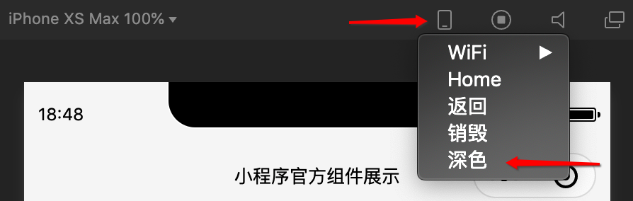
Developer tool debugging
The WeChat developer tool version 1.03.2004271 has been supported for DarkMode debugging, switching dark/light mode at the top of the emulator, as shown in the figure:
Bug & Tip
- tip: It is important to note that media queries in WXSS are not affected by the darkmode switch configuration in app.json, as long as the WeChat client (iOS 7.0.12, Android 7.0.13) supports DarkMode, whether or not "darkmode" is configured: true, the media query will take effect when the system switches to DarkMode.
- tip: Theme switching events need to be configured "darkmode": true before they are triggered.
- Bug: iOS 7.0.12 A black background bug may appear when tabBar's BorderStyle is configured as White in light mode and will be fixed in subsequent releases.