WeChat small program WeUI half-screen e-window
May 21, 2021 WeChat Mini Program Development Document
Table of contents
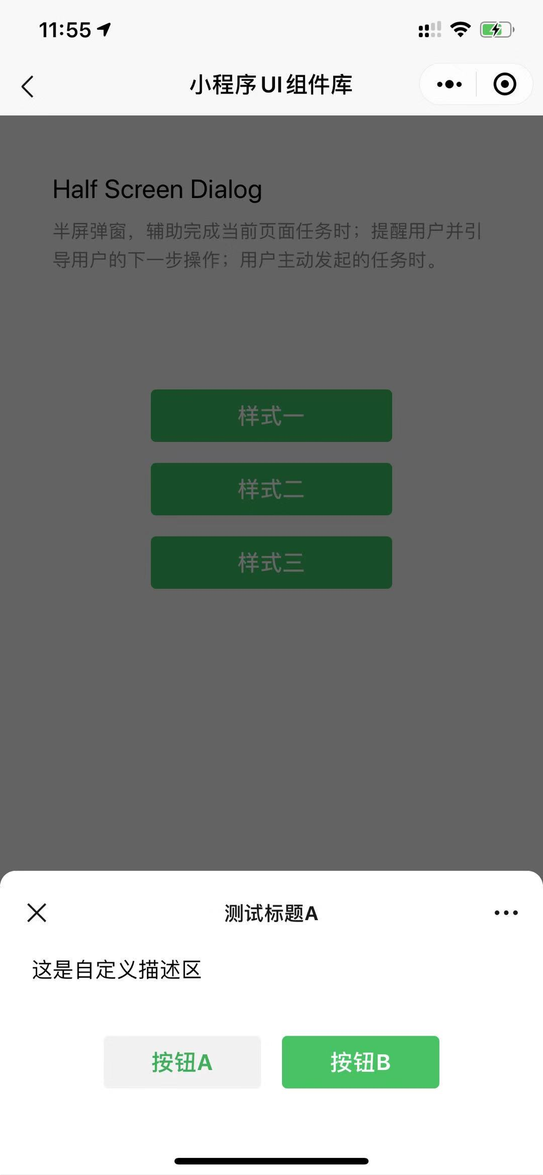
Half Screen Dialog
A half-screen spring window that assists in completing the current page task, alerts the user and guides the user to the next step, and when the user initiates a task.
Code introduction
Introduce components in page.json
{
  "usingComponents": {
    "mp-halfScreenDialog": "../../components/half-screen-dialog/half-screen-dialog"
  }
}
The sample code
<!--WXML示例代码-->
<mp-halfScreenDialog
  bindbuttontap="buttontap"
  show="{{show}}"
  maskClosable="{{false}}"
  title="测试标题B"
  subTitle="测试标题B的副标题"
  desc="辅助描述内容,可根据实际需要安排"
  tips="辅助提示内容,可根据实际需要安排"
  buttons="{{buttons}}"
></mp-halfScreenDialog>
<button class="weui-btn" type="primary" bindtap="open">Open</button>
// page.js示例代码
Page({
    data: {
        show: false,
        buttons: [
            {
                type: 'default',
                className: '',
                text: '辅助操作',
                value: 0
            },
            {
                type: 'primary',
                className: '',
                text: '主操作',
                value: 1
            }
        ]
    },
    open: function () {
        this.setData({
            show: true
        })
    },
    buttontap(e) {
        console.log(e.detail)
    }
});
The effect is displayed
The list of properties
| Property | Type | The default | Description |
|---|---|---|---|
| extClass | string | The name of the component class | |
| closabled | boolean | true | Whether to show the close button |
| title | string | Component titles, which can be customized by slot | |
| subTitle | string | Component subtitles, which can be customized through slot | |
| desc | string | The auxiliary action description | |
| tips | string | Auxiliary action prompt content | |
| maskClosable | boolean | true | Click to see if the matte closes the modified component |
| mask | boolean | true | Whether a mask layer is required |
| show | boolean | true | Whether to open the e-window |
| buttons | array | [] | The list of secondary action buttons |
Custom events
| The name of the event | Description | Callback parameters |
|---|---|---|
| buttontap | Triggered when the auxiliary action button is clicked | e.detail = { index, item } |
| close | Triggered when the component is closed |
Slot
| Name | Describe |
|---|---|
| title | The component customizes the title bar |
| desc | The component custom action description |
| footer | The action button area slot |