WeChat small program content component progress
May 18, 2021 WeChat Mini Program Development Document
Table of contents
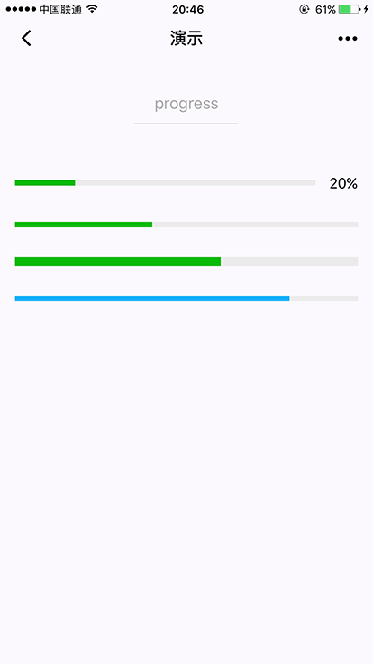
progress
Base library 1.0.0 starts to support, and low versions need to be compatible.
Progress bar. The length units of component properties default to px, with 2.4.0 supporting incoming units (rpx/px).
| Property | Type | The default | Required | Description | The lowest version |
|---|---|---|---|---|---|
| percent | number | no | Percentage 0 ~ 100 | 1.0.0 | |
| show-info | boolean | false | no | Display percentage on the right side of the progress bar | 1.0.0 |
| border-radius | number/string | 0 | no | Rounded | 2.3.1 |
| font-size | number/string | 16 | no | Right percentage font size | 2.3.1 |
| stroke-width | number/string | 6 | no | Progress line width | 1.0.0 |
| color | string | #09BB07 | no | Progress strip color (please use ActiveColor) | 1.0.0 |
| activeColor | string | #09BB07 | no | Color of the selected progress bar | 1.0.0 |
| backgroundColor | string | #EBEBEB | no | Unselected progress bar color | 1.0.0 |
| active | boolean | false | no | Schedule from left to right animation | 1.0.0 |
| active-mode | string | backwards | no | Backwards: Animation from the forecast; Forwards: Animation is broadcast from the last point of the last | 1.7.0 |
| duration | number | 30 | no | Progress increases by 1% for milliseconds | 2.8.2 |
| bindactiveend | eventhandle | no | Animation completion event | 2.4.1 |
Sample code
<view class="progress-box">
  <progress percent="20" show-info stroke-width="3"/>
</view>

<view class="progress-box">
  <progress percent="40" active stroke-width="3" />
  <icon class="progress-cancel" type="cancel"></icon>
</view>

<view class="progress-box">
  <progress percent="60" active stroke-width="3" />
</view>

<view class="progress-box">
  <progress percent="80" color="#10AEFF" active stroke-width="3" />
</view>