WeChat gadget WeUI Checkbox-group
May 21, 2021 WeChat Mini Program Development Document
Table of contents
Checkbox-group and Checkbox
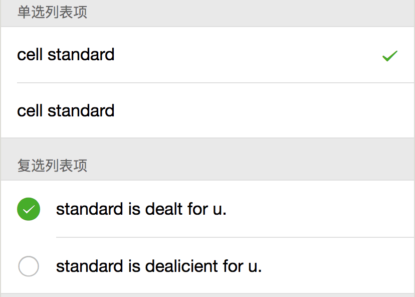
Checkbox-group consists of a single or multiple-selected Checkbox component, as shown in the following image.
Introduce components
Introduce components in page.json
{
  "usingComponents": {
    "mp-checkbox-group": "../../components/checkbox-group/checkbox-group",
    "mp-checkbox": "../../components/checkbox/checkbox",
    "mp-cells": "../../components/cells/cells"
  }
}
The sample code
<!--WXML示例代码-->
<mp-cells title="单选列表项">
    <mp-checkbox-group prop="radio" multi="{{false}}" bindchange="radioChange">
        <mp-checkbox wx:for="{{radioItems}}" wx:key="value" label="{{item.name}}" value="{{item.value}}" checked="{{item.checked}}"></mp-checkbox>
    </mp-checkbox-group>
</mp-cells>
<mp-cells title="复选列表项">
    <mp-checkbox-group prop="checkbox" multi="{{true}}" bindchange="checkboxChange">
        <mp-checkbox wx:for="{{checkboxItems}}" wx:key="value" label="{{item.name}}" value="{{item.value}}" checked="{{item.checked}}"></mp-checkbox>
    </mp-checkbox-group>
</mp-cells>
// page.js示例代码
Page({
    data: {
        radioItems: [
            {name: 'cell standard', value: '0', checked: true},
            {name: 'cell standard', value: '1'}
        ],
        checkboxItems: [
            {name: 'standard is dealt for u.', value: '0', checked: true},
            {name: 'standard is dealicient for u.', value: '1'}
        ],
    },
    radioChange: function (e) {
        console.log('radio发生change事件,携带value值为:', e.detail.value);

        var radioItems = this.data.radioItems;
        for (var i = 0, len = radioItems.length; i < len; ++i) {
            radioItems[i].checked = radioItems[i].value == e.detail.value;
        }

        this.setData({
            radioItems: radioItems,
            [`formData.radio`]: e.detail.value
        });
    },
    checkboxChange: function (e) {
        console.log('checkbox发生change事件,携带value值为:', e.detail.value);

        var checkboxItems = this.data.checkboxItems, values = e.detail.value;
        for (var i = 0, lenI = checkboxItems.length; i < lenI; ++i) {
            checkboxItems[i].checked = false;

            for (var j = 0, lenJ = values.length; j < lenJ; ++j) {
                if(checkboxItems[i].value == values[j]){
                    checkboxItems[i].checked = true;
                    break;
                }
            }
        }

        this.setData({
            checkboxItems: checkboxItems,
            [`formData.checkbox`]: e.detail.value
        });
    },
});
Checkbox-group component property list
| Property | Type | The default | Required | Description |
|---|---|---|---|---|
| ext-class | string | Whether | A class added to the internal structure of a component that can be used to modify the style inside a component | |
| multi | boolean | true | Whether | Single or multiple choices |
| prop | string | Whether | The field name verified by the Form form component | |
| bindchange | eventhandler | Whether | Checkbox-group changes when the event is triggered, the detail is the value, the single value is the value of the checkbox, and the multi-selected value of the checkbox is an array of the values of the selected checkbox |
Checkbox-group's Slot
| Name | Describe |
|---|---|
| Default | Content slot |
Checkbox component property list
| Property | Type | The default | Required | Description |
|---|---|---|---|---|
| ext-class | string | Whether | A class added to the internal structure of a component that can be used to modify the style inside a component | |
| multi | boolean | true | Whether | Single or multiple choices |
| checked | boolean | Whether | Whether to select | |
| value | string | Whether | The value of the checkbox | |
| bindchange | eventhandler | Whether | The event triggered when Checkbox changes, the detail is the value, and the value is the value of checkbox |