Vant get started quickly
May 07, 2021 Vant
Table of contents
Scaffolding
When using Vant in a new project, it is recommended to create a project using Vue Cli, the scaffolding officially provided by Vue
# 安装 Vue Cli
npm install -g @vue/cli

# 创建一个项目
vue create hello-world

# 创建完成后,可以通过命令打开图形化界面,如下图所示
vue ui
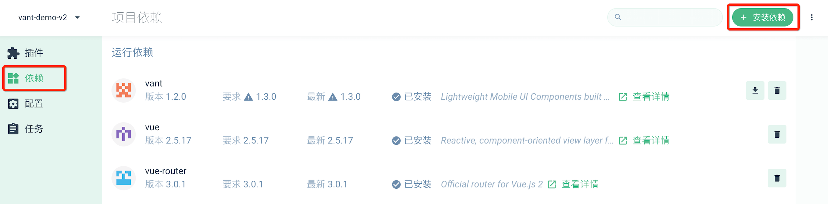
In the graphical interface, click Dependency -gt; install Dependency, and then add vant to Dependency.
Installed by npm
When you use Vant in an existing project, you can install it by npm or yarn
# 通过 npm 安装
npm i vant -S

# 通过 yarn 安装
yarn add vant
Example project
We've provided a Vue Cli-based sample project that will help you understand the following:
- Build a single-page application based on Vant, and configure on-demand ingested components
- Configure a Rem-based fit scenario
- Configure Viewport-based suitability scenarios
- Configure TypeScript-based engineering
- Configure a custom theme color scheme
Introduce components
Way one. Automatic on-demand introduction of components (recommended)
Babel-plugin-import is a babel plug-in that automatically converts the writing of import to an on-demand way during compilation
# 安装插件
npm i babel-plugin-import -D
// 在.babelrc 中添加配置
// 注意:webpack 1 无需设置 libraryDirectory
{
  "plugins": [
    ["import", {
      "libraryName": "vant",
      "libraryDirectory": "es",
      "style": true
    }]
  ]
}

// 对于使用 babel7 的用户,可以在 babel.config.js 中配置
module.exports = {
  plugins: [
    ['import', {
      libraryName: 'vant',
      libraryDirectory: 'es',
      style: true
    }, 'vant']
  ]
};
// 接着你可以在代码中直接引入 Vant 组件
// 插件会自动将代码转化为方式二中的按需引入形式
import { Button } from 'vant';
If you're using TypeScript, you can use ts-import-plugin for on-demand introduction
Mode 2. Introduce components manually and on demand
Without using plug-ins, you can manually introduce the required components
import Button from 'vant/lib/button';
import 'vant/lib/button/style';
Mode three. Import all components
Vant supports a one-time import of all components, and the introduction of all components increases the size of the code package, so this is not recommended
import Vue from 'vue';
import Vant from 'vant';
import 'vant/lib/index.css';

Vue.use(Vant);
Once the configuration is introduced on demand, all components will not be allowed to be imported directly
Mode four. Introduced via CDN
The easiest way to use Vant is to introduce CDN links directly into the html file, after which you can access all components through the global variable vant.
<!-- 引入样式文件 -->
<link rel="stylesheet" href="https://cdn.jsdelivr.net/npm/[email protected]/lib/index.css" rel="external nofollow" target="_blank" >

<!-- 引入 Vue 和 Vant 的 JS 文件 -->
<script src="https://cdn.jsdelivr.net/npm/vue/dist/vue.min.js" rel="external nofollow" ></script>
<script src="https://cdn.jsdelivr.net/npm/[email protected]/lib/vant.min.js" rel="external nofollow" ></script>

<script>
// 在 #app 标签下渲染一个按钮组件
new Vue({
  el: '#app',
  template: `<van-button>按钮</van-button>`
});

// 调用函数组件,弹出一个 Toast
vant.Toast('提示');
// 通过 CDN 引入时不会自动注册 Lazyload 组件
// 可以通过下面的方式手动注册
Vue.use(vant.Lazyload);
</script>
Advanced usage
Rem fits
Styles in Vant use px as units by default, and the following two tools are recommended if you need to use rem units:
- Postcss-pxtorem is a postcs plug-in that converts units into rem
- lib-flexible is used to set the rem reference value
PostCSS configuration
A basic postcs configuration is provided below, which can be modified based on project requirements
module.exports = {
  plugins: {
    'autoprefixer': {
      browsers: ['Android >= 4.0', 'iOS >= 8']
    },
    'postcss-pxtorem': {
      rootValue: 37.5,
      propList: ['*']
    }
  }
}
When configuring postcs-loader, you should avoid node_modules directory, otherwise the Vant style will not compile
Used on the desktop side
Vant is a mobile-oriented component library, so by default only mobile devices are appropriate, which means that the component listens only to touch events on the mobile side and not to mouse events on the desktop side.
If you need to use Vant on the desktop side, you can introduce the @vant/touch-emulator we offer, which automatically converts mouse events to corresponding touch events on the desktop side, enabling components to be used on the desktop side.
# 安装模块
npm i @vant/touch-emulator -S
// 引入模块后自动生效
import '@vant/touch-emulator';
The bottom safety zone fits
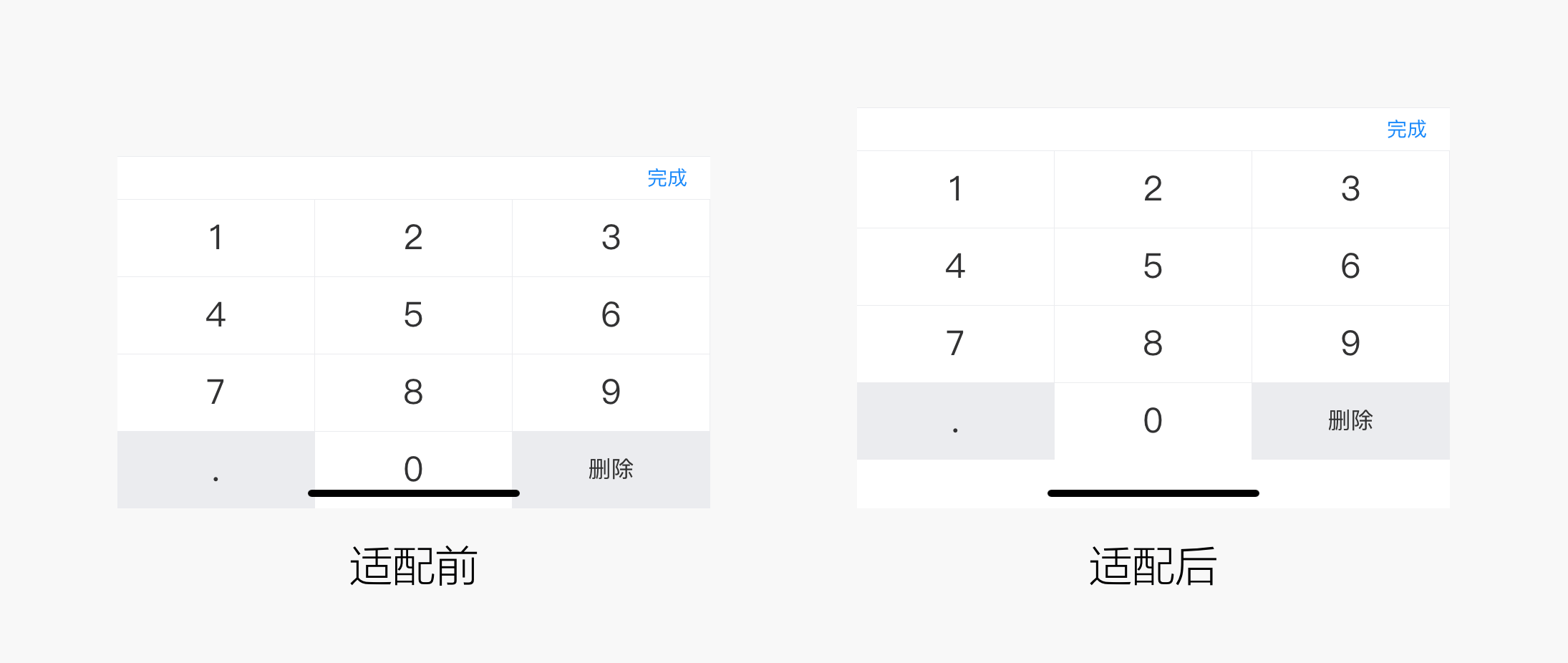
There is a bottom bar at the bottom of models such as the iPhone X, which coincides with the bottom of the page and can easily lead to user misoperation, so we need to adapt the bottom safety zone for these models. Some components in Vant provide the safe-area-inset-bottom property, which, when set, allows fit to be turned on on the corresponding model, as follows:
<!-- 在 head 标签中添加 meta 标签,并设置 viewport-fit=cover 值 -->
<meta
  name="viewport"
  content="width=device-width, initial-scale=1.0, maximum-scale=1.0, minimum-scale=1.0, viewport-fit=cover"
/>

<!-- 开启 safe-area-inset-bottom 属性 -->
<van-number-keyboard safe-area-inset-bottom />
The component instance method
Many components in Vant provide instance methods, and when we call an instance method, we need to register the component reference information through ref, which will be registered on the parent component's $refs object. Once registered, we can access the $refs component instance through this.$refs.xxx and call the instance method above.
<!-- 将该组件绑定到 this.$refs.checkbox 上 -->
<van-checkbox v-model="checked" ref="checkbox">
  复选框
</van-checkbox>
export default {
  data() {
    return {
      checked: false
    };
  },
  // 注意:组件挂载后才能访问到 ref 对象
  mounted() {
    this.$refs.checkbox.toggle();
  }
}
Problems
Not rendering components correctly in HTML?
When you use the Vant component in HTML, you may encounter situations where some of the sample code does not render correctly, such as the following usage:
<van-cell-group>
  <van-cell title="单元格" value="内容" />
  <van-cell title="单元格" value="内容" />
</van-cell-group>
This is because HTML does not support custom elements that are self-closed, which means that the syntax such as slt;van-cell /gt; is not recognized and a complete closed label can avoid this problem:
<van-cell-group>
  <van-cell title="单元格" value="内容"></van-cell>
  <van-cell title="单元格" value="内容"></van-cell>
</van-cell-group>
You can use self-closing custom elements in single-file components, string templates, and JSX, so this problem does not occur.