Tableau line chart
May 26, 2021 Tableau
Table of contents
In a line chart, measures and dimensions are made along two axes in the chart area. /b10> A pair of values for each observation becomes a point, and the connection of all these points creates a line that shows the changes or relationships between the selected dimensions and measures.
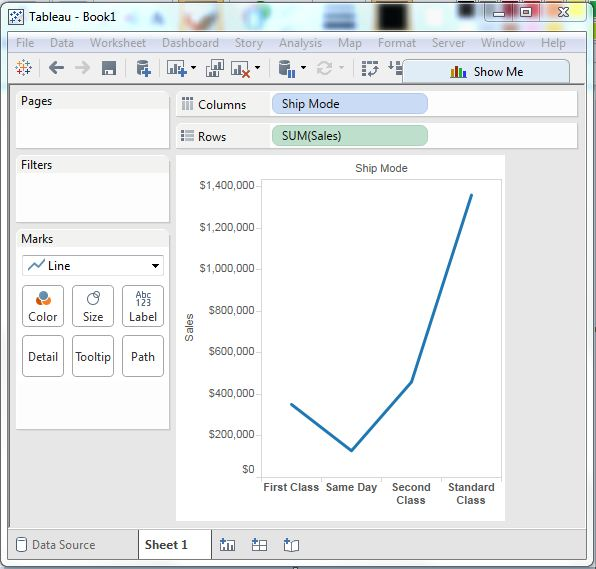
A simple line chart
Let's select a dimension and a measure to create a simple line chart. /b10> Let's drag the dimension transport mode to the column shelf and the sales to the row shelf. /b11> Select a line chart from the marker card. /b12> We get the following line chart showing sales changes for different ship modes.
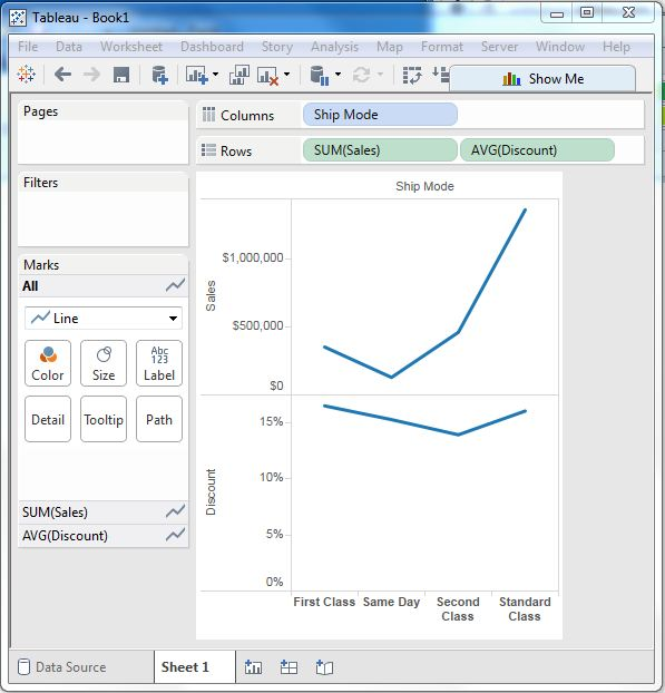
Multi-measure line chart
We can use a dimension with two or more measures in a line chart. /b10> This generates multiple line charts in one pane. /b11> Each pane represents a change in a dimension that has one of the measures.
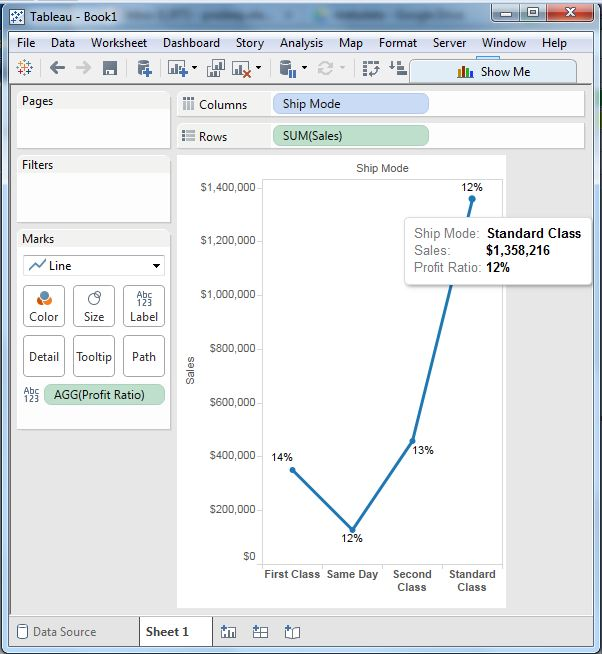
A line chart with a label
You can mark each point that forms a line chart so that the value of the measure is visible. /b10> In this case, we put another measure profit margin into the label pane in the tag card. /b11> Select the average as the aggregation, and we get the chart below showing the label.