Tableau bump chart
May 26, 2021 Tableau
Table of contents
Bump charts are used to compare two dimensions using one of the Measure values. /b10> They are useful for exploring changes in the values of time or local dimensions or other dimensions related to analysis.
Bump charts take two dimensions, zero, and multiple measures.
Create a bump chart
Using the Ample-superstore, we plan to find products that change ship patterns with subcategories. /b10> To achieve this, we follow these steps.
Step 1
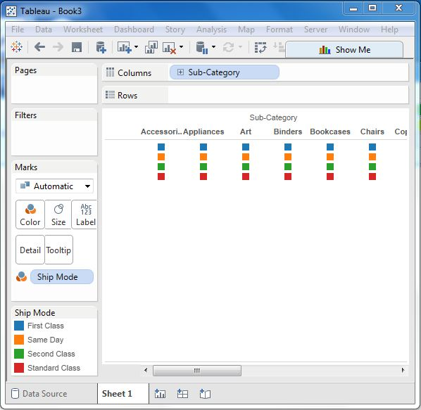
Drag and drop the Wie subcategory into the column box. /b10> You can also drag the label transport mode to the color shelf under the marker card. /b11> Leave the chart type as automatic. T hen we get the chart below.
Step 2
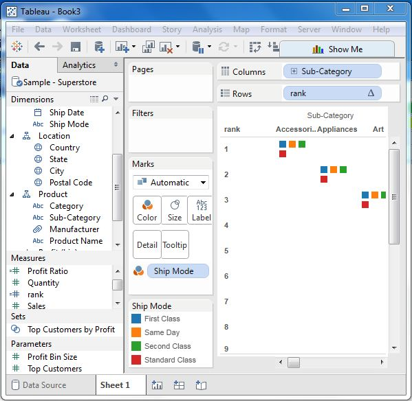
Next we create a calculated field called Rank. /b10> Go to Analysis - Create a calculated field. /b12> Use Rank as the field name and write the expression index() in the evaluation area. /b13> It is a built-in function that creates an index for the current row in the partition. /b14> Click OK and the new field will appear in the Measures section. /b15> Right-click the field Rank and convert it to discrete.
Step 3
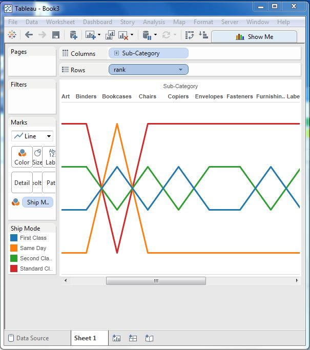
Drag Rank to the row shelf. /b10> The figure below shows the dimension subcategories, with each ship mode in ascending order of its Rank value.
Step 4
Next, let's apply some more calculations to the level field using measured profit. /b10> On the ranking, select Edit Table Calculation. /b11> Select Sort by Field Profit, using by subcategory and addressed by ship mode. /b12> The following image shows the calculation of the app.

After completing the above steps, we get a bump chart, as shown below. /b10> It shows the profit changes for each ship model under different subcategories.