Struts2 form label
May 15, 2021 Struts2
Table of contents
The list of form labels is a subset of the Struts UI labels. T hese tags help render the user interface required by the Struts Web application and fall into three main categories, which are described in this chapter:
Simple UI tags
We've actually used these tags in the previous example, and we'll revisit them in this chapter. H ere's a simple view page email .jsp with a few simple UI tags:
<%@ page language="java" contentType="text/html; charset=ISO-8859-1"
	pageEncoding="ISO-8859-1"%>
<%@ taglib prefix="s" uri="/struts-tags"%>
<!DOCTYPE html PUBLIC "-//W3C//DTD HTML 4.01 Transitional//EN"
"http://www.w3.org/TR/html4/loose.dtd">
<html>
<head>
<s:head/>
<title>Hello World</title>
</head>
<body>
   <s:div>Email Form</s:div>
   <s:text name="Please fill in the form below:" />
   <s:form action="hello" method="post" enctype="multipart/form-data">
   <s:hidden name="secret" value="abracadabra"/>
   <s:textfield key="email.from" name="from" />
   <s:password key="email.password" name="password" />
   <s:textfield key="email.to" name="to" />
   <s:textfield key="email.subject" name="subject" />
   <s:textarea key="email.body" name="email.body" />
   <s:label for="attachment" value="Attachment"/>
   <s:file name="attachment" accept="text/html,text/plain" />
   <s:token />
   <s:submit key="submit" />
   </s:form>
</body>
</html>
If you know HTML, you know that all tags used are very common HTML tags, each with an additional prefix "s:" and different properties. W hen we execute the above program, we will arrive at the following user interface, as long as you have set the correct mapping for all keys.
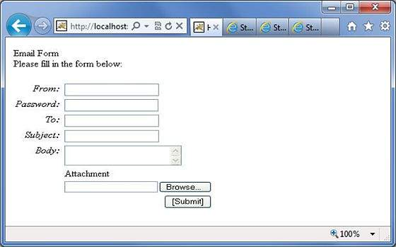
As shown in the figure, s:head generates the javascript and styleheet elements required for the Struts2 application.
Next, the s:div and s:text elements. s
:div is used to render HTML Div elements.
This is useful for people who don't like mixing HTML and Struts tags, and they can choose to use s:div to render div.
As shown in the figure, s:text is used to render text on the screen.
Then there's the similar s:form tag. T
he s:form label has action properties that determine where to submit the form. B
ecause there is a file upload element in the form, we have to set enctype to multipart.
Otherwise, leave it blank.
At the end of the form label, there is the s:submit label, which is used to submit the form.
When you submit a form, all form values are submitted to the action specified in the s:form label.
In the s:form tag, we have a hidden property called secret, which renders a hidden element in HTML. I
n our case, the value of the "secret" element is "abracadabra".
This element is not visible to end users and is used to pass states from one view to another.
Next up are the s:label, s:textfield, s:password, and s:textarea tags. T
hese are used to render labels, input fields, passwords, and text areas, respectively. W
e've seen this in the "Struts2 Send Email" section example. T
he important thing to note here is to use the "key" property. T
he "key" property is used to extract labels for these controls from the property file.
We've discussed this feature in chapter Struts2 Localization/Internationalization (i18n).
Then there is the s:file tag, which renders the component of the input file upload, which allows the user to upload the file.
In this example, we use the "accept" parameter of the s:file label to specify which file types are allowed to be uploaded.
Finally, the s:token label.
The token label generates a unique token to find out if the form has been submitted twice.
When the form is rendered, a hidden variable is placed as a token value. F
or example, the token is "ABC" and when you submit this form, Struts Fitler checks against the token stored in the session. I
f it matches, the token is removed from the session. N
ow, if the form is accidentally resubmitted (by refreshing or by clicking the browser back button), the form is resubmitted with "ABC" as the token. I
n this case, the filter checks against the token stored in the session.
However, because the token "ABC" has been removed from the session, it will not match and the Struts filter will reject the request.
The group UI tag
The group UI label is used to create a turn button and check box. L et's take a look at a simple view page helloWorld with check boxes and a .jsp:
<%@ page contentType="text/html; charset=UTF-8"%>
<%@ taglib prefix="s" uri="/struts-tags"%>
<html>
<head>
<title>Hello World</title>
<s:head />
</head>
<body>
   <s:form action="hello.action">
   <s:radio label="Gender" name="gender" list="{'male','female'}" />
   <s:checkboxlist label="Hobbies" name="hobbies"
   list="{'sports','tv','shopping'}" />
   </s:form>
</body>
</html>
When we execute the program above, our output will look similar to the following:
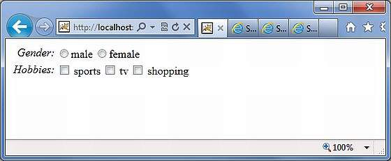
Now let's look at these examples. I
n the first example, we created a simple radiobutton with the label "Gender". T
he name attribute is required for the radiobutton label, so we specify a name named "gender". T
hen we provide a list of genders filled with the values "male" and "female".
So in the output we get a radiobutton with two values.
In the second example, we create a list of check boxes. T
his is to collect the user's hobbies. U
sers can have multiple hobbies, so we use check boxes instead of turn buttons.
Check boxes fill in the list with "sports," "Tv," and "Shopping" and use these hobbies as check boxes.
Select the UI label
Let's explore the different variations of select tags provided by Struts. Let's take a look at a simple view page with a select tag, HelloWorld.jsp:
<%@ page contentType="text/html; charset=UTF-8"%>
<%@ taglib prefix="s" uri="/struts-tags"%>
<html>
<head>
<title>Hello World</title>
<s:head />
</head>
<body>
   <s:form action="login.action">
      <s:select name="username" label="Username"
         list="{'Mike','John','Smith'}" />

      <s:select label="Company Office" name="mySelection"
         value="%{'America'}"
         list="%{#{'America':'America'}}">
      <s:optgroup label="Asia"
         list="%{#{'India':'India','China':'China'}}" />
      <s:optgroup label="Europe"
         list="%{#{'UK':'UK','Sweden':'Sweden','Italy':'Italy'}}" />
      </s:select>

      <s:combobox label="My Sign" name="mySign"
         list="#{'aries':'aries','capricorn':'capricorn'}"
         headerKey="-1"
         headerValue="--- Please Select ---" emptyOption="true"
         value="capricorn" />
      <s:doubleselect label="Occupation" name="occupation"
         list="{'Technical','Other'}" doubleName="occupations2"
         doubleList="top == 'Technical' ?
         {'I.T', 'Hardware'} : {'Accounting', 'H.R'}" />

   </s:form>
</body>
</html>
When we execute the program above, the output will look similar to the following:
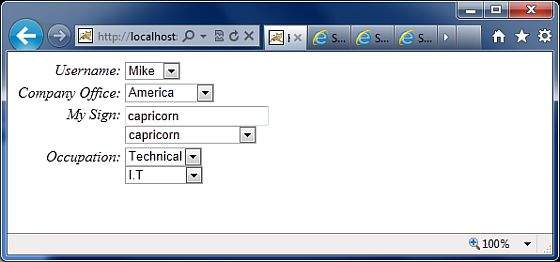
Now let's look at each case one by one.
- First, the select label renders the HTML selection box. I n the first example, we create a simple selection box called "username" and the tag "username". The selection box populates the list with names Mike, John, and Smith.
- In the second example, the company has a headquarters in the United States. I t also has global offices in Asia and Europe. W e want to display the office in a selection box, but group the global offices by the name of the global continent. T his is where optgroup is used. We use the s:optgroup tag to create a new group, giving the group a tag and a separate list.
- In the third example, use a combo box. A combo box is a combination of an input field and a selection box. T he user can select a value from the selection box, in which case the input field is automatically filled in with the value selected by the user. If the user enters the value directly, the value from the selection box is not selected.
- In our example, we have combo boxes listing constellations. T he selection box lists only four entries that allow the user to enter his constellation if it is not in the list. W e also add a title entry to the selection box. H eaderentry is displayed at the top of the selection box. I n the example, we're going to show "Please Select." I f the user does not select anything, then we assume -1 as the value. I n some cases, we do not want the user to select an empty value. Y ou can then set the "emptyOption" property to false. Finally, in our example, we provide "capricorn" as the default value for combo boxes.
- In the fourth example, we have a double marquee. U se double select when you want to display two selection boxes. T he value selected in the first selection box determines the value displayed in the second selection box. I n the example, the first selection box shows "Technical" and "Other." I f the user chooses Technical, we'll show IT and Hardware in the second selection box. O therwise, Counting and HR are displayed. This can use the "list" and "doubleList" properties, as shown in the example.