SAS scatter chart
May 27, 2021 SAS
Table of contents
Scatter charts are charts that use values from two variables drawn in the Descartes plane. I
t is often used to find out the relationship between two variables.
In SAS, we use PROC SGSCATTER to create scatterpics.
Note that in the first example, we create a dataset named CARS1 and use the same dataset for all subsequent datasets.
This dataset remains in the working library until the end of the SAS session.
Grammar
The basic syntax for creating scatterpics in SAS is:
PROC sgscatter  DATA=DATASET;
   PLOT VARIABLE_1 * VARIABLE_2
   / datalabel = VARIABLE group = VARIABLE;
RUN;
The following is a description of the parameters used:
- DATASET is the name of the dataset.
- VARIABLE is a variable used from a dataset.
Simple scatter chart
In a simple scatter chart, we select two variables from the data set and group them according to the third variable. W e can also tag the data. T he results show how the two variables are dispersed in the Descartes plane.
Cases
PROC SQL;
create table CARS1 as
SELECT make,model,type,invoice,horsepower,length,weight
 FROM
SASHELP.CARS
WHERE make in ('Audi','BMW')
;
RUN;

TITLE 'Scatterplot - Two Variables';
PROC sgscatter  DATA=CARS1;
   PLOT horsepower*Invoice
   / datalabel = make group = type grid;
   title 'Horsepower vs. Invoice for car makers by types';
RUN;
When we execute the above code, we get the following output:

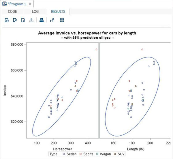
Scatter charts and predictions
We can use estimate parameters to predict the intensity of correlation by drawing ellipses around values. W e use the additional options in the procedure to draw the ellipse, as shown below.
Cases
proc sgscatter data =cars1;
compare y = Invoice  x =(horsepower length)
           / group=type  ellipse =(alpha =0.05 type=predicted);
title
'Average Invoice vs. horsepower for cars by length';
title2
'-- with 95% prediction ellipse --'
;
format
Invoice dollar6.0;
run;
When we execute the above code, we get the following output:
Scatter matrix
We can also have a scatter chart that involves more than two variables by sub-grouping them into pairs. I n the following example, we consider three variables and draw a scatterpic matrix. W e get 3 pairs of results matrix.
Cases
PROC sgscatter  DATA=CARS1;
  matrix horsepower invoice length
  / group = type;

   title 'Horsepower vs. Invoice vs. Length for car makers by types';
RUN;