R language pie chart
May 12, 2021 R language tutorial
Table of contents
The R programming language has many libraries to create charts and charts. A pie chart is a slice that represents a value as a circle with a different color. Slices are marked, and the numbers corresponding to each slice are also represented in the chart.
In the R language, pie charts are created using the pie() function, which uses positive numbers as vector inputs. Additional parameters are used to control labels, colors, titles, etc.
Grammar
The basic syntax for creating pie charts using the R language is -
pie(x, labels, radius, main, col, clockwise)
The following is a description of the parameters used -
-
x is a vector that contains the values used in the pie chart.
-
Labels are used to give a description of the slice.
-
Radius represents the radius of the pie circle (between the values -1 and .1).
-
Main represents the title of the chart.
-
col represents the palette.
-
Clockwise is a logical value that indicates whether a fragment is drawn clockwise or counterclockwise.
Cases
Create a very simple pie chart with input vectors and labels. T he following script creates and saves pie charts from the current R-language working directory.
# Create data for the graph.
x <- c(21, 62, 10, 53)
labels <- c("London", "New York", "Singapore", "Mumbai")

# Give the chart file a name.
png(file = "city.jpg")

# Plot the chart.
pie(x,labels)

# Save the file.
dev.off()
When we execute the code above, it produces the following results -
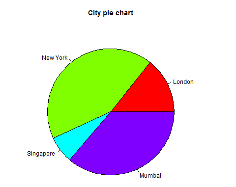
Pie chart title and color
We can extend the functionality of the chart by adding more parameters to the function. W e'll use the parameter main to add a title to the chart, and the other parameter is col, which will use the rainbow slab when drawing the chart. T he length of the tray should be the same as the number of values in the chart. T herefore, we use length(x).
Cases
The following script creates and saves pie charts from the current R-language working directory.
# Create data for the graph.
x <- c(21, 62, 10, 53)
labels <- c("London", "New York", "Singapore", "Mumbai")

# Give the chart file a name.
png(file = "city_title_colours.jpg")

# Plot the chart with title and rainbow color pallet.
pie(x, labels, main = "City pie chart", col = rainbow(length(x)))

# Save the file.
dev.off()
When we execute the code above, it produces the following results -
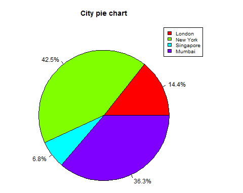
Slice percentage and chart legend
We can add slice percentages and chart legends by creating additional chart variables.
# Create data for the graph.
x <-  c(21, 62, 10,53)
labels <-  c("London","New York","Singapore","Mumbai")

piepercent<- round(100*x/sum(x), 1)

# Give the chart file a name.
png(file = "city_percentage_legends.jpg")

# Plot the chart.
pie(x, labels = piepercent, main = "City pie chart",col = rainbow(length(x)))
legend("topright", c("London","New York","Singapore","Mumbai"), cex = 0.8,
   fill = rainbow(length(x)))

# Save the file.
dev.off()
When we execute the code above, it produces the following results -
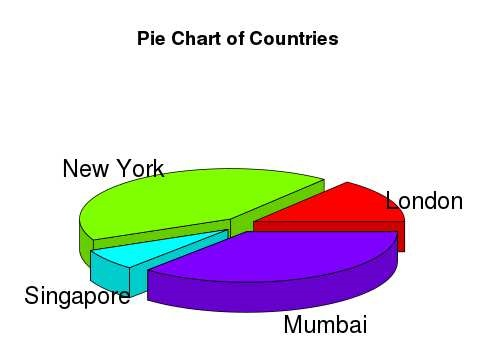
3D pie chart
You can use other packages to draw pie charts with 3 dimensions. T he package plotrix has a function called pie3D() for this purpose.
# Get the library.
library(plotrix)

# Create data for the graph.
x <-  c(21, 62, 10,53)
lbl <-  c("London","New York","Singapore","Mumbai")

# Give the chart file a name.
png(file = "3d_pie_chart.jpg")

# Plot the chart.
pie3D(x,labels = lbl,explode = 0.1, main = "Pie Chart of Countries ")

# Save the file.
dev.off()
When we execute the code above, it produces the following results -