Python ---- the matplotlib pie chart and histogram of data visualization
May 31, 2021 Article blog
Table of contents
Matplotlib library can draw graphs, but also can draw statistical graphs, this article describes pie charts, bar charts and other commonly used statistical graphics drawing methods.
Recommended lessons:
Python automated office,
with Python automated office as a workplace master.
1, pie chart
Draw a pie chart using the pie() method:
import matplotlib.pyplot as plt
Print ('\ n ----- Welcome to W3cschool.cn')
plt.rc('font',family='Arial',size='9')
plt.rc('axes',unicode_minus='False')
labels = ['Strawberry', 'Apple', 'Banana', 'Pear', 'Orange']
SIZES = [39, 20, 55, 30, 25] # Value of each element, automatically calculates percentage based on this value
Explode = [0.1, 0.2, 0, 0, 0] # Expansion distance of each element, specified 0 and 1
fig, ax = plt.subplots()
ax.pie(sizes, explode=explode, labels=labels, autopct='%1.1f%%', shadow=True, startangle=0)
# AutoPCT Accuracy Startangle The starting angle of the first element, other elements are tissue in counter-hour, whether Shadow uses a shadow
Ax.axis ('scaled') # Set the pattern of the pie chart, set to equals displayed is round
fig.savefig('matplot-basic-pie.jpg')
plt.show()
The effect is as shown:

ax.pie() method parameters:
- sizes: the absolute value size of each element, the relative percentage will be calculated according to these values;
- explode: the value of each part popping out;
- autopct: the display accuracy of the percentage;
- shadow: whether to display shadows;
- Startangle: The position of the starting element is the position of the starting angle of the labels, and the remaining elements are organized counterclockwise.
2, bar chart
Use the bar() method to draw a bar chart:
import matplotlib.pyplot as plt
import numpy as np
Print ('\ n ----- Welcome to W3cschool.cn')
plt.rc('font',family='Arial',size='9')
plt.rc('axes',unicode_minus='False')
fig, ax = plt.subplots()
fruit = ('Banana', 'Strawberry', 'Watermelon', 'Apple', 'Papaya', 'Tomatoes')
weight = (100,135,50,83,92,66)
ax.bar(fruit, weight, align='center',width=0.7)
Ax.set_ylabel ('weight') # Settings an X-axis tag
ax.set_title('Histogram')
fig.savefig('matplot-bar.jpg')
plt.show()
The effect is as shown:
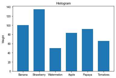
Bar() parameter:
- 1st fixed parameter: x coordinate point name
- 2nd fixed parameter: y coordinate value
- alignment: alignment;
- width: the width of the bar;
3, horizontal bar chart
Draw a horizontal bar chart using the barh() method:
import matplotlib.pyplot as plt
import numpy as np
Print ('\ n ----- Welcome to W3cschool.cn')
plt.rc('font',family='Arial',size='9')
plt.rc('axes',unicode_minus='False')
fig, ax = plt.subplots()
fruit = ('Banana', 'Strawberry', 'Watermelon', 'Apple', 'Papaya', 'Tomatoes')
y_pos = np.arange(len(fruit))
weight = (100,135,50,83,92,66)
ax.barh(y_pos, weight, align='center',height=0.7)
AX.SET_YTICKS # Sets the y-axis coordinate
Ax.set_ytyicklabels (wind) # Set Y-axis tag
AX.INVERT_YAXIS () # Setting the label from top to bottom, more in line with reading habits
Ax.set_xlabel ('weight') # Settings an x-axis tag
ax.set_title('Horizontal bar chart')
fig.savefig('matplot-hor-bar.jpg')
plt.show()
The effect is as shown:

Barh() method parameters:
- 1st fixed parameter: y axis coordinates;
- The second fixed parameter: the width value, in fact, corresponds to the length of the x axis;
- alignment: alignment method, optional centerer and edge, representing the position of the bar chart and the corresponding y axis coordinates of the relationship;
- height: The height of the bar y direction
ax.invert_yaxis() means that the y coordinate is reversed, which is more in line with reading habits, and the 0th element is displayed at the top.
4, grouped bar chart
A grouped bar chart is a combination of a bar chart, which is actually a combination of two bars:
import matplotlib.pyplot as plt
import numpy as np
Print ('\ n ----- Welcome to W3cschool.cn')
plt.rc('font',family='Arial',size='9')
plt.rc('axes',unicode_minus='False')
fruit = ('Banana', 'Strawberry', 'Watermelon', 'Apple', 'Papaya', 'Tomatoes')
weight = (100,135,50,83,92,66)
count = (20,15,30,53,22,36)
x = np.arange(len(fruit))
fig, ax = plt.subplots()
width = 0.4
ax.bar(x-width/2, weight, width=width,label='weight')
ax.bar(x+width/2, count, width=width,label='number')
ax.set_title('Grouping histogram')
Ax.set_ylabel ('Weight / Number') # Set Y-axis tag
Ax.set_xticks (x) # Set X-axis coordinate values
Ax.set_xtickLabels (FRUIT) # Set X-axis coordinate tag
fig.savefig('matplot-bar-group.jpg')
Ax.Legend () # Display legend
plt.show()
The effect is as shown:
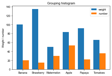
The first parameter of the bar() entry parameter is not a tuple that uses the classification form directly, but a numpy array that is redefined according to the number of categories, so that the two bars can be placed side-by-side based on half of the value plus or minus width.
Usage is similar to pyplot.plot(), with an additional parameterwhere indicating which position the dash ladder is in the front and last at that point, which can be 'pre', 'mid', 'post' and other three types, the default 'pre'.