Python analyzed data from 50,000 dating sites to see portraits of male and female dating men and women
May 30, 2021 Article blog
Author: Ye Tingyun
Source: Public Practice Python
In this short life, we will eventually lose. You may as well be bold, love a person, climb a mountain, chase a dream.
First, the foreword
Source: www.zhenai.com/zhenghun/ This article uses Python to analyze marriage information by city looking for all regions to see portraits of married men and women.

Second, data viewing and pre-processing
The library used for the import
import pandas as pd
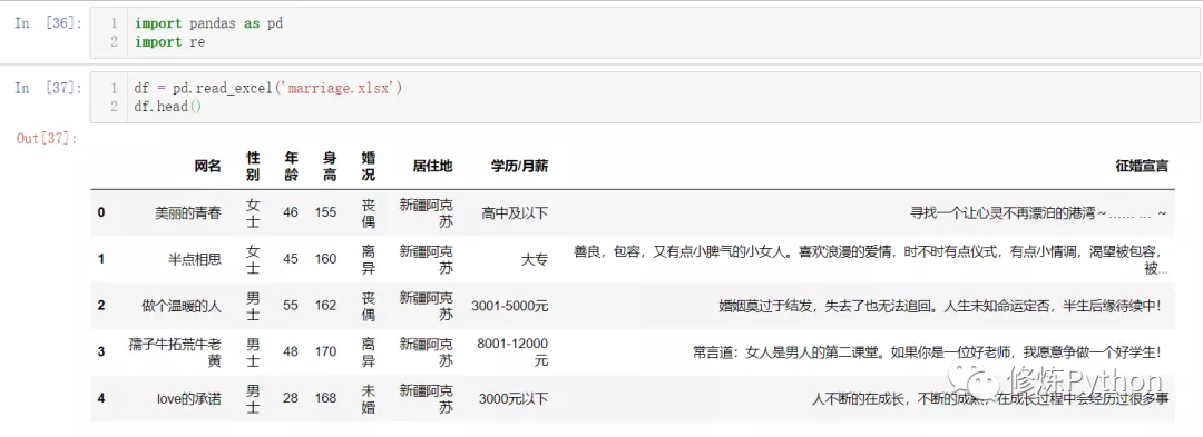
import reRead the data and view the first 5 rows
df = pd.read_excel('marriage.xlsx')
df.head()
The results are as follows:
View index, data type, and memory information
df.info()

You can see that there are no missing values in the data.
The data obtained, the place of residence is regional, in order to facilitate analysis, need to be processed into provincial administrative regions, education / monthly salary that column of data, some are monthly salary, some are academic qualifications, can be processed into two columns of data, is academic qualifications, extract the level of education, monthly salary marked "unknown";

# 获取34个省级行政区域,包括23个省,5个自治区,4个直辖市,2个特别行政区的名称
with open('地区.txt', 'r', encoding='utf-8') as f:
    area = f.read().split('\\n')


print(area)
print(len(area))
The results are as follows:
['北京', '上海', '天津', '重庆', '黑龙江', '吉林', '辽宁', '内蒙古', '河北', '新疆', '甘肃', '青海', '陕西', '宁夏', '河南', '山东', '山西', '安徽', '湖北', '湖南', '江苏', '四川', '贵州', '云南', '广西', '西藏', '浙江', '江西', '广东', '福建', '台湾', '海南', '香港', '澳门']
34
areas_list = []
for i in df['居住地']:
for j in area:
if j in i:
areas_list.append(j)
break
else:
areas_list.append('未知')
df['居住地'] = areas_list
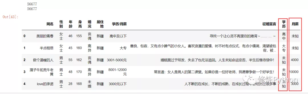
df.head()The results are as follows:

with open('学历.txt', 'r', encoding='utf-8') as fp:
    edu = fp.read().split('\\n')


print(edu)
The results are as follows:
['博士', '硕士', '本科', '大专', '中专', '高中', '初中', '小学']
salary_list = []
edu_list = []
for item in df['学历/月薪']:
    if '元' in item:   # 这一列的数据是表达月薪的话  计算
        data = re.findall('\\d+', item)
        data = [int(x) for x in data]
        salary = int(sum(data) / len(data))  # 取整
        salary_list.append(salary)
        edu_list.append('未知')
    else:
        salary_list.append('未知')
        for e in edu:
            if e in item:
                edu_list.append(e)
                break
        else:
            edu_list.append('未知')


print(len(edu_list))
print(len(salary_list))
df['学历'] = edu_list
df['月薪'] = salary_list
df.head()
The results are as follows:
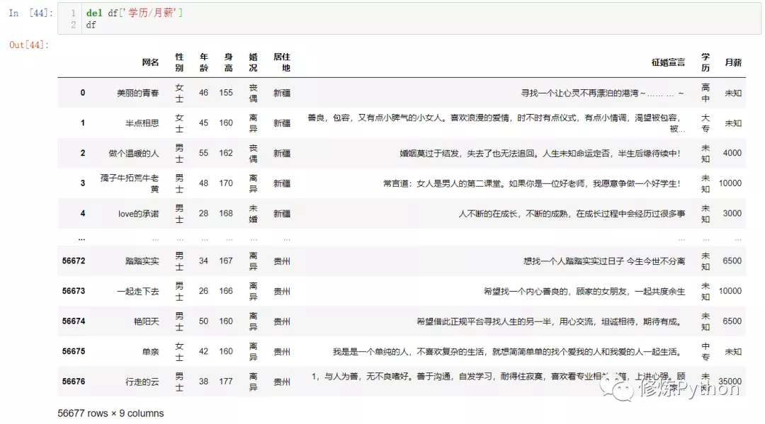
At this point the data is processed and you can delete the education/monthly salary column and save it back to Excel blank.
del df['学历/月薪']
df
df.to_excel('处理后数据.xlsx', index=False)
Third, data analysis
The sex ratio of male to female?
# -*- coding: UTF-8 -*-
"""
@File    :男女占比情况.py
@Author  :叶庭云
@CSDN    :https://yetingyun.blog.csdn.net/
"""
import pandas as pd
import collections
from pyecharts.charts import Pie
from pyecharts import options as opts
from pyecharts.globals import ThemeType, CurrentConfig


# 引用本地js资源渲染
CurrentConfig.ONLINE_HOST = 'D:/python/pyecharts-assets-master/assets/'
# 提取数据
df = pd.read_excel('处理后数据.xlsx')
gender = list(df['性别'])
# 统计男女人数
gender_count = collections.Counter(gender).most_common()
gender_count = [(k, v) for k, v in gender_count]


pie = Pie(init_opts=opts.InitOpts(theme=ThemeType.MACARONS))
# 富文本效果  环图
pie.add('性别', data_pair=gender_count, radius=["40%", "55%"],
        label_opts=opts.LabelOpts(
            position="outside",
            formatter="{a|{a}}{abg|}\\n{hr|}\\n {b|{b}: }{c}  {per|{d}%}  ",
            background_color="#eee",
            border_color="#aaa",
            border_width=1,
            border_radius=4,
            rich={
                "a": {"color": "#999", "lineHeight": 22, "align": "center"},
                "abg": {
                    "backgroundColor": "#e3e3e3",
                    "width": "100%",
                    "align": "right",
                    "height": 22,
                    "borderRadius": [4, 4, 0, 0],
                },
                "hr": {
                    "borderColor": "#aaa",
                    "width": "100%",
                    "borderWidth": 0.5,
                    "height": 0,
                },
                "b": {"fontSize": 16, "lineHeight": 33},
                "per": {
                    "color": "#eee",
                    "backgroundColor": "#334455",
                    "padding": [2, 4],
                    "borderRadius": 2,
                },
            },
        ),)
pie.set_global_opts(title_opts=opts.TitleOpts(title='相亲男女占比情况'))
pie.set_colors(['red', 'blue'])   # 设置颜色
pie.render('男女占比情况.html')
The results are as follows:

There are more women than men in dating men and women. There were 25,910 men, or 45.72 per cent, and 30,767 women, or 54.28 per cent.
Age distribution of male and female dating?
# -*- coding: UTF-8 -*-
"""
@File    :年龄分布.py
@Author  :叶庭云
@CSDN    :https://yetingyun.blog.csdn.net/
"""
import pandas as pd
import collections
from pyecharts.charts import Bar
from pyecharts.globals import ThemeType, CurrentConfig
from pyecharts import options as opts


CurrentConfig.ONLINE_HOST = 'D:/python/pyecharts-assets-master/assets/'


df = pd.read_excel('处理后数据.xlsx')
age = list(df['年龄'])
age_count = collections.Counter(age).most_common()
# 按年龄排序
age_count.sort(key=lambda x: x[0])
age = [x[0] for x in age_count]
nums = [y[1] for y in age_count]


# print(age_count)
bar = Bar(init_opts=opts.InitOpts(theme=ThemeType.MACARONS))
bar.add_xaxis(age)
bar.add_yaxis('人数', nums)  # 数据多的时候设置不显示标签
bar.set_global_opts(title_opts=opts.TitleOpts(title='相亲男女年龄分布'))
# 标记最大值  最小值  平均值   标记平均线
bar.set_series_opts(label_opts=opts.LabelOpts(is_show=False),
                    markpoint_opts=opts.MarkPointOpts(
                    data=[
                        opts.MarkPointItem(type_="max", name="最大值"),
                        opts.MarkPointItem(type_="min", name="最小值"),
                        opts.MarkPointItem(type_="average", name="平均值")]),
                    markline_opts=opts.MarkLineOpts(
                    data=[
                        opts.MarkLineItem(type_="average", name="平均值")]))
bar.render('年龄分布.html')
The results are as follows:
The 31-year-old has the largest number of male and female dating, with 2,637 men and women of all ages, and we can extract data on male and female partners under the age of 20 and greater than or equal to 70 years of age.
import pandas as pd


df = pd.read_excel('处理后数据.xlsx')
df1 = df[df['年龄'] <= 20]
df2 = df1['婚况'].value_counts()    # 统计小于等于20岁的相亲男女的婚况
print(df2)
The results are as follows:
未婚    153
离异      6
丧偶      2
Name: 婚况, dtype: int64
Most are unmarried, at a young age so anxious to date, and then look at the marriage situation is divorce data.
import pandas as pd


df = pd.read_excel('处理后数据.xlsx')
df1 = df[df['年龄'] <= 20]


df3 = df1[df1['婚况'] == '离异']
print(df3)
The results are as follows:
                网名  性别  ...  学历     月薪
17425          微风轻起  男士  ...  未知  50000
29645            媳妇  女士  ...  大专     未知
30398            仙妹  女士  ...  高中     未知
30485  会员1415395937  男士  ...  未知  35000
36684         微笑着变老  女士  ...  高中     未知
49864        风吹动了风玲  女士  ...  高中     未知


[6 rows x 9 columns]
Men whose monthly salaries say 50,000 or 35,000 are a little conspicuous, check in the dataset.
The breeze of a monthly salary of 50,000, the age of marriage information written 19, the marriage declaration also wrote in 1994 26 years old;
Dating a man and a woman?
# -*- coding: UTF-8 -*-
"""
@File    :男女占比情况.py
@Author  :叶庭云
@CSDN    :https://yetingyun.blog.csdn.net/
"""
import pandas as pd
import collections
from pyecharts.charts import Pie
from pyecharts import options as opts
from pyecharts.globals import ThemeType, CurrentConfig


# 引用本地js资源渲染
CurrentConfig.ONLINE_HOST = 'D:/python/pyecharts-assets-master/assets/'
# 提取数据  婚况不为未填写的
df = pd.read_excel('处理后数据.xlsx')
data = df[df['婚况'] != '未填写']
# 统计各婚况相亲男女人数
data_count = collections.Counter(data['婚况']).most_common()
print(data)


c = (
    Pie()
    .add(
        "婚况",
        data_count,
        radius=["40%", "55%"],
        label_opts=opts.LabelOpts(
            position="outside",
            formatter="{a|{a}}{abg|}\\n{hr|}\\n {b|{b}: }{c}  {per|{d}%}  ",
            background_color="#eee",
            border_color="#aaa",
            border_width=1,
            border_radius=4,
            rich={
                "a": {"color": "#999", "lineHeight": 22, "align": "center"},
                "abg": {
                    "backgroundColor": "#e3e3e3",
                    "width": "100%",
                    "align": "right",
                    "height": 22,
                    "borderRadius": [4, 4, 0, 0],
                },
                "hr": {
                    "borderColor": "#aaa",
                    "width": "100%",
                    "borderWidth": 0.5,
                    "height": 0,
                },
                "b": {"fontSize": 16, "lineHeight": 33},
                "per": {
                    "color": "#eee",
                    "backgroundColor": "#334455",
                    "padding": [2, 4],
                    "borderRadius": 2,
                },
            },
        ),
    )
    .set_colors(["#8B008B", "#FF1493", "#000000"])
    .set_global_opts(title_opts=opts.TitleOpts(title="相亲男女婚况"))
    .render("pie_rich_label.html")
)
The results are as follows:
The marriage status of a married man and a woman. Divorce accounted for 57.67 per cent, the largest proportion, with unmarried accounting for 34.14 per cent and widowhood accounting for 8.19 per cent.
What is the distribution of educational qualifications between male and female dating?
# -*- coding: UTF-8 -*-
"""
@File    :学历分布.py
@Author  :叶庭云
@CSDN    :https://yetingyun.blog.csdn.net/
"""
import pandas as pd
import collections
from pyecharts.charts import Pie
from pyecharts import options as opts
from pyecharts.globals import CurrentConfig


# 引用本地js资源渲染
CurrentConfig.ONLINE_HOST = 'D:/python/pyecharts-assets-master/assets/'
# 提取数据  学历不为未知的
df = pd.read_excel('处理后数据.xlsx')
data = df[df['学历'] != '未知']
# print(data)
# 统计各学历层次相亲男女数量
data_count = collections.Counter(data['学历']).most_common()
c = (
    # 宽  高  背景颜色
    Pie(init_opts=opts.InitOpts(width="800px", height="500px", bg_color="#2c343c"))
    .add(
        series_name="相亲男女学历",   # 系列名称
        data_pair=data_count,         # 系列数据项,格式为 [(key1, value1), (key2, value2)...]
        rosetype="radius",        # radius:扇区圆心角展现数据的百分比,半径展现数据的大小
        radius="55%",             # 饼图的半径
        center=["50%", "50%"],    # 饼图的中心(圆心)坐标,数组的第一项是横坐标,第二项是纵坐标
        label_opts=opts.LabelOpts(is_show=False, position="center"),   # 标签配置项
    )
    .set_colors(["#00BFFF", "#00FF7F", "#FF1493", "#8B008B", "#FFFF00", "#556B2F"])
    .set_global_opts(
        title_opts=opts.TitleOpts(
            title="相亲男女学历",
            pos_left="center",
            pos_top="20",
            title_textstyle_opts=opts.TextStyleOpts(color="#fff"),
        ),
        legend_opts=opts.LegendOpts(is_show=False),
    )
    .set_series_opts(
        tooltip_opts=opts.TooltipOpts(
            trigger="item", formatter="{a} <br/>{b}: {c} ({d}%)"  # 'item': 数据项图形触发,主要在散点图,饼图等无类目轴的图表中使用
         ),
        label_opts=opts.LabelOpts(color="#fff"),
    )
    .render("相亲男女学历.html")
)
The results are as follows:
The majority of male and female students with relatives are in high school (35.92 per cent) and tertiary (24.72 per cent), and nearly 60 per cent of them are related. Undergraduates accounted for 20.7%, secondary schools accounted for 16.35%, master's and doctoral degrees of the number of male and female relatives is very small, accounting for 2.14%, 0.17%, respectively.
Regional distribution of male and female dating?
# -*- coding: UTF-8 -*-
"""
@File    :地区分布.py
@Author  :叶庭云
@CSDN    :https://yetingyun.blog.csdn.net/
"""
import pandas as pd
import collections
from pyecharts import options as opts
from pyecharts.charts import Geo
from pyecharts.globals import ChartType
from pyecharts.globals import ThemeType, CurrentConfig


CurrentConfig.ONLINE_HOST = 'D:/python/pyecharts-assets-master/assets/'


df = pd.read_excel('处理后数据.xlsx')
area = list(df['居住地'])
area_count = collections.Counter(area).most_common(34)
print(area_count)


# 初始化配置项  背景颜色  大小  主题
geo = Geo(init_opts=opts.InitOpts(width='1000px', height='600px', theme=ThemeType.DARK))
# 设置是否显示省份
geo.add_schema(maptype='china', label_opts=opts.LabelOpts(is_show=True))
# 绘制什么类型图  热力图  涟漪图等
geo.add('相亲男女人数', data_pair=area_count, type_=ChartType.EFFECT_SCATTER)
geo.set_series_opts(label_opts=opts.LabelOpts(is_show=False))   # 不显示数据标签
geo.set_global_opts(title_opts=opts.TitleOpts(title="相亲男女地区分布"),
                 visualmap_opts=opts.VisualMapOpts(max_=5000, is_piecewise=True,   # 划分区间是否精确
     pieces=[{"max": 1000, "min": 100, "label": "100-1000", "color": "#708090"},  # 分段  添加图例注释  和颜色
                            {"max": 1500, "min": 1001, "label": "1001-1500", "color": "#00008B"},
                            {"max": 2000, "min": 1501, "label": "1501-2000", "color": "#483D8B"},
                            {"max": 2500, "min": 2001, "label": "2001-2500", "color": "#1E90FF"},
                            {"max": 3000, "min": 2501, "label": "2501-3000", "color": "#8B008B"},
                            {"max": 5000, "min": 3001, "label": ">=3000", "color": "#FF0000"}])
                    )
geo.render('地区分布.html')
The results are as follows:
[('重庆', 4436), ('广东', 2637), ('四川', 2519), ('山东', 2398), ('河南', 2160), ('上海', 2156), ('云南', 2039), ('北京', 2037), ('台湾', 1997), ('安徽', 1920), ('江苏', 1919), ('天津', 1918), ('黑龙江', 1918), ('湖南', 1800), ('新疆', 1799), ('辽宁', 1680), ('甘肃', 1680), ('广西', 1679), ('湖北', 1679), ('内蒙古', 1559), ('山西', 1440), ('福建', 1440), ('江西', 1440), ('浙江', 1440), ('陕西', 1439), ('河北', 1439), ('青海', 1339), ('贵州', 1200), ('吉林', 1080), ('西藏', 942), ('宁夏', 702), ('海南', 360), ('香港', 353), ('澳门', 117)]
Chongqing, Guangdong, Sichuan and other regions have the largest number of male and female relatives.
Marriage declarations generally present themselves and express their demands and expectations for their other half. Let's take a look at the key words in the marriage declaration for married men and women.
# -*- coding: UTF-8 -*-
"""
@File    :征婚宣言词云.py
@Author  :叶庭云
@CSDN    :https://yetingyun.blog.csdn.net/
"""
import pandas as pd
import jieba
import collections
import re
from wordcloud import WordCloud
import matplotlib.pyplot as plt
import numpy as np
from PIL import Image


# 提取性别  征婚宣言这两列数据就好
df = pd.read_excel('处理后数据.xlsx')[['性别', '征婚宣言']]
# df1 = df[df['性别'] == '女士']['征婚宣言']
df2 = df[df['性别'] == '女士']['征婚宣言']


# 读取停用词数据
with open('stop_words.txt', encoding='utf-8') as f:
    con = f.read().split('\\n')    # 得到每一行的停用词
    stop_words = set()
    for i in con:
        stop_words.add(i)


result_list = []
for data in df2:
    # 文本预处理  去除一些无用的字符   只提取出中文出来
    new_data = re.findall('[\\u4e00-\\u9fa5]+', data, re.S)
    new_data = "/".join(new_data)
    # 文本分词
    seg_list_exact = jieba.cut(new_data, cut_all=True)
    # 去除停用词和单个词
    for word in seg_list_exact:
        if word not in stop_words and len(word) > 1:
            result_list.append(word)


print(result_list)
# 筛选后统计
word_counts = collections.Counter(result_list)
mask_ = 255 - np.array(Image.open('woman_mask.png'))
# 绘制词云
my_cloud = WordCloud(
    background_color='white',  # 设置背景颜色  默认是black
    mask=mask_,
    font_path='simhei.ttf',   # 设置字体  显示中文
    max_font_size=112,        # 设置字体最大值
    min_font_size=12,         # 设置字体最小值
    random_state=88           # 设置随机生成状态,即多少种配色方案
).generate_from_frequencies(word_counts)


# 绘制词云
plt.figure(figsize=(8, 5), dpi=200)
# 显示生成的词云图片
plt.imshow(my_cloud, interpolation='bilinear')
# 显示设置词云图中无坐标轴
plt.axis('off')
plt.savefig('woman_cloud.png', dpi=200)
plt.show()
The results are as follows:


In the declaration of marriage, like, hope, life, kindness, sincerity, sincerity, happiness, character, etc. are the words that appear frequently.