px, em, rem difference introduction
May 04, 2021 HTML Reference Manual
Table of contents
Px
px pixels (Pixels). R elative length units. Pixel px is relative to the display screen resolution.
PX features
- 1. IE cannot adjust the font size of those fonts that use px as units;
- 2. Most websites abroad are able to adjust because they use em or rem as font units;
- 3. Firefox is able to adjust px and em, rem, but more than 96% of Chinese Internet users use Internet Explorer (or kernel).
Em
em is calculated based on the relative font size based on a base (e.g., 1.5em).
em is a relative length unit. T he font size relative to the text within the current object. If the font size of the current line text is not artificially set, it is relative to the browser's default font size.
EM features
- 1. The value of em is not fixed;
- 2. em inherits the font size of the parent element.
Note: The default font height for any browser is 16px. A ll unedited browsers are compliant: 1em-16px. S o 12px is 0.75em, 10px is 0.625em. In order to simplify the conversion of foot-size, you need to declare Font-size-62.5% in the body selector in css, which makes the em value 16px x 62.5% x 10px, so that 12px=1.2em, 10px=1em, that is, just divide your original px value by 10, and then replace em as a unit.
So when we write CSS, we need to pay attention to two points:
- 1. The body selector declares Thatfont-size is 62.5%;
- 2. Divide your original px value by 10 and replace it with em as a unit;
- 3. Recalculate the em values of those magnified fonts. Avoid duplicate declarations of font size.
That is to avoid the phenomenon of 1.2 x 1.2 x 1.44. For example, if you declare a font size of 1.2em in the content, the font size in the declaration p can only be 1em, not 1.2em, because this em is not the other em, it is inherited from the high font size of the content and becomes 1em s 12px.
Rem
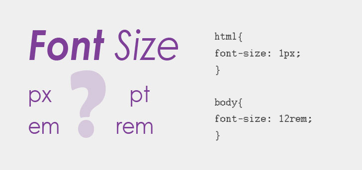
Rem is a new relative unit (root em, root em) added to CSS3, which has attracted widespread attention. W hat's the difference between this unit and em? T he difference is that using rem to set the font size for an element is still relatively large, but relative to only the HTML root element. T his unit can be described as a set of relative size and absolute size advantages in one, through which you can only modify the root element proportionally adjust all font size, but also to avoid the chain reaction of font size layer by layer composite. C urrently, rem is supported in all browsers except IE8 and earlier. F or browsers that don't support it, the way to do this is simply to write an absolute statement. T hese browsers ignore the font size set with rem. Here's an example:
p {font-size:14px; font-size:.875rem;}
Note: Choosing which font units to use is primarily up to your project, and if your user base uses the latest version of your browser, it's recommended to use rem, px if you want to consider compatibility, or both.
The choice of px and rem?
Use px for phone devices that only need to be adapted to a small number of phones and have little impact on the page.
For mobile devices that need to be adapted to a variety of devices, use rem, such as devices that only need to be adapted to a wide range of resolutions, such as iPhones and iPads.