jQuery EasyUI Data Grid - Create complex toolbars
May 09, 2021 jQuery EasyUI
Table of contents
jQuery EasyUI Data Grid - Create complex toolbars
In the last section, we learned how to add toolbars to the jQuery EasyUI datagrid, and in this section, we'll continue with how complex toolbars should be created.
The toolbar for the jQuery EasyUI data grid can contain buttons and other components. You can simply define the toolbar layout through an existing DIV tag that becomes the contents of the data grid toolbar.
Here are the steps to create a complex toolbar for a data grid component.
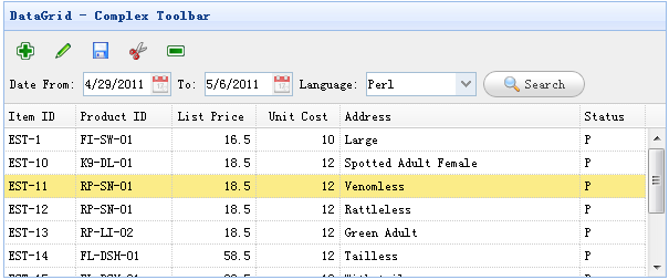
Create a toolbar
	<div id="tb" style="padding:5px;height:auto">
		<div style="margin-bottom:5px">
			<a href="#" class="easyui-linkbutton" iconCls="icon-add" plain="true"></a>
			<a href="#" class="easyui-linkbutton" iconCls="icon-edit" plain="true"></a>
			<a href="#" class="easyui-linkbutton" iconCls="icon-save" plain="true"></a>
			<a href="#" class="easyui-linkbutton" iconCls="icon-cut" plain="true"></a>
			<a href="#" class="easyui-linkbutton" iconCls="icon-remove" plain="true"></a>
		</div>
		<div>
			Date From: <input class="easyui-datebox" style="width:80px">
			To: <input class="easyui-datebox" style="width:80px">
			Language:
			<input class="easyui-combobox" style="width:100px" 	url="data/combobox_data.json" 					                    valueField="id" textField="text">
			<a href="#" class="easyui-linkbutton" iconCls="icon-search">Search</a>
		</div>
	</div>
Create a data grid (DataGrid)
	<table class="easyui-datagrid" style="width:600px;height:250px" url="data/datagrid_data.json"
             title="DataGrid - Complex Toolbar" toolbar="#tb" singleSelect="true" fitColumns="true">
		<thead>
			<tr>
				<th field="itemid" width="60">Item ID</th>
				<th field="productid" width="80">Product ID</th>
				<th field="listprice" align="right" width="70">List Price</th>
				<th field="unitcost" align="right" width="70">Unit Cost</th>
				<th field="attr1" width="200">Address</th>
				<th field="status" width="50">Status</th>
			</tr>
		</thead>
	</table>
As you can see, the toolbar field dialog box for the datagrid is similar. We don't need to write any javascript code to create a data grid with complex toolbars.