ionic Toggle
May 21, 2021 ionic
Table of contents
ionic Toggle (switch)
The switch is similar to the checkbox tag with HTML, but it's easier to use on mobile devices.
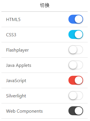
The toggle-assertive can be used to specify the color.
<label class="toggle">
   <input type="checkbox">
   <div class="track">
     <div class="handle"></div>
   </div>
</label>
The instance has a list of multiple toggle switches. Note that each option of the item class needs to be added after the item-toggle class.
<ul class="list">

  <li class="item item-toggle">
     HTML5
     <label class="toggle toggle-assertive">
       <input type="checkbox">
       <div class="track">
         <div class="handle"></div>
       </div>
     </label>
  </li>

  ...

</ul>
Here's how it works: