Introduction to Bootstrap
What is Bootstrap?
Bootstrap is a front-end framework for rapidly developing web applications and websites. Bootstrap is BASED on HTML, CSS, JAVASCRIPT.
Bootstrap's latest version is Bootstrap4, which uses our Sass variables and a large number of mixins, responsive raster systems, scalable prefabribrio components, and a powerful jQuery-based plug-in system to quickly prototype or build your entire app for your ideas.
History
Bootstrap was developed by Twitter's Mark Otto and Jacob Thornton. Bootstrap is an open source product released on GitHub in August 2011.
Why Bootstrap?
-
Mobile Device First: Starting with Bootstrap 3, the framework includes mobile device-first styles throughout the library.
-
Browser support: Bootstrap is supported by all major browsers.

-
Easy to get started: As long as you have the basics of HTML and CSS, you can start learning Bootstrap.
-
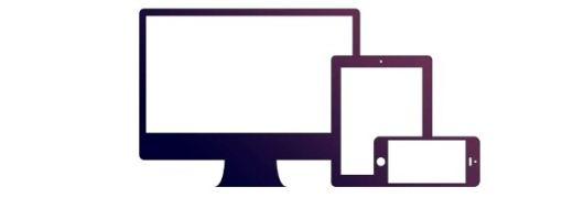
Responsive design: Bootstrap's responsive CSS adapts to desktops, tablets, and phones.
-
It provides a simple and unified solution for developers to create interfaces.
-
It contains powerful built-in components that are easy to customize.
-
It also provides web-based customization.
-
It's open source.
The contents of the Bootstrap package
-
Basic structure: Bootstrap provides a basic structure with a grid system, link style, and background. This will be explained in more detail in the Bootstrap Basic Structure section.
-
CSS: Bootstrap brings its own features: global CSS settings, defined basic HTML element styles, scalable class, and an advanced grid system. This will be explained in more detail in the Bootstrap CSS section.
-
Components: Bootstrap contains more than a dozen reusable components for creating images, drop-down menus, navigation, warning boxes, pop-ups, and more. This is explained in more detail in the Layout Components section.
-
JavaScript Plug-in: Bootstrap contains more than a dozen custom jQuery plug-ins. Y ou can include all the plug-ins directly, or you can include them one by one. This will be explained in more detail in the Bootstrap plug-in section.
-
Customization: You can customize Bootstrap's components, LESS variables, and jQuery plug-ins to get your own version.
Online instance
The Bootstrap tutorial on this site contains hundreds of examples.
You can edit the code online using our online editor and click the Run button to see the results.
Bootstrap instance
<div class="jumbotron">
My first Bootstrap page
Reset the window size to see the responsive effect! & lt;/p>
</div>
<div class="row">
<div class="col-sm-4">
<h3>Column 1</h3>
Learn technology, starting with W3Cschool! & lt;/p>
</div>
<div class="col-sm-4">
<h3>Column 2</h3>
Learn technology, starting with W3Cschool! & lt;/p>
</div>
<div class="col-sm-4">
<h3>Column 3</h3>
Learn technology, starting with W3Cschool! & lt;/p>
</div>
</div>
</div>
Try it out . . .
More instances
Bootstrap Instance 2
<p>Create a responsive table with alternating cell background color:</p>
<div class="table-responsive">
<table class="table table-striped table-bordered">
<thead>
<tr>
<th>#</th>
<th>Name</th>
<th>Street</th>
</tr>
</thead>
<tbody>
<tr>
<td>1</td>
<td>Anna Awesome</td>
<td>Broome Street</td>
</tr>
<tr>
<td>2</td>
<td>Debbie Dallas</td>
<td>Houston Street</td>
</tr>
<tr>
<td>3</td>
<td>John Doe</td>
<td>Madison Street</td>
</tr>
</tbody>
</table>
</div>
</div>
Try it out . . .
Bootstrap4 instance
Bootstrap4 instance
<div class="jumbotron">
My first Bootstrap page
Reset the window size to see the responsive effect! & lt;/p>
</div>
<div class="row">
<div class="col-sm-4">
<h3>Column 1</h3>
Learn technology, starting with W3Cschool! & lt;/p>
</div>
<div class="col-sm-4">
<h3>Column 2</h3>
Learn technology, starting with W3Cschool! & lt;/p>
</div>
<div class="col-sm-4">
<h3>Column 3</h3>
Learn technology, starting with W3Cschool! & lt;/p>
</div>
</div>
</div>
Try it out . . .
Click the "Try it" button to see how it works.