Introduction to Bootstrap components
May 30, 2021 Article blog
Table of contents
First, drop-down menu
A switchable, contextual menu for displaying a list of links. The JavaScript plug-in for the drop-down menu makes it interactive.
1, instance
Wrap both the drop-down menu trigger and the drop-down menu in .dropdown, or another declared position: relative; T he element of the . Then join the HTML code that makes up the menu.
<div class="dropdown">
<button class="btn btn-default dropdown-toggle" type="button" id="dropdownMenu1" data-toggle="dropdown" aria-haspopup="true" aria-expanded="true">
Dropdown
<span class="caret"></span>
</button>
<ul class="dropdown-menu" aria-labelledby="dropdownMenu1">
<li><a href="#">Action</a></li>
<li><a href="#">Another action</a></li>
<li><a href="#">Something else here</a></li>
<li role="separator" class="divider"></li>
<li><a href="#">Separated link</a></li>
</ul>
</div>
aria-haspopup:true means that menus or floating elements appear when clicked; false means that there is no pop-up effect.
aria-expanded: Represents the expanded state. T he default is underfined, which means that the current expanded state is unknown. Other optional values: true means that the element is expanded; false means that the element is not expanded
aria-labelledby: When the desired label text already exists in other elements, you can use aria-labelledby and value it as the id of all read elements. as follows:
When ul gets to focus, the screen reader reads: "Choose your position"
data-toggle: Indicates what event type occurs
Second, button drop-down menu
Put any button in the .btn-group and add the appropriate menu label to make the button a trigger for the menu.
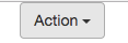
1, single-button drop-down menu
<!-- Single button -->
<div class="btn-group">
  <button type="button" class="btn btn-default dropdown-toggle" data-toggle="dropdown" aria-haspopup="true" aria-expanded="false">
    Action <span class="caret"></span>
  </button>
  <ul class="dropdown-menu">
    <li><a href="#">Action</a></li>
    <li><a href="#">Another action</a></li>
    <li><a href="#">Something else here</a></li>
    <li role="separator" class="divider"></li>
    <li><a href="#">Separated link</a></li>
  </ul>
</div>
 The background color is displayed when the mouse points.
2, split drop-down menu
Just one more separate button.
<!-- Split button -->
<div class="btn-group">
<button type="button" class="btn btn-danger">Action</button>
<button type="button" class="btn btn-danger dropdown-toggle" data-toggle="dropdown" aria-haspopup="true" aria-expanded="false">
<span class="caret"></span>
<span class="sr-only">Toggle Dropdown</span>
</button>
<ul class="dropdown-menu">
<li><a href="#">Action</a></li>
<li><a href="#">Another action</a></li>
<li><a href="#">Something else here</a></li>
<li role="separator" class="divider"></li>
<li><a href="#">Separated link</a></li>
</ul>
</div>
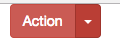 You can see that the buttons are split into left and right buttons.
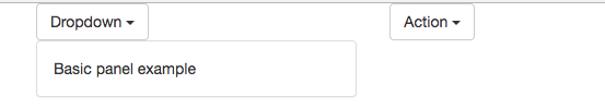
Third, the panel
Sometimes you may need to put some DOM content in a box. In this case, try the panel components.
1, basic examples
All the default .panel component does is set the basic border and padding to contain the content.
<div class="panel panel-default">
  <div class="panel-body">
    Basic panel example
  </div>
</div>
Show effect:
2, with the title of the panel
.panel-heading makes it easy to add a title container to a panel. Y ou can also add a predefined style title by adding the - tag that sets the .panel-title class. However, the font size of the < h1>- label will be overwritten by the .panel-heading style.
In order to color the link appropriately, be sure to place the link in the title label with the .panel-title class.