ECharts case tutorial
May 30, 2021 Article blog
Table of contents
Brief introduction
Enterprise Charts is an open source data visualization tool for Baidu, with the underlying ZRender (a new lightweight canvas class library) that makes it easier to compare line charts, bars, scatterplots, K-line charts, pie charts, radar charts, maps, chords, force-guided layouts, dashboards and funnel charts, while supporting stacking and multi-chart mixing of any dimension.
Case appreciation
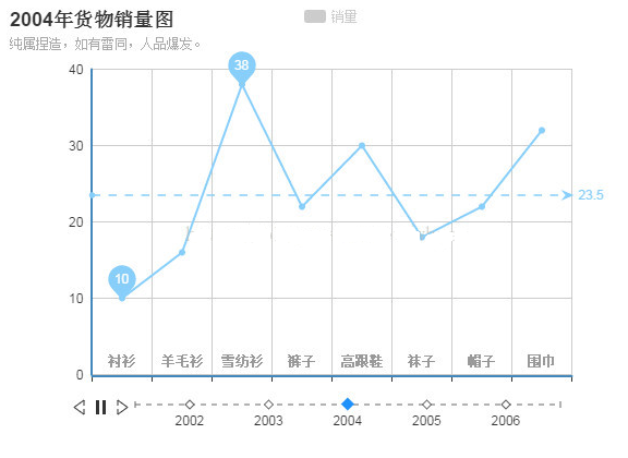
This case is a line series chart with a timeline, which is suitable for contrasting display data, such as an annual sales change chart of a supermarket, a product's pre-investment capital map, etc.
Knowledge reserve
1. Label single files are introduced into Echarts.
Officials recommend three ways to introduce ECharts, modular package introduction, modular single file introduction, and label single file introduction. T he first blog introduced modular single files, which can be loaded on demand and are officially recommended. I n this article, we'll use the way labeled single files are introduced, and if your project isn't based on modular development and isn't based on AMD specifications, then it's very convenient to use labeled single files, we just need to introduce an ECharts library using a script tag, and the single files that can be introduced include: dist/echarts-all.js and source/echarts-all .js. The former has been tightened to include full charts, including world, china and 34 provincial and municipal map data, while the latter is not, including full charts, including world, china and 34 provincial and municipal map data, for debugging.
2. Use of timeline controls.
Using timeline controls, we need to prepare in two ways, one is to set the timeline and the other is to set each point in time (data, title, etc.).
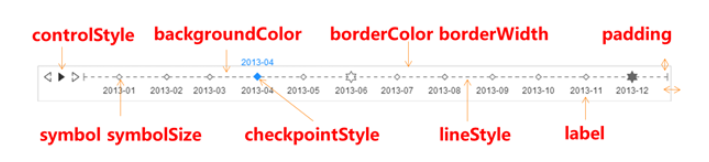
Set the timeline. The timeline is set in ECharts, and each icon can have up to one timeline, below the main parameters.
| grouping | parameter | type | Acquiescing value | meaning |
|---|---|---|---|---|
| The parameter settings | data | Array | [] | The timeline list, which is also the axis label content |
| show | boolean | true | Display policy, optional: true (display) | false (hidden) | |
| type | string | 'time' | The mode is a time type, the timeline interval is calculated according to the time span, optional: 'number' | |
| notMerge | boolean | false | Whether to do the merge operation when switching multiple options on the timeline, with setOption 2nd argument (see instance method for details) | |
| realtime | boolean | true | Drag or click to change whether the timeline is displayed in real time, and in readers that do not support Canvas, the value is automatically forced to false | |
| Play control | autoPlay | boolean | false | Is it automatically played |
| loop | boolean | true | Is not looping | |
| playInterval | number | 2000 | Play interval | |
| currentIndex | number | 0 | The current index location, corresponding to the options array, is used to specify the display of a specific series | |
| Style settings | width | number|string | Adaptive | Timeline width, acquiesced to the total width - x - x2, after specifying width will be ignored x2. |
| height | number|string | 50 | Timeline height | |
| x | number|string | 80 | The horizontal coordinates in the upper left corner of the timeline | |
| y | number|string | null | Timeline upper left corner ordinate, acquiesced no, positioning with y2, | |
| x2 | number|string | 80 | The horizontal coordinates in the lower right corner of the timeline | |
| y2 | number|string | 0 | The ordinate in the lower right corner of the timeline | |
| padding | number| Array | 5 | The inner margin, unit px, accepts the array to set the upper right and bottom left margins, respectively, with css. | |
| backgroundColor | color | 'rgba(0,0,0,0)' | Background color, acquiescing in transparency. | |
| borderWidth | number | 0 | The border line is wide | |
| borderColor | color | '#ccc' | Border color | |
| controlPosition | string | 'left' | Play the controller position, optional: 'left' | ' right' | 'none' | |
| lineStyle | Object | See code | Timeline styling, lineStyle control line style (see lineStyle for details) | |
| label | Object | See code | Timeline label text | |
| checkpointStyle | Object | See code | The current point in the timeline | |
| controlStyle | Object | See code | Timeline controller style that specifies normal and highlighted colors | |
| symbol | string | 'emptyDiamond' | Axis point symbol, with serie.symbol | |
| symbolSize | number | 4 | Axis point symbol, with serie.symbolSize |
note:
a++. Width, height, x, x2, y, y2 and other parameters that set the size position, type number|string, can accept numeric, in px, or accept percentages (strings), such as 50% for center display.
b++. LineStyle's acquiescing value is 'color: '#666', width: 1, type: 'dashed'.
c++. T he acquiesced value of the label is shown in the code. The parameters explain the following
show : is not displayed;
interval : Pick the interval, acquiesce to 'auto', optional: 'auto' (auto-hide display is not under) | 0 (all shown) | {number} ;
rotate : rotation angle, acquiesced to 0, do not rotate, positive value is counterclockwise, negative value is clockwise, optional: (9)0 to 90;
formatter: Interval name formatter: | {Function} ;
textStyle : text style (see textStyle for details)
{ show: true, interval: 'auto', rotate: 0, formatter: null, textStyle: { color: '#333' } }
d++. The parameters of checkpointStyle are interpreted below, and the acquiescing value is shown in the code.
symbol: The current point symbol, acquiescing to the symbol on the axis
symbolSize: The current point symbol size, acquiescing to the symbol size on the axis
color : The current point symbol color, acquiesced to the current point color, can specify specific colors, if none is '#1e90ff'
borderColor: The current point symbol edge color
borderWidth: The width of the current point symbol edge
Label is the same as c
{ symbol : 'auto', symbolSize : 'auto', color : 'auto', borderColor : 'auto', borderWidth : 'auto', label: { show: false, textStyle: { color: 'auto' } } }
e++. The acquiescing value of controlStyle is
{ normal : { color : '#333'}, emphasis : { color : '#1e90ff'} }
The effect of style parameters on the timeline is detailed in the figure below.
Set each point in time. Step 2 is to set each specific point in time, each point in time is an icon, including the title, legend, axes, data, etc. , although the general axis, legend, etc. unchanged, only change the title and data.
var option = { //时间轴设置 timeline : {}, //时间点设置 options : [ //第1个时间点 {}, //第2个时间点 {}, //... ] }
The implementation process
Then let's interpret the implementation process.
In the timeline, we set the timestamp to show only the year, adjust the position of the timeline to ensure aesthetics, and set the timeline playback setting.
var option = {
//时间轴设置 timeline : {
//时间轴时间列表 data:[ '2002-01-01','2003-01-01','2004-01-01','2005-01-01','2006-01-01' ],
//自定义处理,只显示年份 label:{ formatter : function(s) { return s.slice(0, 4); } },
//时间轴的位置设定 height:80, x:50, padding:[40,10,10,10],
//时间轴播放控制 autoPlay : true, playInterval : 2000 },
//时间点设置 options : [ //第1个时间点 {}, //第2个时间点 {}, //... ] }
Then set the point in time, first look at the 2012 data settings, we set the title, prompts, legends, axes, draw data lines.
var option = {
//时间轴设置 timeline : {
//时间轴时间列表 data:[ '2002-01-01','2003-01-01','2004-01-01','2005-01-01','2006-01-01' ], //自定义处理,只显示年份 label:{ formatter : function(s) { return s.slice(0, 4); } },
//时间轴的位置设定 height:80, x:50, padding:[40,10,10,10],
//时间轴播放控制 autoPlay : true, playInterval : 2000 },
//时间点设置 options : [
//第1个时间点
//2002年数据表,新增内容 { title:{ text:'2002年货物销量图', subtext:'纯属捏造,如有雷同,人品爆发。' }, //设置提示 tooltip: { show: true },
//设置图例 legend: { data:['销量'] },
//设置坐标轴 xAxis : [ { type : 'category', data : ["衬衫","羊毛衫","雪纺衫","裤子","高跟鞋","袜子","帽子","围巾"], axisLabel:{ margin:⑵0, textStyle:{ color:'#999', fontWeight:'bold' } } } ], yAxis : [ { type : 'value' } ], series : [ { type:'line', data:[5, 20, 38, 10, 24, 20,24,32],
//绘制平均线 markLine : { data : [ {type : 'average', name: '平均值'} ] },
//绘制最高最低点 markPoint : { data : [ {type : 'max', name: '最大值'}, {type : 'min', name: '最小值'} ] } } ] },
//第2个时间点 {}, //... ] }
Other points in time only need to be set in different places in 2002, in this case we only set the title and data table.
var option = {
//时间轴设置 timeline : {
//时间轴时间列表 data:[ '2002-01-01','2003-01-01','2004-01-01','2005-01-01','2006-01-01' ],
//自定义处理,只显示年份 label:{ formatter : function(s) { return s.slice(0, 4); } },
//时间轴的位置设定 height:80, x:50, padding:[40,10,10,10],
//时间轴播放控制 autoPlay : true, playInterval : 2000 },
//时间点设置 options : [
//第1个时间点
//2002年数据表 { title:{ text:'2002年货物销量图', subtext:'纯属捏造,如有雷同,人品爆发。' },
//设置提示 tooltip: { show: true },
//设置图例 legend: { data:['销量'] },
//设置坐标轴 xAxis : [ { type : 'category', data : ["衬衫","羊毛衫","雪纺衫","裤子","高跟鞋","袜子","帽子","围巾"], axisLabel:{ margin:⑵0, textStyle:{ color:'#999', fontWeight:'bold' } } } ], yAxis : [ { type : 'value' } ], series : [ { type:'line', data:[5, 20, 38, 10, 24, 20,24,32],
//绘制平均线 markLine : { data : [ {type : 'average', name: '平均值'} ] },
//绘制最高最低点 markPoint : { data : [ {type : 'max', name: '最大值'}, {type : 'min', name: '最小值'} ] } } ] },
//第2个时间点
//2003年数据表,新增内容 { title:{ text:'2003年货物销量图', subtext:'纯属捏造,如有雷同,人品爆发。' }, series : [ { type:'line', data:[10, 20, 36, 18, 26, 16,20,34],
//绘制平均线 markLine : { data : [ {type : 'average', name: '平均值'} ] },
//绘制最高最低点 markPoint : { data : [ {type : 'max', name: '最大值'}, {type : 'min', name: '最小值'} ] } } ] }, //第3个时间点 {}, //... ] }