Coding With Fun
Home Docker Django Node.js Articles Python pip guide FAQ Policy

CSS3 shadow implementation methods and techniques are fully solved


May 04, 2021 CSS3


Table of contents


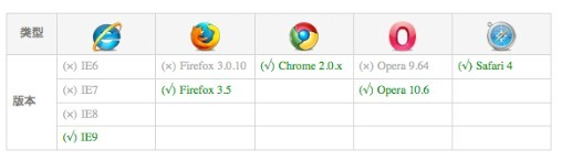
Web design often use the effect of shadows, through shadows can be easier to highlight an element, in the absence of CSS3, generally use pictures as shadow effects, and now by using CSS3 text-shadow and box-shadow properties can be set text and container shadows. me. owever, this feature only works in CSS3-supported browsers, such as Firefox 3.5, Safari 3.1 plus, and Google Chrome.


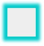
The container sets the shadow box-shadow

Grammar:
box-shadow: h-shadow v-shadow blur spread color inset;
Resolution of the above property values:
horizontal: Specifies a horizontal offset shadow. A positive value (i.e., 5px) shadows to the right, while a negative value (i.e.: - 10px) will bias it to the left.

Vertical: Specifies a vertical offset shadow. A positive value (i.e., 5px) causes the shadow to appear at the bottom of the box, while a negative value (i.e.: - 10px) causes it to be tilted upward.

blur (blur): Set the softening radius. T he default is 0, which means there is no blur. P ositive values increase blur, while negative values actually narrow the shadows. This property defaults to 0.

spread: The size of the shadow, which is optional. 0 px means that the shadow is as large as the current entity, and a larger than 0 indicates a size larger than the solid.

Color: The color value, which is the shadow color.

inset: Change the outer shadow (outset) to the inner shadow. T his parameter is optional.

Reminder: This property can be added to any element, such as pictures, Div, SPAN, P tags, and so on.
<html>
<head>
<title>W3Cschool(w3cschool.cn)</title>
<meta http-equiv="Content-Type" content="text/html; charset=utf-8" />
<style type="text/css">
#shadow {
    box-shadow: 10px 10px 5px #888888;
    width:500px;
    padding:5px;
    text-align:center;
    font-size:20px;
    background:#21759b;
    margin:0 auto;
    color:#ffffff;
}
</style>
</head>
<body>
<div id="shadow">W3Cschool(w3cschool.cn)</div>
</body>
</html>

Effect:

CSS3 shadow implementation methods and techniques are fully solved


Browser compatibility:

CSS3 shadow implementation methods and techniques are fully solved

In order to be compatible with and support earlier versions of these mainstream browsers, when using box-shadow properties on browsers such as Webkit-based Chrome and Safari, we need to write the name of the property as -webkit-box-shadow. Firefox browsers need to be written in the form of -moz-box-shadow.

.box-shadow{  
  
         //Firefox4.0-  
  
         -moz-box-shadow:h-shadow v-shadow blur spread color inset;
  
         //Safariand Google chrome10.0-  
  
         -webkit-box-shadow:h-shadow v-shadow blur spread color inset;
  
         //Firefox4.0+、 Google chrome 10.0+ 、 Oprea10.5+ and IE9  
  
         box-shadow:h-shadow v-shadow blur spread color inset;
 
}  
Note: For convenience, the css properties of the 3d article have only box-shadow properties written, not written-moz-and-webkit-prefix forms, and don't forget to add them in use.

To get a clearer look at the characteristics of box-shadow, do a few small tests to see the results:
<!DOCTYPE html>  
<html>  
  
<head>  
<meta content="text/html; charset=utf-8" http-equiv="Content-Type">  
<title>CSS3属性:box-shadow测试</title>  
<script type="text/javascript" src="js/jquery.min.js"></script>  
<script type="text/javascript" src="js/jquery.boxshadow.js"></script>  
<style type="text/css">  
.box-shadow-1{  
  -webkit-box-shadow: 3px 3px 3px;  
  -moz-box-shadow: 3px 3px 3px;  
  box-shadow: 3px 3px 3px;  
}  
.box-shadow-2{  
  -webkit-box-shadow:0 0 10px #0CC;  
  -moz-box-shadow:0 0 10px #0CC;  
  box-shadow:0 0 10px #0CC;  
}  
.box-shadow-3{  
  -webkit-box-shadow:0 0 10px rgba(0, 204, 204, .5);  
  -moz-box-shadow:0 0 10px rgba(0, 204, 204, .5);  
  box-shadow:0 0 10px rgba(0, 204, 204, .5);  
}  
.box-shadow-4{  
  -webkit-box-shadow:0 0 10px 15px #0CC;  
  -moz-box-shadow:0 0 10px 15px #0CC;  
  box-shadow:0 0 10px 15px #0CC;  
}  
.box-shadow-5{  
  -webkit-box-shadow:inset 0 0 10px #0CC;  
  -moz-box-shadow:inset 0 0 10px #0CC;  
  box-shadow:inset 0 0 10px #0CC;  
}  
.box-shadow-6{  
    box-shadow:-10px 0 10px red, /*左边阴影*/  
    10px 0 10px yellow, /*右边阴影*/  
    0 -10px 10px blue, /*顶部阴影*/  
    0 10px 10px green; /*底边阴影*/  
}  
.box-shadow-7{  
    box-shadow:0 0 10px 5px black,  
    0 0 10px 20px red;  
}  
.box-shadow-8{  
    box-shadow:0 0 10px 20px red,  
    0 0 10px 5px black;  
}  
.box-shadow-9{  
    box-shadow: 0 0 0 1px red;  
}  


.obj{  
    width:100px;  
    height:100px;  
    margin:50px auto;  
    background:#eee;      
}  
.outer{  
    width: 100px;  
    height: 100px;  
    border: 1px solid red;  
}  
.inner{  
    width: 60px;  
    height: 60px;  
    background-color: red;  
    -webkit-box-shadow: 50px 50px blue;  
    -moz-box-shadow: 50px 50px blue;  
    box-shadow: 50px 50px blue;  
  }  
</style>  
</head>  
  
<body>  
    <div class="obj box-shadow-1"></div>  
    <div class="outer">  
        <div class="inner"></div>  
    </div>  
    <div class="obj  box-shadow-2" ></div>  
    <div class="obj  box-shadow-3" ></div>  
    <div class="obj  box-shadow-4" ></div>  
    <div class="obj  box-shadow-5" ></div>  
    <div class="obj  box-shadow-6" ></div>  
    <div class="obj  box-shadow-7" ></div>  
    <div class="obj  box-shadow-8" ></div>  
    <div class="obj  box-shadow-9" ></div>  
    <script type="text/javascript">  
        $(document).ready(function(){  
        if($.browser.msie) {  
          $('.obj').boxShadow(-10,-10,5,"#0cc"); //obj元素使用了box-shadow  
        }  
      });  
    </script>  
  
</body>  
</html>  

Analysis:
1, from the .box-shadow-1 effect can be derived without specifying the color of the property shadow, the shadow under the webkit kernel safari and chrome browser appears transparent color, in the Firefox/Opera performance as black.

CSS3 shadow implementation methods and techniques are fully solved


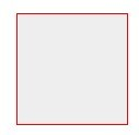
2, from the internal and external two div block inner, outer comparison, all the mainstream browsers supporting box-shadow are shown as: the inner shadow to break the outer container will show the entire shadow effect. The W3C standard interprets the principles and performance of box-shadow in an illustration:

CSS3 shadow implementation methods and techniques are fully solved

From the figure we can see: filletborder-radius, shadow expansion radius, shadow blur radius, and how padding affects the shadow of the object: a non-zero border-radius will affect the shape of the shadow in the same way, but the border-image will not affect any shape of the object shadow; W e know that the default background picture is above the background color. So the whole hierarchy is: Borders, Inner Shadows, Background Pictures, Background Colors, Outer Shadows.

3, from. box-shadow-2 to. Box-shadow-5 effect, we can understand the role of box-shadow value.

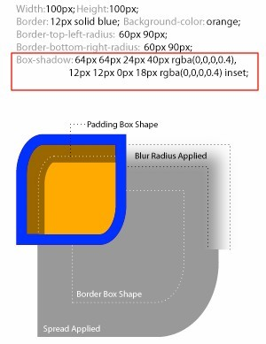
. Box-shadow-2 is xy no offset, shadow size 10px, no extended radius, color s0CC i.e. rgba (0, 204, 204, 1), here we are using the color HEX value;

CSS3 shadow implementation methods and techniques are fully solved

And. box-shadow-3 is in. B ox-shadow-2 effect based on the application of rgba color values, the advantage is to add alpha transparency to the box-shadow shadow. Effect:

CSS3 shadow implementation methods and techniques are fully solved

. b ox-shadow-4 in. The box-shadow-2 effect adds a shadow extension radius of 15px.

CSS3 shadow implementation methods and techniques are fully solved

. b ox-shadow-5 in. Based on the box-shadow-2 effect, set the outer shadow to the inner shadow.

CSS3 shadow implementation methods and techniques are fully solved

4、. B ox-shadow-6 An element uses multiple shadows, separated by commas between them. T o cast a shadow effect on all four sides of an object, we do this by changing the positive and negative values of x-offset and y-offset, where x-offset is negative, the left shadow is generated, the right shadow is generated for positive values, and y-offset is positive is the bottom shadow generated, and the top shadow is generated when negative values are negative. A nd set the blur radius to 0, if not set to 0 then the other three sides will also have shadows. This needs attention!

CSS3 shadow implementation methods and techniques are fully solved

Note that this is written incorrectly: (box-shadow:-10px 0 10px red, box-shadow:10px 0 10px blue, box-shadow:0-10px 10px yellow box, shadow-shadow:0 10px 10px green}

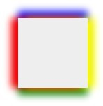
And there is also a multi-shadow sequential issue involved here. When you use more than one shadow property for the same element, you need to be aware of its order, and the shadows written first appear at the top, such as .box-shadow-7 with a different fuzzy value:
.box-shadow-7{

         box-shadow:0 0 10px 5px black,

         0 0 10px 20px red;

}
You'll see the sequence effect of the cascades:
CSS3 shadow implementation methods and techniques are fully solved

If you adjust the two shadow effects, change to the following:
.box-shadow-8{

         box-shadow:0 0 10px 20px red,

         0 0 10px 5px black;

}
Only the red shadow effect is displayed because the red shadow layer is on top and the blur radius is large, completely obscuring the black shadow behind it.

CSS3 shadow implementation methods and techniques are fully solved
The conclusion is that if the shadow blur value in front is less than the shadow blur value in the back, the previous shadow appears above the back, and if the fuzzy value of the front shadow is greater than the shadow blur value in the back, the shadow in front will obscure the shadow effect in the back.

4, classborder border effect (only set shadow expansion radius and shadow color)
The effect rendered by .box-shadow-9 is similar to that of boder:1px solid red, but the effect of box-shadow differs from the boder effect in terms of object height, which is exactly one extended radius larger than the height of the boder. And shadows don't affect any layout of the page, as evidenced by looking at the layout diagram under the firebug.

CSS3 shadow implementation methods and techniques are fully solved

Simulate the box-shadow shadow effect in css3 under ie

Method 1: You can use IE's Shadow filter

Basic syntax: filter:progid:DXImageTransform.Microsoft.Shadow (color s'color value', Direction s shadow angle (value), Strength s shadow radius (value));

Note: The filter must be used with the background property or it will fail.

Simulate the box-shadow code in css3 under IE:

.box-shadow{  
    filter: progid:DXImageTransform.Microsoft.Shadow(color='#969696',Direction=135, Strength=5);/*for ie6,7,8*/  
    background-color: #ccc;  
    -moz-box-shadow:2px 2px 5px #969696;/*firefox*/  
    -webkit-box-shadow:2px 2px 5px #969696;/*webkit*/  
    box-shadow:2px 2px 5px #969696;/*opera或ie9*/  
}  

A thematic case for Children's Day on June 1
li.blk-item{  
         width:423px;  
         height:229px;  
         float:left;  
         padding:8px;  
         margin:2px 18px 13px 21px;  
         display:inline;  
         border:1px solid #d3c998;  
         border-radius:2px;  
         filter:progid:DXImageTransform.Microsoft.Shadow(color='#d3c998', Direction=135,Strength=5);/*for ie6,7,8*/  
         background-color: #fff;  
         -moz-box-shadow:2px 2px 5px#d3c998;/*firefox*/  
         -webkit-box-shadow:2px 2px 5px#d3c998;/*webkit*/  
         box-shadow:2px 2px 5px #d3c998;/*opera或ie9*/  
  
}  

Method 2: Some js and .htc hack files can achieve the shadow effect in IE

ie-css3.htc is an htc file that allows Internet Explorer to support some CSS3 properties, not just box-shadow, but also allows your Internet Explorer to support fillet propertiesborder-radius and text shadow properties text-shadow.

It is used by downloading it and putting it in your server directory

Write the following code in your .lt;head>/head>

The disadvantage of this script is that IE only supports a portion of the box-shadow value. Note:

1, when you use this htc file, your CSS inside, as long as written box-shadow, -moz-box-shadow or -webkit-box-shadow of any kind, IE will render.

2. When you use this htc file, you can't write box-shadow like this: 0 0 10px red; B etween box-shadow: 0px 0px 10px red; Otherwise, IE will fail.

3. Alpha transparency in RGBA values is not supported.

4, does not support inset shadows.

5, does not support shadow expansion.

6. Shadows will only appear black in IE, no matter what color you set to.

Method 3: Use jQuery's plug-in jquery.boxshadow .js
The easy way to do this is to introduce the file and the jquery repository into the head label and insert the following js effect code:
<script type="text/javascript">  
          $(document).ready(function(){  
   if($.browser.msie) {  
     $('.obj').boxShadow(-10,-10,5,"#0cc"); //obj元素使用了box-shadow  
   }  
 });  
</script> 
Note: js can be used: obj.style.webkitBoxShadow value (string); obj.style.MozBoxShadow value (string); obj.style.boxShadow s value (string);

Additional knowledge: The property of CSS3
border-top-left-radius:[<length> | <percentage> ] [ <length> | <percentage> ]?

Default: 0


Value:

<length>:

Sets the length of the object's upper-left fillet radius with a length value. Negative values are not allowed

<percentage>:

Set the upper-left fillet radius length of the object as a percentage. Negative values are not allowed


Description:

Set or retrieve the upper-left fillet border of the object. T wo parameters are provided, two parameters are separated by spaces, each parameter allows 1 parameter value to be set, the first parameter represents the horizontal radius, and the second parameter represents the vertical radius, which is equal to the 1st argument by default if the second parameter is omitted. S uch as setting border-top-left-radius: 5px10px; R epresents a horizontal fillet radius of 5px for the top-left corner and a vertical fillet radius of 10px. The corresponding script feature is BorderTopLeftRadius.


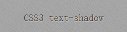
Set text shadow text-shadow

In fact, text-shadow is not a new property designed in CSS3, which was already in place at CSS 2.0, then deleted in CSS 2.1 and eventually re-incorporated in CSS3.

Grammar:
text-shadow : offset-x || offset-y || opacity || color
The property supports four parameters: the shadow color, the horizontal extension of the shadow (the x-axis offset of the shadow), the vertical extension of the shadow (the y-axis offset of the shadow), and the radius of motion of the blur effect (the length of the shadow). Perhaps this introduction to the concept will be a little difficult to understand, let's write a small example to illustrate:
/* For text-shadow */
#example {text-shadow: 1px 1px 2px #d8d8d8; }
Note: CSS code independent of shadow settings is omitted from the code (the same between 2), and the full CSS refers to demo's source code at the end of the article.

The effect is as follows:
CSS3 shadow implementation methods and techniques are fully solved

In addition, text-shadow also supports multiple shadows, for example, to set a triple shadow for a text at the same time, you can write code like this:
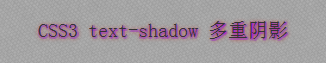
/* For text-shadow 多重阴影 */
#example-muti {text-shadow: 1px 1px 2px #c10ccc, 1px 1px 2px #648cb4, 1px 1px 6px #cc150c;
}

The effect is as follows:
CSS3 shadow implementation methods and techniques are fully solved

It is important to note that in multiple shadows, the order of shadows does not necessarily behave the same in different versions of the browser, because in CSS 2.0, the shadows defined first in the code appear at the bottom, while in CSS3, the shadows defined first appear at the top. In newer versions of modern browsers (Kayo tested Chrome 22.0.1229.94, Firefox 17.0.1, Safari 5.1.7, Opera 12.11) the multiple shadows are rendered in the order of CSS3, but there will still be differences in some modern browsers in earlier versions, which will be explained when describing browser support.

Compared to pictures, it's a lot easier to solve a problem with one property now. H owever, as you may have guessed, the IE of the cup does not support CSS shadows (so neither text-shadow IE8 and the following versions support box-shadow), so for IE, if you need to achieve the same effect above, you need to use IE private filter shadow or dropshadow. The specific use of these two filters will also be somewhat different, as detailed below:

If you use the shadow filter, developers can write code like this for the above examples:
progid:DXImageTransform.Microsoft.shadow(Color='#d8d8d8', Direction='135', Strength='2'); zoom: 1; }
The shadow filter has three parameters, namely, shadow color, shadow offset angle, and shadow length, where the shadow offset angle needs to be calculated to obtain, in the example, "135" degrees. If you're used to setting shadows with offset values, you can use another filter, dropshadow, as follows:
#example-ie {filter: progid:DXImageTransform.Microsoft.DropShadow(OffX='1', OffY='1', Color='#d8d8d8', Positive='true'); zoom: 1; }
The effect is as follows:
CSS3 shadow implementation methods and techniques are fully solved

Dropshadow has four parameters: shadow x-axis offset, shadow y-axis offset, shadow color, and last positive property to decide whether to create a visible projection only for non-transparent pixels, the default value is true, that is, only for non-transparent pixels, or if false, for transparent pixels.

Both filters also support multiple shadows, which developers can write as follows, but will actually work much worse than text-shadow.
/* IE 下多重阴影 */
#example-ie-muti {filter: DropShadow(OffX='1', OffY='1', Color='#c10ccc', Positive='true') DropShadow(OffX='1', OffY='1', Color='#648cb4', Positive='true') DropShadow(OffX='1', OffY='1', Color='#cc150c', Positive='true'); zoom: 1; }

In addition, when using the above two filters, there are a few points to note:
1, if the element set the background color at the same time, then the above two filters will fail, because the shadow filter does not distinguish between text shadows and container shadows like the CSS filter, when the developer sets the background color for the element, IE automatically adds a shadow to the element and cancels its Chinese-word shadow. There will be a complex mechanism for dealing with this process, which will be explained separately below.

2, shadow color needs to use a shape such as "#aabbcc" such as writing, can not use "#abc" such short writing, if you use short rote, will automatically use black as the shadow color and ignore the specified color, and the shadow distance is not controllable (do not use the specified value).

3, to make multiple shadows effective, the element must trigger hasLayout, the most commonly used is to set zoom: 1 or specify the height and width of the element. I n addition, in IE7 and below versions of IE, using a single filter also requires triggering the element's hasLayout. With regard to hasLayout, we'll cover it in a future article