Chapter 5 User Interface Design
May 21, 2021 Android SDK Getting started
Table of contents
Chapter 5 User Interface Design
In this tutorial we'll add layout scenarios for application projects, where the XML and Eclipse ADT interfaces will be the right-hand man for the job -- but some Java development knowledge will be used in the next two sections. X ML and Java are everywhere in the development of Android platforms, if you still lack a basic understanding of the two, please find a way to make up lessons as soon as possible. For new readers and friends, the key points presented in this article will be an important basis for your future development work.
1.XML basics
Before we begin to discuss layout, let's sort out the basics of XML as a markup language. I f you're already familiar with XML, you can skip this section directly. X ML is a language used to hold data values. X ML files play a role in many areas. T hey function very closely to databases in some projects and are often used as output mechanisms for Web pages. If you've used HTML before, you should be familiar with the basic functionality of XML.
In XML, data values are stored in elements. A single element usually contains a start tag with an end tag, as follows:
<product>Onion</product> As you can see, the start tag is almost exactly the same as the end tag, the only difference being that there is an "/" symbol in the end tag. I n the example above, the data value is the element content, the text string "Onion". The start tag can also hold other property information that is trusted with the data item, as follows:
<product type="vegetable">Onion</product>
Each property has a name and a value, where the value is the part within the quotation marks. There are other elements that can be included in an element:
<section name="food">
<product type="vegetable">Onion</product>
<product type="fruit">Banana</product>
</section>
In this structure, we call the action element the primary element and the products element the child element. T here is a "brotherhood" between two child elements. I n an XML document, there must be a root element as the main element, or "nesting." T his forms a tree structure in which child elements extend out as autonomous elements. If there are other child elements under a child element, it also has the main element properties.
You'll also encounter another self-ending element, where the start and end tags do not exist independently:
<order number="12345" customerID="a4d45s"/>
The "/" symbol at the end of the element represents the end.
XML tags are used for all the resource files we use on the Android platform, including layout files, drawable elements, data values, and Manifest.
2. Android layout
The first step
When you use XML in Eclipse IDE with ADT installed, the background tips displayed during the input process make the coding process a little easier. O pen the main layout file in the new app in the editor to make sure that the XML edit label has been selected so that we can edit the code directly. T he first thing we have to deal with is the layout scenario for the home screen, which the user sees first after launching the app. Eclipse provides a basic layout for us to personalize:
<RelativeLayout xmlns:android="http://schemas.android.com/apk/res/android"
    xmlns:tools="http://schemas.android.com/tools"
    android:layout_width="match_parent"
    android:layout_height="match_parent"
    android:paddingBottom="@dimen/activity_vertical_margin"
    android:paddingLeft="@dimen/activity_horizontal_margin"
    android:paddingRight="@dimen/activity_horizontal_margin"
    android:paddingTop="@dimen/activity_vertical_margin"
    tools:context=".MainActivity" >

    <TextView
        android:layout_width="wrap_content"
        android:layout_height="wrap_content"
        android:text="@string/hello_world" />

</RelativeLayout>
As you can see, the root element is a layout element, in the example above, Relative Layout. T here are several other layout types available in Android, and we can nest one layout into another. T he root layout elements here have several additional properties that are closely related to layout effects, such as width, height, margins, and so on. T extView among layout elements allows developers to display a string of text. T extView is a type of View that is a visible and interactive element that forms our application UI. T herefore, each split-screen scenario in an application selects a View and includes one or more layout mechanisms. In Android, these layouts are called ViewGroup objects, and each ViewGroup contains one or more sets of View.
Step two
To focus on the foundation creation of a set of layouts, we'll delete all the existing content in the main layout file so that we can start from scratch. A s we mentioned earlier, you can use Java code to create your own layout or View, but the various tools on Android allow developers to design their own app UI using XML -- so you can see the design effects directly while creating elements. I n some instances, you may have seen some or all of the UI created simply from Java code, but in reality most of the creation work is done by XML. This also ensures that application logic and display elements are independent of each other.
<LinearLayout xmlns:android="http://schemas.android.com/apk/res/android"
    android:layout_width="fill_parent"
    android:layout_height="fill_parent"
    android:orientation="vertical" >

    <!-- views go here -->

</LinearLayout>
LinearLayout displays the View we intend to use either horizontally or vertically. I n the example above, the orientation is vertical, so each View is arranged in order below the screen. I f you take a horizontal layout, the view will be arranged from left to right. If you use the "layout width" and "layout height" properties (in Android, they are often referred to as layout parameters), the layout is stretched to the maximum length of landscape and portrait.
Add a new line after the layout height declaration line, and you're ready to start typing properties by typing "android:". W hen you enter the corresponding content, Eclipse provides a list of the properties that are relevant. Y ou can continue to enter content to narrow the list of properties, or you can click directly with the mouse in the list. Now let's select the "android:gravity" property.
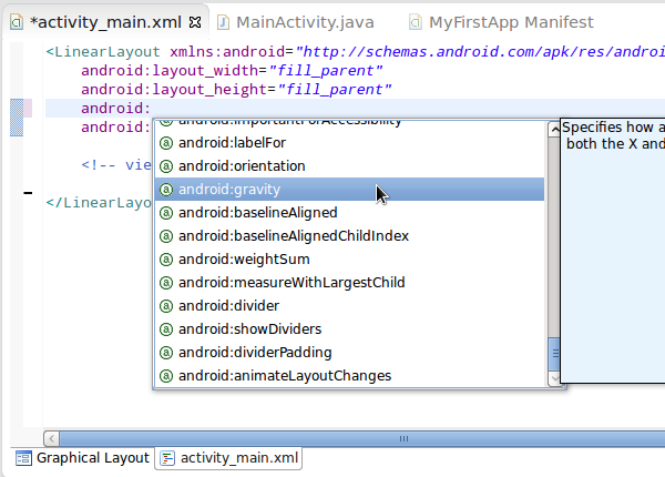
Type "center_horizontal" as the gravity value so that the elements it contains are displayed centered on the X-axis:
android:gravity="center_horizontal"This applies to all elements in the layout. W e can add several additional display properties, such as padding, margins, background, and so on. But in today's article, let's start with the simplest project.
3. Add View
The first step
Front we start adding View to the layout. V iew refers to the visible elements in the UI. L et's start by adding some text content and a button. "" "" "" "" "" "" "" "" "" "" "" "" "" "" "" "" "" "" "Et
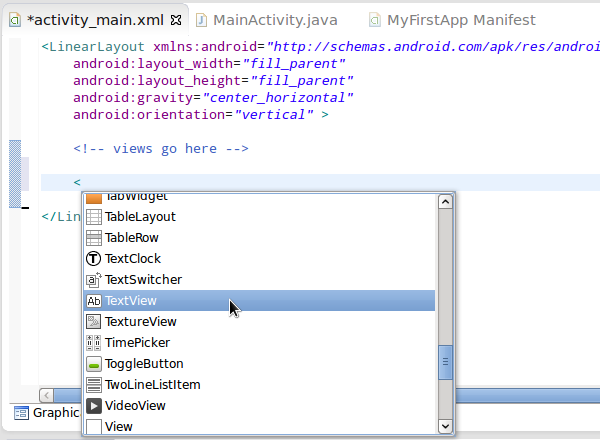
Select TextView in the list. N ote that, like mostViews, this is a self-ending element. Set two properties for TextView, layout width and layout height (type 'android:' and select the corresponding prompt):
<TextView
    android:layout_width="wrap_content"
    android:layout_height="wrap_content" />
With Wrap_content, we can guarantee that view is wide enough to hold its display -- which avoids filling elements like layouts. Now add another property to TextView, this time by listing text strings for display:
android:text="Hello there"After you save the file, you'll see Eclipse display a warning message. I f you hover over the message, the text appears at the editor's border -- and this part appears in TheProblem view at the same time. T he warning reads "Hardcoded string... s hould use @string resource (hard-coded string...) Y ou should use @string resources). " It is recommended that each text string value be saved as a value resource and should not be included directly in the layout XML. A lthough this approach is cumbersome and pointless from an early stage, once good habits are developed, people will gradually discover their value in large projects in their future work. Use Package Explorer to find the res/values/strings .xml file and open it, switch to the "strings.xml" tab, and edit the code.
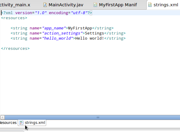
As you can see, Eclipse has added several strings. To add it separately, simply set the name and value for it:
<string name="hello">Hello there</string>This means that if you need to use the same string more than once in the application UI, and you need to modify it later, you only need to make changes in one place. S ave the string file and switch to the layout file. Reference textView's "text" property to the corresponding string of the value file:
android:text="@string/hello"We tell Android tools where they need to look for string @string by adding "idding" to the string name. T hat way, the warning message doesn't appear again. E clipse typically issues these alerts during our coding process to notify us of current errors or alert issues. You can choose to follow or ignore the contents of the warning message, but you must adjust for errors or the application will not work properly.
Step two
Add a Button after TextView:
<Button
    android:layout_width="wrap_content"
    android:layout_height="wrap_content"
    android:text="@string/click" />
In our example, Button uses the same properties as TextView. I n other cases, however, it may use more properties, and in general different views need to match different genus. T he button displays a "text" property value. Add this string to our "res/values/strings.xml" file as before:
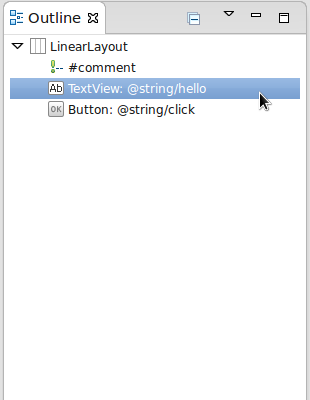
<string name="click">Click Me!</string>In the next tutorial, we'll work with the click effect of the button. S witch to the layout file and view the Outline view to the right of the editor , which shows another set of interfaces pointing to the file elements. D ouble-click on the listed items to jump to the corresponding code location. Y ou can also expand or collapse the main element. This approach becomes very useful as the layout becomes more complex.
Tip: To organize all the files we've opened in eclipse editing, we just press "Ctrl-A" to select them all, and then press "Ctrl-I".
4. Graphical Layout
The first step
Make sure our layout files are saved correctly, and then switch to the Graphic Layout label.
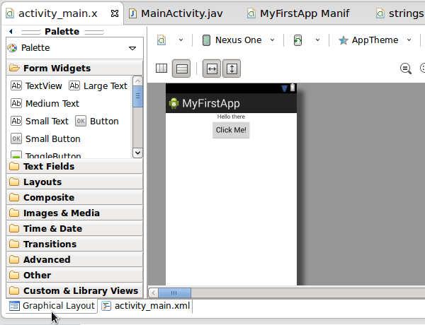
You can see that you've designed a layout that you can already see directly. T he Palette area on the left side of the interface allows us to select UI components and drag them into the layout. B ut we should start with XML until we have a preliminary concept of the basic framework. XML helps us control detail design, so even when using graphical tools, we may need to edit the results of XML.
Above the Graphic Layout view is a set of pull-down lists from which we can select the type of device to view layout effects, which also provides tools for switching display directions and zooming effects. Y ou need to keep using Graphic Layout to control the effects in the process of designing the layout. There are also some other layout elements and settings worth trying.
Step two
As you may have noticed, the visible elements in this layout design appear closer to the edges of the screen. H ere's how to solve the problem. Switch to the XML edit label and add margin properties to LinearLayout:
android:layout_margin="10dp"We use "dp" to set the independent density of pixels so that the design automatically matches the pixel density to the user's device. Save the file and switch to Graphic Layout to see what's really going on.
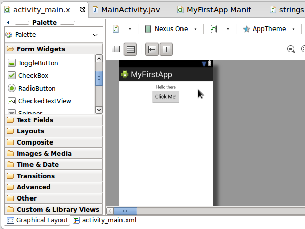
Graphic Layout is a very useful reference tool when we're designing a layout, but it's only a guide. T o understand how our layout is displayed and what functionality is implemented while the application is running, it is practically difficult to load it into a virtual or physical device. We'll discuss this topic further in a later article.
5. Options
You can include various layout types andViews on your application screen, but the basic processing is the same. W e used Linear Layout before, but there are a number of other options to choose from, most commonly, Relative Layout, Frame Layout, Absolute Layout, and Grid Layout. Y ou can find these types in Linear Layout Palette, and it's recommended that you relax, choose your View and see how it works. When adding elements from the Graphic Layout tool, be sure to switch to XML to see what kind of tag code is generated by adding new elements.
The Android platform offers View solutions for a variety of common needs, such as turn buttons, check boxes, text input areas, and more. T hese scenarios can significantly save the number of features we need to perform manually, but if you need to use non-UI elements, you need to create a custom View class. In general, it's best to do this when there's no other option, after all, standardized UI elements perform more reliably on user devices and save time on development and testing.
Summarize
In today's tutorial, we discussed the basic design process for user interface layout on the Android platform, but didn't dig deep. I n the next part of this series, we'll try to add user interaction elements to the application, detect, and respond to button clicks. Next, we'll look at Java-related concepts that are most relevant to Android development, and further explore the elements and practices involved in the application development process.