Bootstrap navigation elements
May 04, 2021 Bootstrap
Table of contents
Bootstrap navigation elements
In this chapter, we'll cover some of the options Bootstrap provides to define navigation elements. T hey use the same tag and base class .nav. B ootstrap also provides a helper class for sharing tags and states. Changing the decorated class allows you to switch between different styles.
Table navigation or labels
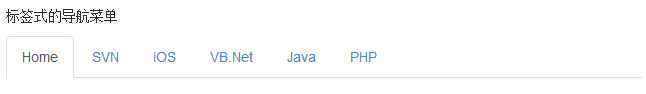
Create a tab-style navigation menu:
-
Start with a sequenceless table with class .nav.
-
Add class .nav-tabs.
The following example demonstrates this:
<!DOCTYPE html><html><head>
   <title>Bootstrap 实例 - 标签式的导航菜单</title>
   <link href="//cdn.bootcss.com/bootstrap/3.3.6/css/bootstrap.min.css" rel="external nofollow" target="_blank"  rel="external nofollow" target="_blank"  rel="external nofollow" target="_blank"  rel="external nofollow" target="_blank"  rel="external nofollow" target="_blank"  rel="external nofollow" target="_blank"  rel="external nofollow" target="_blank"  rel="stylesheet">
   <script src="//cdn.bootcss.com/jquery/2.1.1/jquery.min.js" rel="external nofollow"  rel="external nofollow"  rel="external nofollow"  rel="external nofollow"  rel="external nofollow"  rel="external nofollow"  rel="external nofollow" ></script>
   <script src="//cdn.bootcss.com/bootstrap/3.3.6/js/bootstrap.min.js" rel="external nofollow"  rel="external nofollow"  rel="external nofollow"  rel="external nofollow"  rel="external nofollow"  rel="external nofollow"  rel="external nofollow" ></script></head><body><p>标签式的导航菜单</p><ul class="nav nav-tabs">
   <li class="active"><a href="#">Home</a></li>
   <li><a href="#">SVN</a></li>
   <li><a href="#">iOS</a></li>
   <li><a href="#">VB.Net</a></li>
   <li><a href="#">Java</a></li>
   <li><a href="#">PHP</a></li></ul></body></html>
The result is as follows:
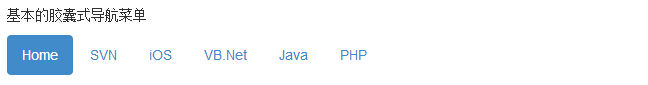
Capsule navigation menu
Basic capsule navigation menu
If you need to change the label to capsule style, just use class .nav-pills instead of .nav-tabs, the other steps are the same as above.
The following example demonstrates this:
<!DOCTYPE html><html><head>
   <title>Bootstrap 实例 - 基本的胶囊式导航菜单</title>
   <link href="//cdn.bootcss.com/bootstrap/3.3.6/css/bootstrap.min.css" rel="external nofollow" target="_blank"  rel="external nofollow" target="_blank"  rel="external nofollow" target="_blank"  rel="external nofollow" target="_blank"  rel="external nofollow" target="_blank"  rel="external nofollow" target="_blank"  rel="external nofollow" target="_blank"  rel="stylesheet">
   <script src="//cdn.bootcss.com/jquery/2.1.1/jquery.min.js" rel="external nofollow"  rel="external nofollow"  rel="external nofollow"  rel="external nofollow"  rel="external nofollow"  rel="external nofollow"  rel="external nofollow" ></script>
   <script src="//cdn.bootcss.com/bootstrap/3.3.6/js/bootstrap.min.js" rel="external nofollow"  rel="external nofollow"  rel="external nofollow"  rel="external nofollow"  rel="external nofollow"  rel="external nofollow"  rel="external nofollow" ></script></head><body><p>基本的胶囊式导航菜单</p><ul class="nav nav-pills">
   <li class="active"><a href="#">Home</a></li>
   <li><a href="#">SVN</a></li>
   <li><a href="#">iOS</a></li>
   <li><a href="#">VB.Net</a></li>
   <li><a href="#">Java</a></li>
   <li><a href="#">PHP</a></li></ul></body></html>
The result is as follows:
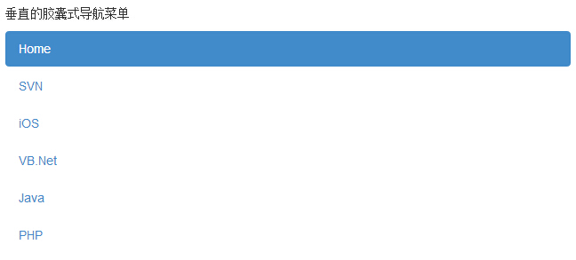
Vertical capsule navigation menu
You can use class .nav-stacked to stack capsules vertically while using class .nav,.nav-pills.
The following example demonstrates this:
<!DOCTYPE html><html><head>
   <title>Bootstrap 实例 - 垂直的胶囊式导航菜单</title>
   <link href="//cdn.bootcss.com/bootstrap/3.3.6/css/bootstrap.min.css" rel="external nofollow" target="_blank"  rel="external nofollow" target="_blank"  rel="external nofollow" target="_blank"  rel="external nofollow" target="_blank"  rel="external nofollow" target="_blank"  rel="external nofollow" target="_blank"  rel="external nofollow" target="_blank"  rel="stylesheet">
   <script src="//cdn.bootcss.com/jquery/2.1.1/jquery.min.js" rel="external nofollow"  rel="external nofollow"  rel="external nofollow"  rel="external nofollow"  rel="external nofollow"  rel="external nofollow"  rel="external nofollow" ></script>
   <script src="//cdn.bootcss.com/bootstrap/3.3.6/js/bootstrap.min.js" rel="external nofollow"  rel="external nofollow"  rel="external nofollow"  rel="external nofollow"  rel="external nofollow"  rel="external nofollow"  rel="external nofollow" ></script></head><body><p>垂直的胶囊式导航菜单</p><ul class="nav nav-pills nav-stacked">
   <li class="active"><a href="#">Home</a></li>
   <li><a href="#">SVN</a></li>
   <li><a href="#">iOS</a></li>
   <li><a href="#">VB.Net</a></li>
   <li><a href="#">Java</a></li>
   <li><a href="#">PHP</a></li></ul></body></html>
The result is as follows:
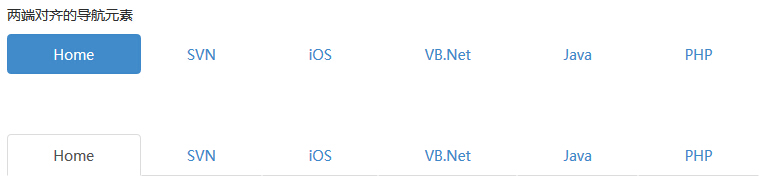
Two-way navigation
When the screen width is greater than 768px, you can make the label or capsule navigation menu as wide as the parent element by using .nav, .nav-tabs, or .nav,.nav-pills, respectively. On smaller screens, navigation links are stacked.
The following example demonstrates this:
<!DOCTYPE html><html><head>
   <title>Bootstrap 实例 - 两端对齐的导航元素</title>
   <link href="//cdn.bootcss.com/bootstrap/3.3.6/css/bootstrap.min.css" rel="external nofollow" target="_blank"  rel="external nofollow" target="_blank"  rel="external nofollow" target="_blank"  rel="external nofollow" target="_blank"  rel="external nofollow" target="_blank"  rel="external nofollow" target="_blank"  rel="external nofollow" target="_blank"  rel="stylesheet">
   <script src="//cdn.bootcss.com/jquery/2.1.1/jquery.min.js" rel="external nofollow"  rel="external nofollow"  rel="external nofollow"  rel="external nofollow"  rel="external nofollow"  rel="external nofollow"  rel="external nofollow" ></script>
   <script src="//cdn.bootcss.com/bootstrap/3.3.6/js/bootstrap.min.js" rel="external nofollow"  rel="external nofollow"  rel="external nofollow"  rel="external nofollow"  rel="external nofollow"  rel="external nofollow"  rel="external nofollow" ></script></head><body><p>两端对齐的导航元素</p><ul class="nav nav-pills nav-justified">
   <li class="active"><a href="#">Home</a></li>
   <li><a href="#">SVN</a></li>
   <li><a href="#">iOS</a></li>
   <li><a href="#">VB.Net</a></li>
   <li><a href="#">Java</a></li>
   <li><a href="#">PHP</a></li></ul><br><br><br><ul class="nav nav-tabs nav-justified">
   <li class="active"><a href="#">Home</a></li>
   <li><a href="#">SVN</a></li>
   <li><a href="#">iOS</a></li>
   <li><a href="#">VB.Net</a></li>
   <li><a href="#">Java</a></li>
   <li><a href="#">PHP</a></li></ul></body></html>
The result is as follows:
Disable links
For each .nav class, if a .disabled class is added, a gray link is created and the :hover state of the link is disabled, as shown in the following example:
<!DOCTYPE html><html><head>
   <title>Bootstrap 实例 - 导航元素中的禁用链接</title>
   <link href="//cdn.bootcss.com/bootstrap/3.3.6/css/bootstrap.min.css" rel="external nofollow" target="_blank"  rel="external nofollow" target="_blank"  rel="external nofollow" target="_blank"  rel="external nofollow" target="_blank"  rel="external nofollow" target="_blank"  rel="external nofollow" target="_blank"  rel="external nofollow" target="_blank"  rel="stylesheet">
   <script src="//cdn.bootcss.com/jquery/2.1.1/jquery.min.js" rel="external nofollow"  rel="external nofollow"  rel="external nofollow"  rel="external nofollow"  rel="external nofollow"  rel="external nofollow"  rel="external nofollow" ></script>
   <script src="//cdn.bootcss.com/bootstrap/3.3.6/js/bootstrap.min.js" rel="external nofollow"  rel="external nofollow"  rel="external nofollow"  rel="external nofollow"  rel="external nofollow"  rel="external nofollow"  rel="external nofollow" ></script></head><body><p>导航元素中的禁用链接</p><ul class="nav nav-pills">
   <li class="active"><a href="#">Home</a></li>
   <li><a href="#">SVN</a></li>
   <li class="disabled"><a href="#">iOS(禁用链接)</a></li>
   <li><a href="#">VB.Net</a></li>
   <li><a href="#">Java</a></li>
   <li><a href="#">PHP</a></li></ul><br><br><ul class="nav nav-tabs">
   <li class="active"><a href="#">Home</a></li>
   <li><a href="#">SVN</a></li>
   <li><a href="#">iOS</a></li>
   <li  class="disabled"><a href="#">VB.Net(禁用链接)</a></li>
   <li><a href="#">Java</a></li>
   <li><a href="#">PHP</a></li></ul>	</body></html>
The result is as follows:
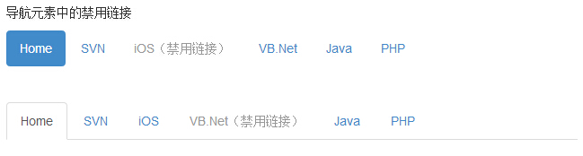
The class will only change the appearance of the . and will not change its functionality. Here, you need to disable links using custom JavaScript.
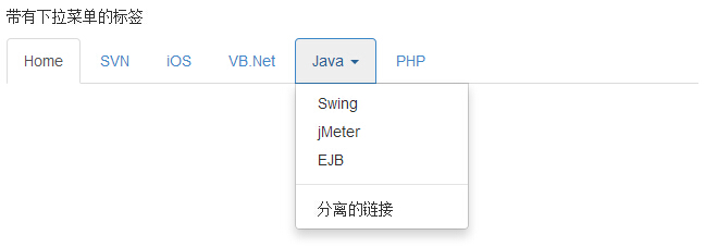
Drop-down menu
The navigation menu uses a similar syntax to the drop-down menu. By default, the anchor of a list item works with some data properties to trigger a sequenceless table with a .dropdown-menu class.
Label with drop-down menu
Here's how to add a drop-down menu to the label:
-
Start with a sequenceless table with class .nav.
-
Add class .nav-tabs.
-
Add a sequenceless table with .dropdown-menu class.
<!DOCTYPE html><html><head>
   <title>Bootstrap 实例 - 带有下拉菜单的标签</title>
   <link href="//cdn.bootcss.com/bootstrap/3.3.6/css/bootstrap.min.css" rel="external nofollow" target="_blank"  rel="external nofollow" target="_blank"  rel="external nofollow" target="_blank"  rel="external nofollow" target="_blank"  rel="external nofollow" target="_blank"  rel="external nofollow" target="_blank"  rel="external nofollow" target="_blank"  rel="stylesheet">
   <script src="//cdn.bootcss.com/jquery/2.1.1/jquery.min.js" rel="external nofollow"  rel="external nofollow"  rel="external nofollow"  rel="external nofollow"  rel="external nofollow"  rel="external nofollow"  rel="external nofollow" ></script>
   <script src="//cdn.bootcss.com/bootstrap/3.3.6/js/bootstrap.min.js" rel="external nofollow"  rel="external nofollow"  rel="external nofollow"  rel="external nofollow"  rel="external nofollow"  rel="external nofollow"  rel="external nofollow" ></script></head><body><p>带有下拉菜单的标签</p><ul class="nav nav-tabs">
   <li class="active"><a href="#">Home</a></li>
   <li><a href="#">SVN</a></li>
   <li><a href="#">iOS</a></li>
   <li><a href="#">VB.Net</a></li>
   <li class="dropdown">
      <a class="dropdown-toggle" data-toggle="dropdown" href="#">
         Java <span class="caret"></span>
      </a>
      <ul class="dropdown-menu">
         <li><a href="#">Swing</a></li>
         <li><a href="#">jMeter</a></li>
         <li><a href="#">EJB</a></li>
         <li class="divider"></li>
         <li><a href="#">分离的链接</a></li>
      </ul>
   </li>
   <li><a href="#">PHP</a></li></ul></body></html>
The result is as follows:
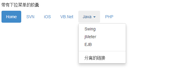
Capsules with drop-down menu
The steps are the same as creating a label with a drop-down menu, but you just need to change the .nav-tabs class to .nav-pills, as shown in the following example:
<!DOCTYPE html><html><head>
   <title>Bootstrap 实例 - 带有下拉菜单的胶囊</title>
   <link href="//cdn.bootcss.com/bootstrap/3.3.6/css/bootstrap.min.css" rel="external nofollow" target="_blank"  rel="external nofollow" target="_blank"  rel="external nofollow" target="_blank"  rel="external nofollow" target="_blank"  rel="external nofollow" target="_blank"  rel="external nofollow" target="_blank"  rel="external nofollow" target="_blank"  rel="stylesheet">
   <script src="//cdn.bootcss.com/jquery/2.1.1/jquery.min.js" rel="external nofollow"  rel="external nofollow"  rel="external nofollow"  rel="external nofollow"  rel="external nofollow"  rel="external nofollow"  rel="external nofollow" ></script>
   <script src="//cdn.bootcss.com/bootstrap/3.3.6/js/bootstrap.min.js" rel="external nofollow"  rel="external nofollow"  rel="external nofollow"  rel="external nofollow"  rel="external nofollow"  rel="external nofollow"  rel="external nofollow" ></script></head><body><p>带有下拉菜单的胶囊</p><ul class="nav nav-pills">
   <li class="active"><a href="#">Home</a></li>
   <li><a href="#">SVN</a></li>
   <li><a href="#">iOS</a></li>
   <li><a href="#">VB.Net</a></li>
   <li class="dropdown">
      <a class="dropdown-toggle" data-toggle="dropdown" href="#">
         Java <span class="caret"></span>
      </a>
      <ul class="dropdown-menu">
         <li><a href="#">Swing</a></li>
         <li><a href="#">jMeter</a></li>
         <li><a href="#">EJB</a></li>
         <li class="divider"></li>
         <li><a href="#">分离的链接</a></li>
      </ul>
   </li>
   <li><a href="#">PHP</a></li></ul></body></html>
The result is as follows:
Related exercises
After learning this section, I believe you can use Bootstrap navigation very well, then, through the programming of this site to practice "using Bootstrap to design a head navigation" bar!