Bootstrap input box group
May 04, 2021 Bootstrap
Table of contents
Bootstrap input box group
This chapter explains another feature supported by Bootstrap, entering box groups. T he input box group is extended from the form control. With input box groups, you can easily add text or buttons as prefixes and suffixes to text-based input boxes.
By adding prefixes and suffixes to the input domain, you can add common elements to the user's input. For example, you can add a dollar sign, or you can add a hashtag before your Twitter username, or you can add another common element that the application interface requires.
Here's how to add a prefix or suffix element to .form-control:
-
Place the prefix or suffix element in a .lt;div.gt; with class .input-group.
-
Next, in the same . . . .
-
Place the .lt;span> in front or behind the .lt;input> element.
To maintain cross-browser compatibility, avoid using the elements because they do not render the effect completely in a WebKit browser. Also don't apply the class of the input box group directly to the form group, which is an isolated component.
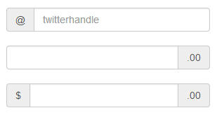
Basic input box group
The following example demonstrates a basic set of input boxes:
<!DOCTYPE html><html><head>
   <title>Bootstrap 实例 - 基本的输入框组</title>
   <link href="//cdn.bootcss.com/bootstrap/3.3.6/css/bootstrap.min.css" rel="external nofollow" target="_blank"  rel="external nofollow" target="_blank"  rel="external nofollow" target="_blank"  rel="external nofollow" target="_blank"  rel="external nofollow" target="_blank"  rel="external nofollow" target="_blank"  rel="stylesheet">
   <script src="//cdn.bootcss.com/jquery/2.1.1/jquery.min.js" rel="external nofollow"  rel="external nofollow"  rel="external nofollow"  rel="external nofollow"  rel="external nofollow"  rel="external nofollow" ></script>
   <script src="//cdn.bootcss.com/bootstrap/3.3.6/js/bootstrap.min.js" rel="external nofollow"  rel="external nofollow"  rel="external nofollow"  rel="external nofollow"  rel="external nofollow"  rel="external nofollow" ></script></head><body><div style="padding: 100px 100px 10px;">
   <form class="bs-example bs-example-form" role="form">
      <div class="input-group">
         <span class="input-group-addon">@</span>
         <input type="text" class="form-control" placeholder="twitterhandle">
      </div>
      <br>

      <div class="input-group">
         <input type="text" class="form-control">
         <span class="input-group-addon">.00</span>
      </div>
      <br>
      <div class="input-group">
         <span class="input-group-addon">$</span>
         <input type="text" class="form-control">
         <span class="input-group-addon">.00</span>
      </div>
   </form></div></body></html>
The result is as follows:
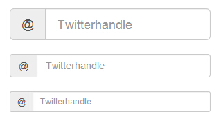
Enter the size of the box group
You can change the size of the input box group by adding a relative form-sized class (such as .input-group-lg, input-group-sm, input-group-xs) to .input-group. The contents of the input box are automatically resized.
The following example demonstrates this:
<!DOCTYPE html><html><head>
   <title>Bootstrap 实例 - 输入框组的大小</title>
   <link href="//cdn.bootcss.com/bootstrap/3.3.6/css/bootstrap.min.css" rel="external nofollow" target="_blank"  rel="external nofollow" target="_blank"  rel="external nofollow" target="_blank"  rel="external nofollow" target="_blank"  rel="external nofollow" target="_blank"  rel="external nofollow" target="_blank"  rel="stylesheet">
   <script src="//cdn.bootcss.com/jquery/2.1.1/jquery.min.js" rel="external nofollow"  rel="external nofollow"  rel="external nofollow"  rel="external nofollow"  rel="external nofollow"  rel="external nofollow" ></script>
   <script src="//cdn.bootcss.com/bootstrap/3.3.6/js/bootstrap.min.js" rel="external nofollow"  rel="external nofollow"  rel="external nofollow"  rel="external nofollow"  rel="external nofollow"  rel="external nofollow" ></script></head><body><div style="padding: 100px 100px 10px;">
   <form class="bs-example bs-example-form" role="form">
      <div class="input-group input-group-lg">
         <span class="input-group-addon">@</span>
         <input type="text" class="form-control" placeholder="Twitterhandle">
      </div><br>

      <div class="input-group">
         <span class="input-group-addon">@</span>
         <input type="text" class="form-control" placeholder="Twitterhandle">
      </div><br>

      <div class="input-group input-group-sm">
         <span class="input-group-addon">@</span>
         <input type="text" class="form-control" placeholder="Twitterhandle">
      </div>
   </form></div></body></html>
The result is as follows:
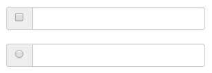
Check boxes and select plug-ins
You can use check boxes and options as prefix or suffix elements for input box groups, as shown in the following example:
<!DOCTYPE html><html><head>
   <title>Bootstrap 实例 - 输入框组的复选框和单选插件</title>
   <link href="//cdn.bootcss.com/bootstrap/3.3.6/css/bootstrap.min.css" rel="external nofollow" target="_blank"  rel="external nofollow" target="_blank"  rel="external nofollow" target="_blank"  rel="external nofollow" target="_blank"  rel="external nofollow" target="_blank"  rel="external nofollow" target="_blank"  rel="stylesheet">
   <script src="//cdn.bootcss.com/jquery/2.1.1/jquery.min.js" rel="external nofollow"  rel="external nofollow"  rel="external nofollow"  rel="external nofollow"  rel="external nofollow"  rel="external nofollow" ></script>
   <script src="//cdn.bootcss.com/bootstrap/3.3.6/js/bootstrap.min.js" rel="external nofollow"  rel="external nofollow"  rel="external nofollow"  rel="external nofollow"  rel="external nofollow"  rel="external nofollow" ></script></head><body><div style="padding: 100px 100px 10px;">
   <form class="bs-example bs-example-form" role="form">
      <div class="row">
         <div class="col-lg-6">
            <div class="input-group">
               <span class="input-group-addon">
                  <input type="checkbox">
               </span>
               <input type="text" class="form-control">
            </div><!-- /input-group -->
         </div><!-- /.col-lg-6 --><br>
         <div class="col-lg-6">
            <div class="input-group">
               <span class="input-group-addon">
                  <input type="radio">
               </span>
               <input type="text" class="form-control">
            </div><!-- /input-group -->
         </div><!-- /.col-lg-6 -->
      </div><!-- /.row -->
   </form></div></body></html>
The result is as follows:
Tip: In this site's Bootstrap programming practice, you can familiarize yourself with the use of Bootstrap check boxes and single-click plug-ins through practice, please refer to the "Using Bootstrap Responsive Check boxes" and "Using Bootstrap Responsive Turn buttons" section for details!
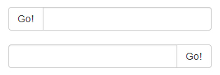
Button plug-in
You can also use the button as a prefix or suffix element for the input box group, and you're not adding .input-group-addon class, you need to wrap the button using class .input-group-btn. T his is required because the default browser style is not override. The following example demonstrates this:
<!DOCTYPE html><html><head>
   <title>Bootstrap 实例 - 输入框组的按钮插件</title>
   <link href="//cdn.bootcss.com/bootstrap/3.3.6/css/bootstrap.min.css" rel="external nofollow" target="_blank"  rel="external nofollow" target="_blank"  rel="external nofollow" target="_blank"  rel="external nofollow" target="_blank"  rel="external nofollow" target="_blank"  rel="external nofollow" target="_blank"  rel="stylesheet">
   <script src="//cdn.bootcss.com/jquery/2.1.1/jquery.min.js" rel="external nofollow"  rel="external nofollow"  rel="external nofollow"  rel="external nofollow"  rel="external nofollow"  rel="external nofollow" ></script>
   <script src="//cdn.bootcss.com/bootstrap/3.3.6/js/bootstrap.min.js" rel="external nofollow"  rel="external nofollow"  rel="external nofollow"  rel="external nofollow"  rel="external nofollow"  rel="external nofollow" ></script></head><body><div style="padding: 100px 100px 10px;">
   <form class="bs-example bs-example-form" role="form">
      <div class="row">
         <div class="col-lg-6">
            <div class="input-group">
               <span class="input-group-btn">
                  <button class="btn btn-default" type="button">
                     Go!                  </button>
               </span>
               <input type="text" class="form-control">
            </div><!-- /input-group -->
         </div><!-- /.col-lg-6 --><br>
         <div class="col-lg-6">
            <div class="input-group">
               <input type="text" class="form-control">
               <span class="input-group-btn">
                  <button class="btn btn-default" type="button">
                     Go!                  </button>
               </span>
            </div><!-- /input-group -->
         </div><!-- /.col-lg-6 -->
      </div><!-- /.row -->
   </form></div></body></html>
The result is as follows:
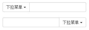
Button with drop-down menu
To add a button with a drop-down menu to an input box group, simply wrap the button and drop-down menu in a .input-group-btn class, as shown in the following example:
<!DOCTYPE html><html><head>
   <title>Bootstrap 实例 - 输入框组的下拉菜单按钮</title>
   <link href="//cdn.bootcss.com/bootstrap/3.3.6/css/bootstrap.min.css" rel="external nofollow" target="_blank"  rel="external nofollow" target="_blank"  rel="external nofollow" target="_blank"  rel="external nofollow" target="_blank"  rel="external nofollow" target="_blank"  rel="external nofollow" target="_blank"  rel="stylesheet">
   <script src="//cdn.bootcss.com/jquery/2.1.1/jquery.min.js" rel="external nofollow"  rel="external nofollow"  rel="external nofollow"  rel="external nofollow"  rel="external nofollow"  rel="external nofollow" ></script>
   <script src="//cdn.bootcss.com/bootstrap/3.3.6/js/bootstrap.min.js" rel="external nofollow"  rel="external nofollow"  rel="external nofollow"  rel="external nofollow"  rel="external nofollow"  rel="external nofollow" ></script></head><body><div style="padding: 100px 100px 10px;">
   <form class="bs-example bs-example-form" role="form">
      <div class="row">
         <div class="col-lg-6">
            <div class="input-group">
               <div class="input-group-btn">
                  <button type="button" class="btn btn-default
                     dropdown-toggle" data-toggle="dropdown">
                     下拉菜单
                     <span class="caret"></span>
                  </button>
                  <ul class="dropdown-menu">
                     <li><a href="#">功能</a></li>
                     <li><a href="#">另一个功能</a></li>
                     <li><a href="#">其他</a></li>
                     <li class="divider"></li>
                     <li><a href="#">分离的链接</a></li>
                  </ul>
               </div><!-- /btn-group -->
               <input type="text" class="form-control">
            </div><!-- /input-group -->
         </div><!-- /.col-lg-6 --><br>
         <div class="col-lg-6">
            <div class="input-group">
               <input type="text" class="form-control">
               <div class="input-group-btn">
                  <button type="button" class="btn btn-default
                     dropdown-toggle" data-toggle="dropdown">
                     下拉菜单
                     <span class="caret"></span>
                  </button>
                  <ul class="dropdown-menu pull-right">
                     <li><a href="#">功能</a></li>
                     <li><a href="#">另一个功能</a></li>
                     <li><a href="#">其他</a></li>
                     <li class="divider"></li>
                     <li><a href="#">分离的链接</a></li>
                  </ul>
               </div><!-- /btn-group -->
            </div><!-- /input-group -->
         </div><!-- /.col-lg-6 -->
      </div><!-- /.row -->
   </form></div></body></html>
The result is as follows:
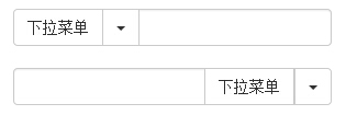
Split the drop-down menu button
Add a split button with a drop-down menu to the input box group, using much the same style as the drop-down menu button, but adding the main functionality to the drop-down menu, as shown in the following example:
<!DOCTYPE html><html><head>
   <title>Bootstrap 实例 - 输入框组中分割的下拉菜单按钮</title>
   <link href="//cdn.bootcss.com/bootstrap/3.3.6/css/bootstrap.min.css" rel="external nofollow" target="_blank"  rel="external nofollow" target="_blank"  rel="external nofollow" target="_blank"  rel="external nofollow" target="_blank"  rel="external nofollow" target="_blank"  rel="external nofollow" target="_blank"  rel="stylesheet">
   <script src="//cdn.bootcss.com/jquery/2.1.1/jquery.min.js" rel="external nofollow"  rel="external nofollow"  rel="external nofollow"  rel="external nofollow"  rel="external nofollow"  rel="external nofollow" ></script>
   <script src="//cdn.bootcss.com/bootstrap/3.3.6/js/bootstrap.min.js" rel="external nofollow"  rel="external nofollow"  rel="external nofollow"  rel="external nofollow"  rel="external nofollow"  rel="external nofollow" ></script></head><body><div style="padding: 100px 100px 10px;">
   <form class="bs-example bs-example-form" role="form">
      <div class="row">
         <div class="col-lg-6">
            <div class="input-group">
               <div class="input-group-btn">
                  <button type="button" class="btn btn-default"
                     tabindex="-1">下拉菜单                  </button>
                  <button type="button" class="btn btn-default
                     dropdown-toggle" data-toggle="dropdown" tabindex="-1">
                     <span class="caret"></span>
                     <span class="sr-only">切换下拉菜单</span>
                  </button>
                  <ul class="dropdown-menu">
                     <li><a href="#">功能</a></li>
                     <li><a href="#">另一个功能</a></li>
                     <li><a href="#">其他</a></li>
                     <li class="divider"></li>
                     <li><a href="#">分离的链接</a></li>
                  </ul>
               </div><!-- /btn-group -->
               <input type="text" class="form-control">
            </div><!-- /input-group -->
         </div><!-- /.col-lg-6 --><br>
         <div class="col-lg-6">
            <div class="input-group">
               <input type="text" class="form-control">
               <div class="input-group-btn">
                  <button type="button" class="btn btn-default"
                     tabindex="-1">下拉菜单                  </button>
                  <button type="button" class="btn btn-default
                     dropdown-toggle" data-toggle="dropdown" tabindex="-1">
                     <span class="caret"></span>
                     <span class="sr-only">切换下拉菜单</span>
                  </button>
                  <ul class="dropdown-menu pull-right">
                     <li><a href="#">功能</a></li>
                     <li><a href="#">另一个功能</a></li>
                     <li><a href="#">其他</a></li>
                     <li class="divider"></li>
                     <li><a href="#">分离的链接</a></li>
                  </ul>
               </div><!-- /btn-group -->
            </div><!-- /input-group -->
         </div><!-- /.col-lg-6 -->
      </div><!-- /.row -->
   </form></div></body></html>
The result is as follows: