Bootstrap grid system
May 30, 2021 Article blog
Table of contents
First, grid system (layout)
Bootstrap has a responsive, mobile-first streaming grid system that automatically divides into up to 12 columns as the size of the screen device or viewport increases.
Here I call the grid system in Bootstrap layout. I t's about creating a page layout with a series of rows and columns, and then your content can be put into the layout you've created. Here's a quick look at how the Bootstrap raster system works:
Grid system implementation principle is very simple, only by defining the size of the container, divided equally 12 (also divided into 24 or 32 copies, but 12 are the most common), and then adjust the internal and external margins, and finally combined with media inquiries, on the system made a strong responsive grid system. The grid system in the Bootstrap framework is to split the container flat into 12 parts.
When using, you can recompile the LES (or Sass) source code to modify the value of 12 (i.e. change to 24 or 32, of course, you can also divide into more, but this is not recommended).
Second, the use of rules
Bootstrap has built-in responsive, mobile devices.
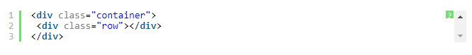
1. The data row (.row) must be contained in the container (.container) in order to give it the appropriate alignment and padding. as:
2. Columns can be added in rows (.row), but the sum of the columns cannot exceed the total number of equally divided columns, such as 12. as:
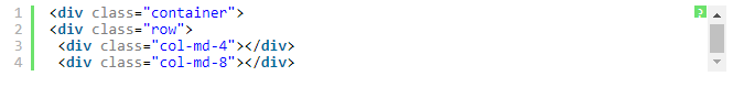
3, the specific content should be placed in the column container (column), and only column (column) can be used as a row container (.row) direct child elements
4, by setting the distance (padding) to create the distance between the column and the column. The effect of padding is then offset by setting negative margins for the first and last columns
To better understand how the Bootstrap framework works, let's look at a sketch:
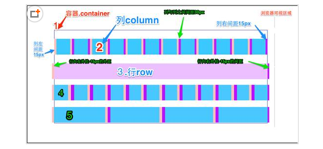
Simply explain the diagram:
1, the outermost border, with a large area of white, is equivalent to the browser's visual area. The Botstrap framework's grid system has a responsive effect with four types of browsers (small screen, small screen, medium screen and large screen) with breakpoints (pixel demarcation points) of 768px, 992px, and 1220px.
2, the second border (1) is equivalent to the container (.container). T he widths vary for different browser resolutions: auto, 750px, 970px, and 1170px. Set up on lines 736 to 756 of the bootstrap .css:
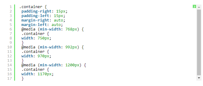
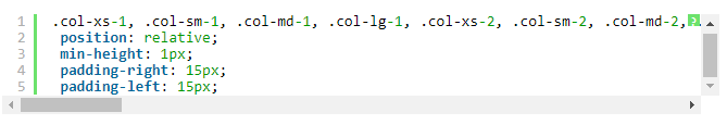
The 3rd and 2nd bars state that the rows of the container (.row) are divided equally into 12 equal parts, i.e. columns. E ach column has a "padding-left:15px" (pink part in the figure) and a "padding-right:15px" (purple part in the figure). T his also results in padding-left in the first column and padding-right in the last column taking up 30px of the total width, which makes the page unsweetening, which is fine if you need to leave a certain spacing. As shown in lines 767 to 772 of the bootstrap .css:
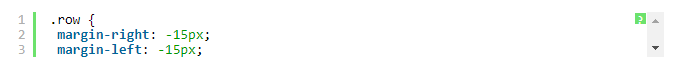
The 4th and 3rd bars are row containers (.row), which define the "margin-left" and "margin-right" values of "-15px" to offset the left and last columns of the first column. You can see in lines 763 to 767 of the bootstrap .css:
5, the row and column together can see the effect of horizontal bar 4. That is, the effect we expect to see, there is no space between the first and last columns and the container (.container).
Bar 5 just wants to show you that you can combine columns and columns as needed, but the sum of their combined numbers should not exceed the total number of columns.
Third, grid options
The screenshot below provides a clearer picture of how Bootstrap's grid system works on a variety of different mobile devices.
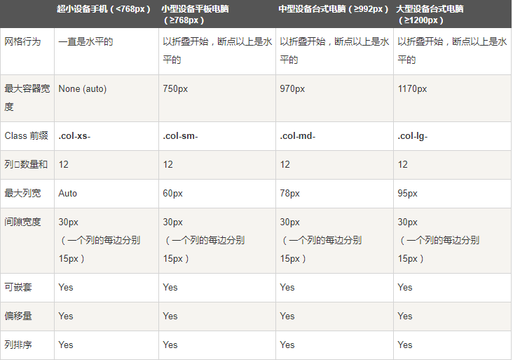
As can be seen from the screenshot above, Bootstrap sets different style classes for different sizes of screens, including phones, tablets, PCs, and so on, giving developers more choices when developing. A s I understand it, if you use more than one different style class on an element, the element selects the most appropriate (matching) style class based on the different sizes. H ere are some simple examples: for example, on an element we use two style classes: .col-md-and.col-lg. You can look at it against the screenshot above
The first case: size: 1200px; Then choose .col-lg.
The second case: size: 992px and size: 1200px; Then .col-md will be selected.
Third case: if the size of 992px; Neither style class will act on the element.
Fourth, the basic usage
Grid systems are used for layout, but are actually a combination of columns. T here are four basic uses in the grid system of the Bootstrap framework. Because the Bootstrap framework uses different mesh styles for different screen sizes, the examples covered in this section are described in the middle screen (970px) as an example, and other screens use a similar one.
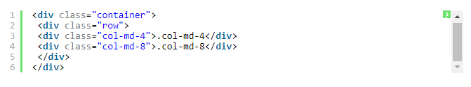
1), column combination
The simple understanding of column composition is to change numbers to merge columns (principle: the sum of columns cannot exceed 12), which is somewhat similar to the colspan property of a table, for example:
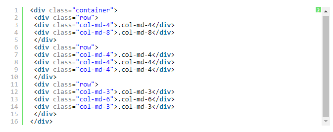
Using the structure above, you'll see the effect of the following image:

V. Column offset
Sometimes we don't want the adjacent two columns to be close together, but we don't want to use margin or other technical means. T his is when you can use the column offset feature. U sing column offsets is also simple, requiring only the class name "col-md-offset-"" to be added to the column element (where the asterisk represents the number of column combinations to be offset), and the columns with the class name are offset to the right. For example, you add "col-md-offset-4" to a column element to indicate that the column moves the width of four columns to the right.
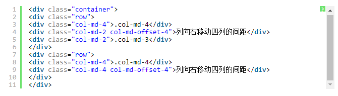
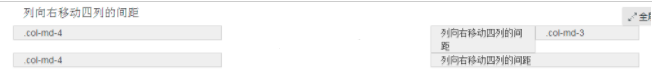
As in the sample code above, the results are as follows
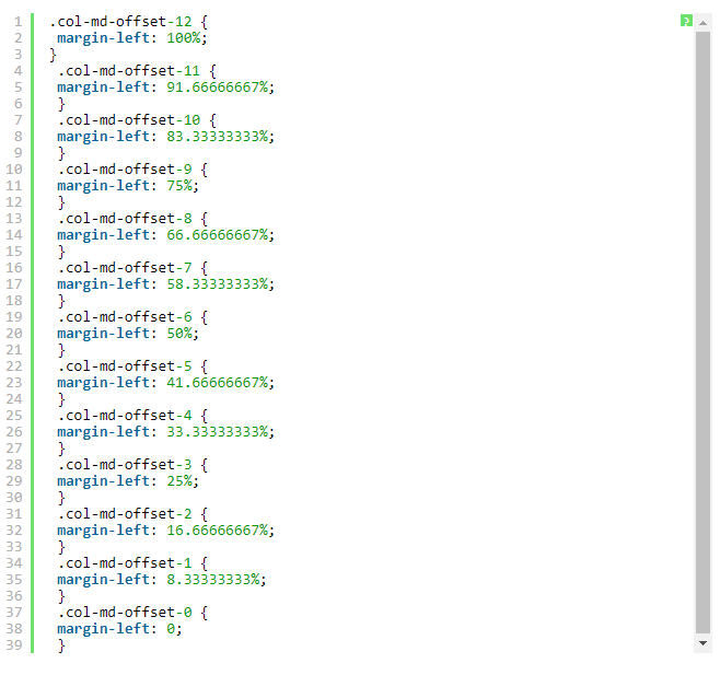
The implementation is very simple, using one-twelfth (1/12) of the margin-left. A nd then how many offsets there are, how many margin-lefts there are. Lines 1205 to 1241 in bootstrap .css are shown:
note:
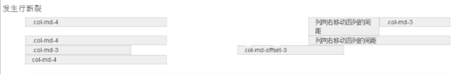
However, there is one detail to note, when using "col-md-offset-", to offset the column to the right, to ensure that the total number of columns and offset columns does not exceed 12, otherwise the column break row display, such as:
<div class="row">
  <div class="col-md-3">.col-md-3</div>
  <div class="col-md-3 col-md-offset-3">col-md-offset-3</div>
  <div class="col-md-4">col-md-4</div>
</div>
The total number of columns and offset columns in the above code is 3 s 3 s 3 s 4 s 13 > 12, so a column break row occurs.
As in the sample code above, the results are as follows
6, column sort column sorting is actually changing the direction of the column, that is, change the left and right floating, and set the floating distance. In the mesh system of the Bootstrap framework, class names "col-md-push-" and "col-md-pull-" are added (where asterisks represent the number of moving column combinations).
Let's look at a simple example:
By default, the above code works as follows:

"col-md-4" to the left, "col-md-8" to the right, if you want to swap positions, you need to move "col-md-4" to the right of the distance of 8 columns, that is, 8 offsets, that is, in the "<div class" col-md-4" > "add class name "col-md-push-8" to call its style.
Also move "col-md-8" to the left by 4 columns, i.e. 4 offsets, and add the class name "col-md-pull-4" on "> <div class","

7, the grid system of the nested Bootstrap framework of columns also supports the nesting of columns. Y ou can add one or more row containers to a column, and then insert columns in that row container (use columns as described earlier). B ut row in a column container, with a width of 100%, is the width of the current external column. Let's look at a simple example:
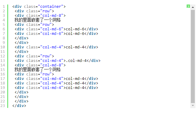
The effect is as follows:

Note: The total number of nested columns also needs to follow no more than 12 columns. Otherwise, the last row break is displayed.