Bootstrap button group
May 04, 2021 Bootstrap
Table of contents
Bootstrap button group
Button groups allow multiple buttons to be stacked on the same line. T his is useful when you want to align buttons together. You can add optional JavaScript check box and check box style behavior through the Bootstrap button plug-in.
The following table summarizes some of the important classes that Bootstrap provides for using button groups:
| Class | describe | Code example |
|---|---|---|
| .btn-group | This Class is used to form a basic button group.exist .btn-group Place a series of classes with Class .btn Button. |
<div class="btn-group"> <button type="button" class="btn btn-default">Button1</button> <button type="button" class="btn btn-default">Button2</button> </div> |
| .btn-toolbar | 该 class 有助于把几组 <div class="btn-group"> 结合到一个 <div class="btn-toolbar"> 中,一般获得更复杂的组件。 |
<div class="btn-toolbar" role="toolbar"> <div class="btn-group">...</div> <div class="btn-group">...</div> </div> |
| .btn-group-lg, .btn-group-sm, .btn-group-xs | These CLASs can be applied to the size adjustment of the entire button group without the need to adjust each button. |
<div class="btn-group btn-group-lg">...</div> <div class="btn-group btn-group-sm">...</div> <div class="btn-group btn-group-xs">...</div> |
| .btn-group-vertical | This class allows a set of buttons to stack the display instead of horizontal stack. |
<div class="btn-group-vertical"> ... </div> |
The basic set of buttons
The following example demonstrates the use of class .btn-group discussed in the table above:
<!DOCTYPE html>
<html>
<head>
   <title>Bootstrap 实例 - 基本的按钮组</title>
   <link href="//cdn.bootcss.com/bootstrap/3.3.6/css/bootstrap.min.css" rel="external nofollow" target="_blank"  rel="external nofollow" target="_blank"  rel="external nofollow" target="_blank"  rel="external nofollow" target="_blank"  rel="external nofollow" target="_blank"  rel="stylesheet">
   <script src="//cdn.bootcss.com/jquery/2.1.1/jquery.min.js" rel="external nofollow"  rel="external nofollow"  rel="external nofollow"  rel="external nofollow"  rel="external nofollow" ></script>
   <script src="//cdn.bootcss.com/bootstrap/3.3.6/js/bootstrap.min.js" rel="external nofollow"  rel="external nofollow"  rel="external nofollow"  rel="external nofollow"  rel="external nofollow" ></script>
</head>
<body>

<div class="btn-group">
  <button type="button" class="btn btn-default">按钮 1</button>
  <button type="button" class="btn btn-default">按钮 2</button>
  <button type="button" class="btn btn-default">按钮 3</button>
</div>

</body>
</html>
The result is as follows:

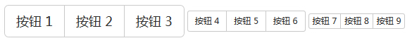
Button toolbar
The following example demonstrates the use of class .btn-toolbar discussed in the table above:
<!DOCTYPE html>
<html>
<head>
   <title>Bootstrap 实例 - 按钮工具栏</title>
   <link href="//cdn.bootcss.com/bootstrap/3.3.6/css/bootstrap.min.css" rel="external nofollow" target="_blank"  rel="external nofollow" target="_blank"  rel="external nofollow" target="_blank"  rel="external nofollow" target="_blank"  rel="external nofollow" target="_blank"  rel="stylesheet">
   <script src="//cdn.bootcss.com/jquery/2.1.1/jquery.min.js" rel="external nofollow"  rel="external nofollow"  rel="external nofollow"  rel="external nofollow"  rel="external nofollow" ></script>
   <script src="//cdn.bootcss.com/bootstrap/3.3.6/js/bootstrap.min.js" rel="external nofollow"  rel="external nofollow"  rel="external nofollow"  rel="external nofollow"  rel="external nofollow" ></script>
</head>
<body>

<div class="btn-toolbar" role="toolbar">
  <div class="btn-group">
  <button type="button" class="btn btn-default">按钮 1</button>
  <button type="button" class="btn btn-default">按钮 2</button>
  <button type="button" class="btn btn-default">按钮 3</button>
 </div>
  <div class="btn-group">
  <button type="button" class="btn btn-default">按钮 4</button>
  <button type="button" class="btn btn-default">按钮 5</button>
  <button type="button" class="btn btn-default">按钮 6</button>
  </div>
  <div class="btn-group">
  <button type="button" class="btn btn-default">按钮 7</button>
  <button type="button" class="btn btn-default">按钮 8</button>
  <button type="button" class="btn btn-default">按钮 9</button>
  </div>
</div>

</body>
</html>
The result is as follows:

The size of the button
The following example demonstrates the use of class .btn-group-?discussed in the table above:
<!DOCTYPE html>
<html>
<head>
   <title>Bootstrap 实例 - 按钮组的大小</title>
   <link href="//cdn.bootcss.com/bootstrap/3.3.6/css/bootstrap.min.css" rel="external nofollow" target="_blank"  rel="external nofollow" target="_blank"  rel="external nofollow" target="_blank"  rel="external nofollow" target="_blank"  rel="external nofollow" target="_blank"  rel="stylesheet">
   <script src="//cdn.bootcss.com/jquery/2.1.1/jquery.min.js" rel="external nofollow"  rel="external nofollow"  rel="external nofollow"  rel="external nofollow"  rel="external nofollow" ></script>
   <script src="//cdn.bootcss.com/bootstrap/3.3.6/js/bootstrap.min.js" rel="external nofollow"  rel="external nofollow"  rel="external nofollow"  rel="external nofollow"  rel="external nofollow" ></script>
</head>
<body>

<div class="btn-group btn-group-lg">
  <button type="button" class="btn btn-default">按钮 1</button>
  <button type="button" class="btn btn-default">按钮 2</button>
  <button type="button" class="btn btn-default">按钮 3</button>
 </div>
  <div class="btn-group btn-group-sm">
  <button type="button" class="btn btn-default">按钮 4</button>
  <button type="button" class="btn btn-default">按钮 5</button>
  <button type="button" class="btn btn-default">按钮 6</button>
</div>
  <div class="btn-group btn-group-xs">
  <button type="button" class="btn btn-default">按钮 7</button>
  <button type="button" class="btn btn-default">按钮 8</button>
  <button type="button" class="btn btn-default">按钮 9</button>
</div>

</body>
</html>
The result is as follows:
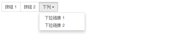
Nesting
You can nest another button group within one button group, that is, another .btn-group within one .btn-group. This is used when you want the drop-down menu to be combined with a series of buttons.
<!DOCTYPE html>
<html>
<head>
   <title>Bootstrap 实例 - 嵌套的按钮组</title>
   <link href="//cdn.bootcss.com/bootstrap/3.3.6/css/bootstrap.min.css" rel="external nofollow" target="_blank"  rel="external nofollow" target="_blank"  rel="external nofollow" target="_blank"  rel="external nofollow" target="_blank"  rel="external nofollow" target="_blank"  rel="stylesheet">
   <script src="//cdn.bootcss.com/jquery/2.1.1/jquery.min.js" rel="external nofollow"  rel="external nofollow"  rel="external nofollow"  rel="external nofollow"  rel="external nofollow" ></script>
   <script src="//cdn.bootcss.com/bootstrap/3.3.6/js/bootstrap.min.js" rel="external nofollow"  rel="external nofollow"  rel="external nofollow"  rel="external nofollow"  rel="external nofollow" ></script>
</head>
<body>

<div class="btn-group">
  <button type="button" class="btn btn-default">按钮 1</button>
  <button type="button" class="btn btn-default">按钮 2</button>

  <div class="btn-group">
    <button type="button" class="btn btn-default dropdown-toggle"        data-toggle="dropdown">
      下列
      <span class="caret"></span>
    </button>
    <ul class="dropdown-menu">
      <li><a href="#">下拉链接 1</a></li>
      <li><a href="#">下拉链接 2</a></li>
    </ul>
  </div>
</div>

</body>
</html>
The result is as follows:
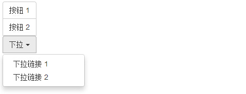
Vertical set of buttons
The following example demonstrates the use of class .btn-group-vertical discussed in the table above:
<!DOCTYPE html>
<html>
<head>
   <title>Bootstrap 实例 - 垂直的按钮组</title>
   <link href="//cdn.bootcss.com/bootstrap/3.3.6/css/bootstrap.min.css" rel="external nofollow" target="_blank"  rel="external nofollow" target="_blank"  rel="external nofollow" target="_blank"  rel="external nofollow" target="_blank"  rel="external nofollow" target="_blank"  rel="stylesheet">
   <script src="//cdn.bootcss.com/jquery/2.1.1/jquery.min.js" rel="external nofollow"  rel="external nofollow"  rel="external nofollow"  rel="external nofollow"  rel="external nofollow" ></script>
   <script src="//cdn.bootcss.com/bootstrap/3.3.6/js/bootstrap.min.js" rel="external nofollow"  rel="external nofollow"  rel="external nofollow"  rel="external nofollow"  rel="external nofollow" ></script>
</head>
<body>

<div class="btn-group-vertical">
  <button type="button" class="btn btn-default">按钮 1</button>
  <button type="button" class="btn btn-default">按钮 2</button>

  <div class="btn-group-vertical">
    <button type="button" class="btn btn-default dropdown-toggle"        data-toggle="dropdown">
      下拉
      <span class="caret"></span>
    </button>
    <ul class="dropdown-menu">
      <li><a href="#">下拉链接 1</a></li>
      <li><a href="#">下拉链接 2</a></li>
    </ul>
  </div>
</div>

</body>
</html>
The result is as follows: