A variety of CSS3 gradient application methods summarize the attached examples
May 04, 2021 CSS3
Table of contents
1. The syntax of the linear gradient of CSS color
2. The syntax of a linear gradient
3. The syntax of radial gradients
As shown in the following image, in the web design, sometimes need to use gradient effects, gradients can create a rainbow-like visual pattern effect, in order to show a gradient needs to make a special picture, this kind of law is not only inflexible but also increase the number of requests, and CSS3 can easily achieve the page gradient effect, used to do gradient background, gradient navigation, with CSS3 animation to do special effects. I n CSS3, Gradient is divided into linear-gradient (linear gradient) and radial-gradient (radial gradient). The syntax of the CSS color linear gradient is slightly different in various browsers, but in the end it is uniform:

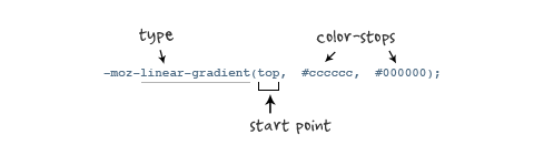
The syntax of the linear gradient of CSS color
background-image: linear-gradient(<point> || <angle>,]? <stop>, <stop> [, <stop>]*)
The first argument is the starting point or angle of the gradient. T
he second parameter is a color stop. Y
ou need at least two colors (start and end), and you can add any color to increase the richness of the color gradient.
The definition of a color stop can be a color, or a color plus a percentage:
/*  color-stop(percentage/amount, color) */
color-stop(0.20, red)
#example1 {
/* 底色 */
background-color: #063053;
/* chrome 2+, safari 4+; multiple color stops */
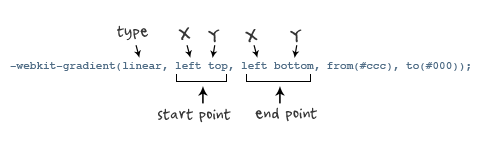
background-image:-webkit-gradient(linear, left bottom, left top, color-stop(0.32, #063053), color-stop(0.66, #395873), color-stop(0.83, #5c7c99));
/* chrome 10+, safari 5.1+ */
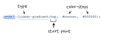
background-image: -webkit-linear-gradient(#063053, #395873, #5c7c99);
/* firefox; multiple color stops */
background-image: -moz-linear-gradient(top,#063053, #395873, #5c7c99);
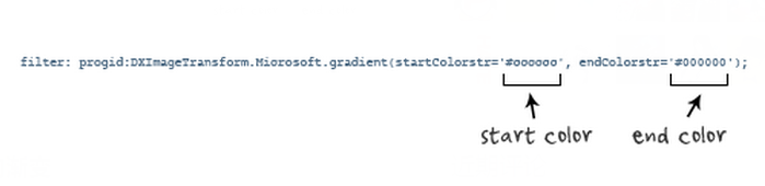
/* ie 6+ */
filter: progid:DXImageTransform.Microsoft.gradient(startColorstr='#063053', endColorstr='#395873');
/* ie8 + */
-ms-filter: "progid:DXImageTransform.Microsoft.gradient(startColorstr='#063053', endColorstr='#395873')";
/* ie10 */
background-image: -ms-linear-gradient(#063053, #395873, #5c7c99);
/* opera 11.1 */
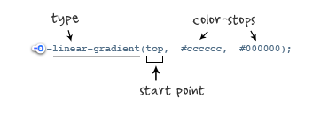
background-image: -o-linear-gradient(#063053, #395873, #5c7c99);
/* 标准写法 */
background-image: linear-gradient(#063053, #395873, #5c7c99);
#example2	{
	/* fallback */
	background-color:#063053;
	/* chrome 2+, safari 4+; multiple color stops */
	background-image:-webkit-gradient(linear, left bottom, right top, color-stop(0.32, #063053), color-stop(0.66, #395873), color-stop(0.83, #5c7c99));
	/* chrome 10+, safari 5.1+ */
	background-image:-webkit-linear-gradient(45deg, #063053, #395873, #5c7c99);
	/* firefox; multiple color stops */
	background-image:-moz-linear-gradient(45deg, #063053, #395873, #5c7c99);
	/* ie10 */
	background-image: -ms-linear-gradient(45deg, #063053 0%, #395873 100%);
	/* opera 11.1 */
	background-image: -o-linear-gradient(45deg, #063053, #395873);
	/* The "standard" */
	background-image: linear-gradient(45deg, #063053, #395873);
}
/* example 3 - linear rainbow */
#example3	{
	/* fallback */
	background-color:#063053;
	/* chrome 2+, safari 4+; multiple color stops */
	background-image:-webkit-gradient(linear, left bottom, left top, color-stop(0.20, red), color-stop(0.40, green), color-stop(0.6, blue), color-stop(0.8, purple), color-stop(1, orange));
	/* chrome 10+, safari 5.1+ */
	background-image:-webkit-linear-gradient(red, green, blue, purple, orange);
	/* firefox; multiple color stops */
	background-image:-moz-linear-gradient(top, red, green, blue, purple, orange);
	/* ie10 */
	background-image: -ms-linear-gradient(red, green, blue, purple, orange);
	/* opera 11.1 */
	background-image: -o-linear-gradient(red, green, blue, purple, orange);
	/* The "standard" */
	background-image: linear-gradient(red, green, blue, purple, orange);
}
Some explanations for IE's support for CSS color gradient techniques: In the early days IE used the filter and -ms-filter syntax to implement gradients, while the latest version of IE changed to the -ms-linear-gradient syntax.
We can solve this problem by using the conditional judgment statement in CSS:
<!--[if lt IE 10]>
<style>
.gradientElement {
	filter: progid:DXImageTransform.Microsoft.gradient(startColorstr='#063053', endColorstr='#395873');
	-ms-filter: "progid:DXImageTransform.Microsoft.gradient(startColorstr='#063053', endColorstr='#395873')";
}
</style>
<![endif]-->
The syntax of a linear gradient
Object Selector (background:-browser prefix-linear-gradient (start direction, start color, end color); }
The syntax of radial gradients
Object Selector (background:-browser prefix-radial-gradient (start direction, shape, size, start color, end color); }
A compatible method for gradients
Each browser prefix
(1) Firefox
Radial gradients have similar syntax to linear gradients, see //www.w3cschool.cn/css3/oj26bfli.html
The instance of the gradient application
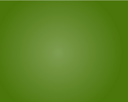
background-color: #4B770A;
background-image: -webkit-gradient(radial,
                        50% 400, 1,
                        50% 400, 400,
                        from(rgba(255, 255, 255, 0.3)),
                        to(rgba(255, 255, 255, 0)));
//仅实现了webkit下的效果

position: fixed;
    width: 100%;
    height: 60px;
    bottom: 0px;
    content: '';
    background: -moz-linear-gradient(top, rgba(255, 255, 255, 0) 0%, rgba(255, 255, 255, 0.33) 33%, rgba(255, 255, 255, 0.73) 66%, rgba(255, 255, 255, 1) 91%);
    background: -webkit-gradient(linear, left top, left bottom, color-stop(0%,rgba(255, 255, 255, 0)), color-stop(33%,rgba(255, 255, 255, 0.33)), color-stop(66%,rgba(255, 255, 255, 0.73)), color-stop(91%,rgba(255, 255, 255, 1)));
    background: -webkit-linear-gradient(top, rgba(255, 255, 255, 0) 0%,rgba(255, 255, 255, 0.33) 33%,rgba(255, 255, 255, 0.73) 66%,rgba(255, 255, 255, 1) 91%);
    background: -o-linear-gradient(top, rgba(255, 255, 255, 0) 0%,rgba(255, 255, 255, 0.33) 33%,rgba(255, 255, 255, 0.73) 66%,rgba(255, 255, 255, 1) 91%);
    background: -ms-linear-gradient(top, rgba(255, 255, 255, 0) 0%,rgba(255, 255, 255, 0.33) 33%,rgba(255, 255, 255, 0.73) 66%,rgba(255, 255, 255, 1) 91%);
    background: linear-gradient(top, rgba(255, 255, 255, 0) 0%,rgba(255, 255, 255, 0.73) 33%,rgba(255, 255, 255, 0.73) 66%,rgba(255, 255, 255, 1) 91%);
    filter:progid:DXImageTransform.Microsoft.gradient( startColorstr='#00ffffff', endColorstr='#ffffff',GradientType=0 );

.myButton {
    -moz-box-shadow:inset 0px 1px 0px 0px #ffffff;
    -webkit-box-shadow:inset 0px 1px 0px 0px #ffffff;
    box-shadow:inset 0px 1px 0px 0px #ffffff;
    background:-webkit-gradient(linear, left top, left bottom, color-stop(0.05, #ededed), color-stop(1, #dfdfdf));
    background:-moz-linear-gradient(top, #ededed 5%, #dfdfdf 100%);
    background:-webkit-linear-gradient(top, #ededed 5%, #dfdfdf 100%);
    background:-o-linear-gradient(top, #ededed 5%, #dfdfdf 100%);
    background:-ms-linear-gradient(top, #ededed 5%, #dfdfdf 100%);
    background:linear-gradient(to bottom, #ededed 5%, #dfdfdf 100%);
    filter:progid:DXImageTransform.Microsoft.gradient(startColorstr='#ededed', endColorstr='#dfdfdf',GradientType=0);
    background-color:#ededed;

    -moz-border-radius:6px;
    -webkit-border-radius:6px;
    border-radius:6px;
    border:1px solid #dcdcdc;
    display:inline-block;
    cursor:pointer;
    color:#777777;
    font-family:arial;
    font-size:15px;
    font-weight:bold;
    padding:6px 24px;
    text-decoration:none;
    text-shadow:0px 1px 0px #ffffff;
    margin-top: 100px;
}
.myButton:hover {
    background:-webkit-gradient(linear, left top, left bottom, color-stop(0.05, #dfdfdf), color-stop(1, #ededed));
    background:-moz-linear-gradient(top, #dfdfdf 5%, #ededed 100%);
    background:-webkit-linear-gradient(top, #dfdfdf 5%, #ededed 100%);
    background:-o-linear-gradient(top, #dfdfdf 5%, #ededed 100%);
    background:-ms-linear-gradient(top, #dfdfdf 5%, #ededed 100%);
    background:linear-gradient(to bottom, #dfdfdf 5%, #ededed 100%);
    filter:progid:DXImageTransform.Microsoft.gradient(startColorstr='#dfdfdf', endColorstr='#ededed',GradientType=0);
    background-color:#dfdfdf;
}
.myButton:active {
    position:relative;
    top:1px;
}
background: radial-gradient(transparent 0, transparent 5px, #F39B00 5px);
background-size: 15px 15px;
background-position: 9px 3px;
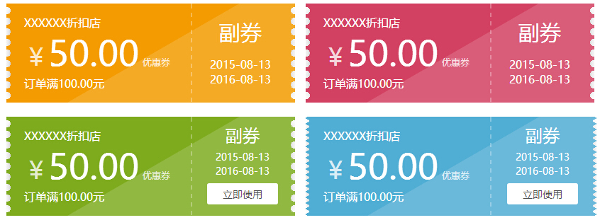
这是公共样式
.stamp {width: 387px;height: 140px;padding: 0 10px;position: relative;overflow: hidden;}
.stamp:before {content: '';position: absolute;top:0;bottom:0;left:10px;right:10px;z-index: -1;}
.stamp:after {content: '';position: absolute;left: 10px;top: 10px;right: 10px;bottom: 10px;box-shadow: 0 0 20px 1px rgba(0, 0, 0, 0.5);z-index: -2;}
.stamp i{position: absolute;left: 20%;top: 45px;height: 190px;width: 390px;background-color: rgba(255,255,255,.15);transform: rotate(-30deg);}
.stamp .par{float: left;padding: 16px 15px;width: 220px;border-right:2px dashed rgba(255,255,255,.3);text-align: left;}
.stamp .par p{color:#fff;}
.stamp .par span{font-size: 50px;color:#fff;margin-right: 5px;}
.stamp .par .sign{font-size: 34px;}
.stamp .par sub{position: relative;top:-5px;color:rgba(255,255,255,.8);}
.stamp .copy{display: inline-block;padding:21px 14px;width:100px;vertical-align: text-bottom;font-size: 30px;color:rgb(255,255,255);}
.stamp .copy p{font-size: 16px;margin-top: 15px;}
.stamp01{background: #F39B00;background: radial-gradient(rgba(0, 0, 0, 0) 0, rgba(0, 0, 0, 0) 5px, #F39B00 5px);background-size: 15px 15px;background-position: 9px 3px;}
.stamp01:before{background-color:#F39B00;}
.stamp02{background: #D24161;background: radial-gradient(transparent 0, transparent 5px, #D24161 5px);background-size: 15px 15px;background-position: 9px 3px;}
.stamp02:before{background-color:#D24161;}
.stamp03{background: #7EAB1E;background: radial-gradient(transparent 0, transparent 5px, #7EAB1E 5px);background-size: 15px 15px;background-position: 9px 3px;}
.stamp03:before{background-color:#7EAB1E;}
.stamp03 .copy{padding: 10px 6px 10px 12px;font-size: 24px;}
.stamp03 .copy p{font-size: 14px;margin-top: 5px;margin-bottom: 8px;}
.stamp03 .copy a{background-color:#fff;color:#333;font-size: 14px;text-decoration:none;padding:5px 10px;border-radius:3px;display: block;}
.stamp04{width: 390px;background: #50ADD3;background: radial-gradient(rgba(0, 0, 0, 0) 0, rgba(0, 0, 0, 0) 4px, #50ADD3 4px);background-size: 12px 8px;background-position: -5px 10px;}
.stamp04:before{background-color:#50ADD3;left: 5px;right: 5px;}
.stamp04 .copy{padding: 10px 6px 10px 12px;font-size: 24px;}
.stamp04 .copy p{font-size: 14px;margin-top: 5px;margin-bottom: 8px;}
.stamp04 .copy a{background-color:#fff;color:#333;font-size: 14px;text-decoration:none;padding:5px 10px;border-radius:3px;display: block;}
<div class="stamp stamp01">
<div class="par"><p>XXXXXX折扣店</p><sub class="sign">¥</sub><span>50.00</span><sub>优惠券</sub><p>订单满100.00元</p></div>
<div class="copy">副券<p>2015-08-13<br>2016-08-13</p></div>
<i></i>
</div>
<div class="stamp stamp02">
<div class="par"><p>XXXXXX折扣店</p><sub class="sign">¥</sub><span>50.00</span><sub>优惠券</sub><p>订单满100.00元</p></div>
<div class="copy">副券<p>2015-08-13<br>2016-08-13</p></div>
<i></i>
</div>
<div class="stamp stamp03">
<div class="par"><p>XXXXXX折扣店</p><sub class="sign">¥</sub><span>50.00</span><sub>优惠券</sub><p>订单满100.00元</p></div>
<div class="copy">副券<p>2015-08-13<br>2016-08-13</p><a href="#">立即使用</a></div>
<i></i>
</div>
<div class="stamp stamp04">
<div class="par"><p>XXXXXX折扣店</p><sub class="sign">¥</sub><span>50.00</span><sub>优惠券</sub><p>订单满100.00元</p></div>
<div class="copy">副券<p>2015-08-13<br>2016-08-13</p><a href="#">立即使用</a></div>
<i></i>
</div>/* 线性渐变 */
.gradient (@origin: top, @start: #ffffff, @stop: #000000) {
background-color: @start;
background-image: -webkit-linear-gradient(@origin, @start, @stop);
background-image: -moz-linear-gradient(@origin, @start, @stop);
background-image: -o-linear-gradient(@origin, @start, @stop);
background-image: -ms-linear-gradient(@origin, @start, @stop);
background-image: linear-gradient(@origin, @start, @stop);
}
/* 快速渐变 */
.quick-gradient (@origin: left, @alpha: 0.2) {
    background-image: -webkit-linear-gradient(@origin, rgba(0,0,0,0.0), rgba(0,0,0,@alpha));
    background-image: -moz-linear-gradient(@origin, rgba(0,0,0,0.0), rgba(0,0,0,@alpha));
    background-image: -o-linear-gradient(@origin, rgba(0,0,0,0.0), rgba(0,0,0,@alpha));
    background-image: -ms-linear-gradient(@origin, rgba(0,0,0,0.0), rgba(0,0,0,@alpha));
    background-image: linear-gradient(@origin, rgba(0,0,0,0.0), rgba(0,0,0,@alpha));
}
//html代码
<div class="div1"></div>
<div class="div2"></div>

//css代码
div{
    width: 200px;
    height: 80px;
    margin: 10px;
}
.div1{
    .gradient(top, #00B7EA, #0391B3);
}
.div2{
    .quick-gradient();
}