CSS background knowledge, an article takes you from shallow to deep comprehensive understanding
Jun 01, 2021 Article blog
The article was reproduced from the public number: Frontman
This article from simple to in-depth explanation of CSS background-related knowledge, please be sure to be patient to read, do not impetuous!
CSS background
is one of the most commonly used
CSS
properties. H
owever, it is still not well understood that multiple backgrounds are used by all developers.
I'll focus on the potential to use multiple backgrounds and take full advantage of the full functionality of
CSS.
In this article,
background-image
explain this property in detail and provide a visual interpreter that explains how to stack multiple backgrounds and their actual benefits.
Of course, there will be some visual examples where you can have a good time!
If you don't understand
CSS background
property, I'd prefer to look at this reference from
Mozilla
Developer Network
MDN
which explains how CSS backspace works.
introduce
CSS background
property is a shorthand for the following properties.
Background clips, background colors, background images, background sources, background locations, background repetitions, background sizes, and background attachments.
In this article, I focus on
background-image
background-position
and
background-size
A
re you ready?
Let's dive in!
Consider the following example.
.element {
 background: url(cool.jpg) top left/50px 50px no-repeat;
}
The background image is positioned around the corner of the component in the upper left corner, with a size of
50px * 50px
It is important to understand and remember the order of location and size.

In the image above,
background-position
is followed by
background-size
v
ice versa!
In other words, the following
CSS
is invalid:
.element {
 /* Warning: Invalid CSS */
 background: url(cool.jpg) 50px 50px/top left no-repeat;
}
The background location
Positioning elements relative to the
background-origin
property settings. I
like the flexibility
background-position
It has several ways to locate elements:
-
Keyword values
top,right,bottom,left,center -
The percentage value.
For example:
50% -
The length value.
For example:
20px 2.5rem -
Edge offset value.
For example:
top 20px left 10px
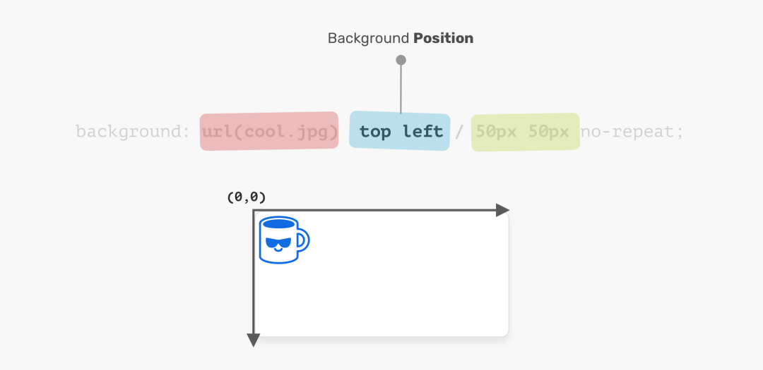
The coordinate system starts in the upper left corner and the default is
0% 0%
It is worth mentioning that the value
top left
is the same
left top
The browser is smart enough to determine which one is for the
x
and which is for the
y
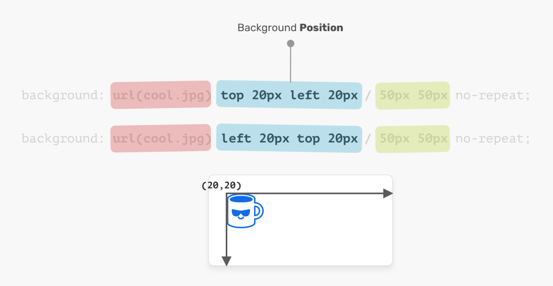
.element {
 background: url(cool.jpg) top left/50px 50px no-repeat;
 /* is the same as */
 background: url(cool.jpg) left top/50px 50px no-repeat;
}
Background size
The name of the property speaks for itself. T
he size consists of
width
and
height
For this
background-size
property, the first is
width
and the second is
height
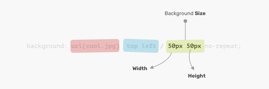
You do not have to use two values. You can use a value that will be used for width and height.
Disclaimer: It is worth mentioning that the
CSSspecification states that "if only one value is given, the second one will be considered automatic". H owever, this feature has not been implemented in the browser and will change in the future. Thanks toIlya Streltsynfor your letter.

Now that I've learned the basics of how
CSS
background
let's explore how to use multiple backgrounds.
A variety of backgrounds
Background properties can have one or more layers, separated by commas. If multiple backgrounds are the same size, one of them overrides the other.
.element {
 background: url(cool.jpg) top left/50px 50px no-repeat,
 url(cool.jpg) center/50px 50px no-repeat;
}
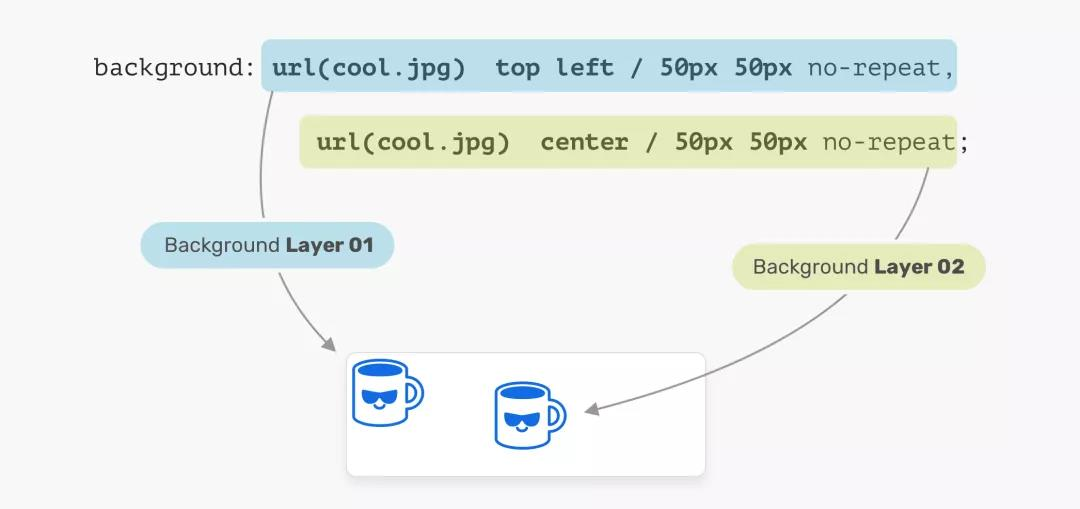
In the image above, we have two background layers. E ach of them is in a different position. T his is the basic use of multiple backgrounds. Let's explore a more advanced example.
Stack order
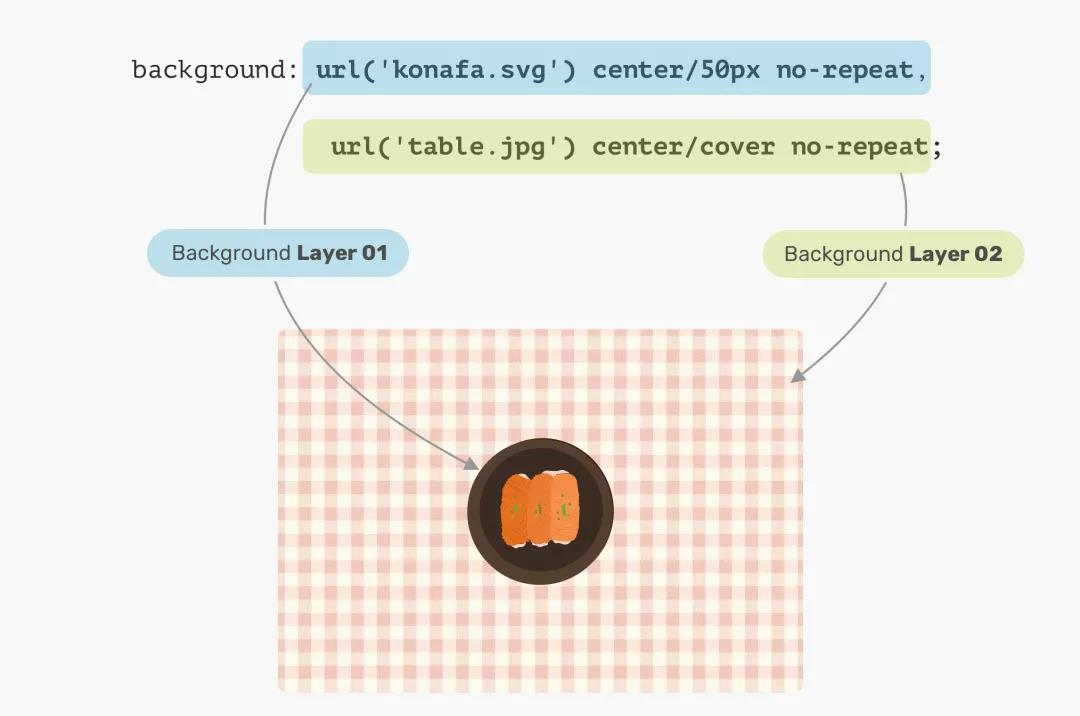
When you place multiple backgrounds, one of the backgrounds occupies the full width and height of its parent, in a stacking order. D eciding when to stack backgrounds on top of each other can be confusing. Consider the following example.
.hero {
  min-height: 350px;
  background: url('table.jpg') center/cover no-repeat,
    url('konafa.svg') center/50px no-repeat;
}
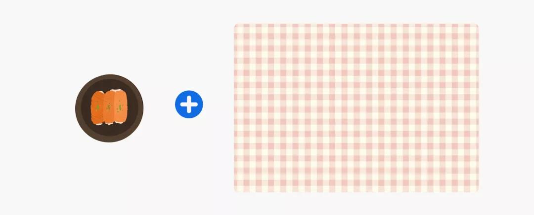
We have a plate and a table. W hat do you want the CSS above to produce? W hich one comes first? A plate or a table?
The answer is the table. I
n
CSS
the first background can be stacked on the second background, the second background can be stacked on the third background, and so on.
By replacing the background order, the results will be expected.
.hero {
  background: url('konafa.svg') center/50px no-repeat,
  url('table.jpg') center/cover no-repeat;
}
Solid color
Suppose you want to draw two rectangles with a
CSS
background, what would you do? F
ortunately, using
CSS
gradients is easy. W
hen
linear-gradient
stops with the same color, the result will be a solid color.
nothing more!
.hero {
 background: linear-gradient(#3c88Ec, #3c88Ec)
}

By exploring a very useful use case for
CSS
gradients, we can take this approach a step further.
Stay tuned for the use case section!
Use cases and examples
superimposing
Typically, you may need to place an overlay at the top of the Hero section to make the text easy to read. This can be done easily by stacking two backgrounds.
.hero {
 background: linear-gradient(rgba(0, 0, 0, 0.15), rgba(0, 0, 0, 0.15)),
    url("landscape.jpg") center/cover;
}

Better yet, we can apply tints to elements in the same way as above. Consider the following:
.hero {
 background: linear-gradient(135deg, rgba(177, 234, 77, 0.25), rgba(69, 149, 34, 0.25),
    url("landscape.jpg") center/cover;
}

Drawing with
CSS
Drawing The possibility of drawing with
CSS
gradients is infinite. Y
ou can use
linear-gradient
or
radial-gradient
more.
For this basic example, I'll explain how to draw a laptop.

Let's remove the laptop and see what gradient we need to use.
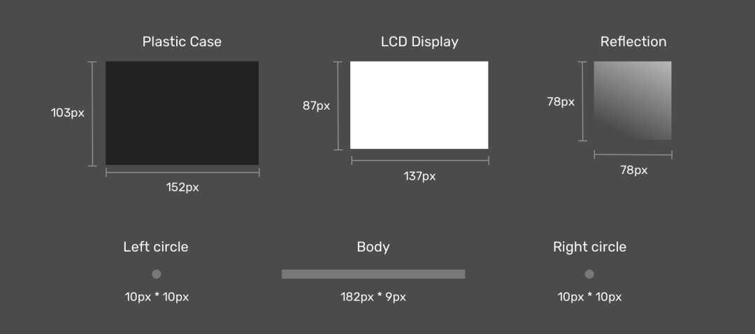
Note that when breaking down laptop projects, it's now easier to think about how to implement them as multiple
CSS
If you notice, I created two circles that act as filleted bodies because there is no direct way to do gradients with round edges.
Next is the drawing. T
he first is to define each gradient as
CSS
variable and its size. I
like to use
CSS
because it reduces the complexity of the code and makes it simpler and easier to read.
When I'm done, I'll go to the steps to place them.
:root {
  --case: linear-gradient(#222, #222);
  --case-size: 152px 103px;


  --display: linear-gradient(#fff, #fff);
  --display-size: 137px 87px;


  --reflection: linear-gradient(205deg, #fff, rgba(255, 255, 255, 0));
  --reflection-size: 78px 78px;


  --body: linear-gradient(#888, #888);
  --body-size: 182px 9px;


  --circle: radial-gradient(9px 9px at 5px 5.5px, #888 50%, transparent 50%);
  --circle-size: 10px 10px;
}
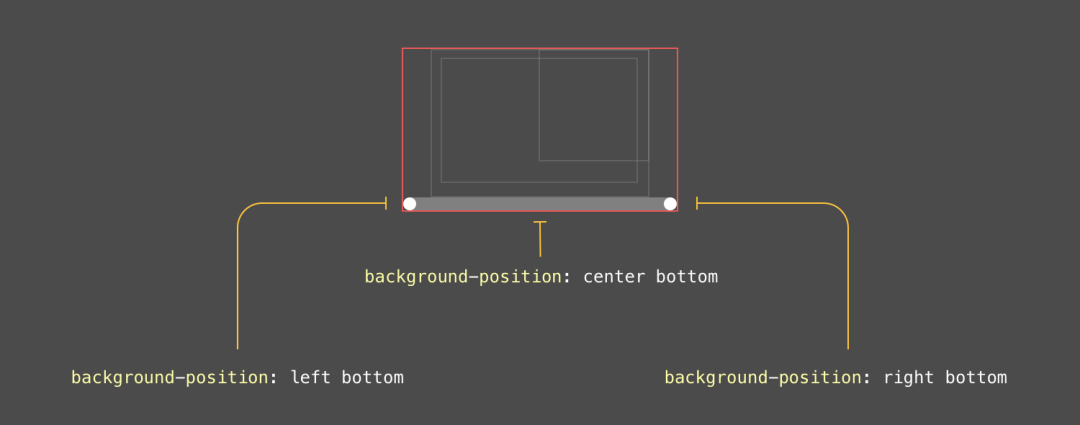
Now that we have defined the gradients and their sizes, the next step is to place them. Consider the following image for a better visual explanation.

Displays the reflection
As mentioned earlier, you should first define the elements that need to be at the top. In our case, the display reflection should be the first gradient.

LCD
The display is located in the center of the x-axis and at the position of the 6pxy axis.

Plastic box
The housing is located below the display and in the center of the x-axis and on the 0pxy axis.

body
That's the most interesting component in graphics. First, the body is a rectangle with two circles on each side (left and right).
The final result
:root {
  --case: linear-gradient(#222, #222);
  --case-size: 152px 103px;
  --case-pos: center 0;


  --display: linear-gradient(#fff, #fff);
  --display-size: 137px 87px;
  --display-pos: center 6px;


  --reflection: linear-gradient(205deg, #fff, rgba(255, 255, 255, 0));
  --reflection-size: 78px 78px;
  --reflection-pos: top right;


  --body: linear-gradient(#888, #888);
  --body-size: 182px 9px;
  --body-pos: center bottom;


  --circle: radial-gradient(9px 9px at 5px 5.5px, #888 50%, transparent 50%);
  --circle-size: 10px 10px;
  --circle-left-pos: left bottom;
  --circle-right-pos: right bottom;
}


.cool {
  width: 190px;
  height: 112px;


  background-image: var(--reflection), var(--display), var(--case), var(--circle), var(--circle), var(--body);


  background-size: var(--reflection-size), var(--display-size), var(--case-size), var(--circle-size), var(--circle-size), var(--body-size);


  background-position: var(--reflection-pos), var(--display-pos), var(--case-pos), var(--circle-left-pos), var(--circle-right-pos), var(--body-pos);


  background-repeat: no-repeat;


  /*outline: solid 1px;*/
}

Mix multiple backgrounds
It's exciting when you can mix multiple backgrounds. T
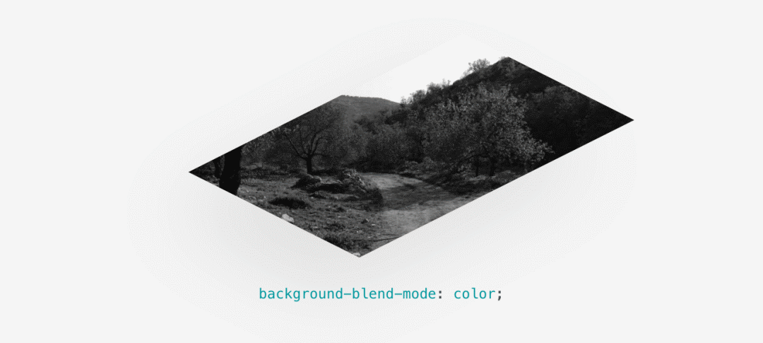
he simplest use case I can explain is to desaturate an image.
Consider the need for your
background-image
to have one in
CSS
and want to convert it to black and white.
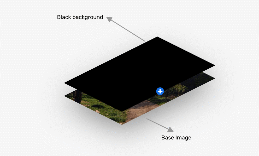
.hero {
  background: linear-gradient(#000, #000),
  url("landscape.jpg") center/cover;
  background-blend-mode: color;
}
Translation: ishadeed.com/article/css-multiple-backgrounds
Above is
W3Cschool编程狮
about
CSS background knowledge, an article takes you from shallow to deep full understanding
of the relevant introduction, I hope to help you.