jQuery Mobile toolbar
May 21, 2021 jQuery Mobile
Table of contents
jQuery Mobile toolbar
jQuery Mobile toolbar
Toolbar elements are usually located inside the head and tail - making navigation easy to access:
Head bar
The headbar typically contains a page title/logo or one or two buttons (usually a home page, option, or search).
You can add buttons to the left or right side of the head.
The following code will add a button to the left side of the header text and a button to the right side of the header title text:
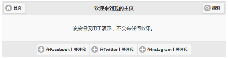
<a href="#" data-role="button">首页</a>
<h1>欢迎来到我的主页</h1>
<a href="#" data-role="button">搜索</a>
</div>
Try it out . . .
The following code will add a button to the left side of the header text:
<a href="#" data-role="button">首页</a>
<h1>欢迎来到我的主页</h1>
</div>
However, if you place the button link after the element, you will not be able to display the text on the right. To add a button to the right of the header, specify class as "ui-btn-right":
<h1>欢迎来到我的主页</h1>
<a href="#" data-role="button" class="ui-btn-right" > Search </A>
</div>
Try it out . . .
|
The head can contain one or two buttons, with no restrictions on the tail. |
|---|
Tail bar
The tailbar is more flexible than the headbar - they are more functional and variable throughout the page, so you can include as many buttons as possible:
<a href="#" data-role="button">在 Facebook上关注我</a>
<a href="#" data-role="button">在Twitter上关注我</a>
<a href="#" data-role="button">在Instagram上关注我</a>
</div>
Try it out . . .
Note: The tail has a different style than the head (no margins and space, and the buttons are not centered). To solve this problem, place "ui-btn" on the class at the tail:
You can also combine buttons in the tail horizontally or vertically:
<div data-role="controlgroup" data-type="horizontal" >
<a href="#" data-role="button" data-icon="plus">在Facebook上关注我</a>
<a href="#" data-role="button" data-icon="plus">在Twitter上关注我</a>
<a href="#" data-role="button" data-icon="plus">在Instagram上关注我</a>
</div>
</div>
Try it out . . .
Position the head bar and tail bar
The head and tail can be positioned in three ways:
- Inline - Default. The head and tail bars are inline with the page content.
- Fixed - The head bar and tail bar are pinned to the top and bottom of the page.
- Fullscreen - Basically the same as Fixed positioning mode, the head and tail bars are pinned to the top and bottom of the page. B ut when his toolbar scrolls out of the screen, it doesn't automatically reappeal unless he taps the screen, which is useful for apps with a sense of elevation in pictures or video classes. Note that the toolbar in this mode obscures the page content, so it is best to use it in more special situations.
Use the data-position property to locate the head and tail bars:
Inline positioning (default)
<div data-role="footer" data-position="inline" ></div>
Try it out . . .
Fixed positioning
<div data-role="footer" data-position="fixed" ></div>
Try it out . . .
To enable full-screen positioning, use data-position"fixed" and add the data-fullscreen property to the element:
Fullscreen positioning
<div data-role="footer" data-position="fixed" data-fullscreen="true" ></div>
Try it out . . .
Tip: Full-screen positioning is available for photos, images, and videos.
Tip: In Fixed and Full Screen Positioning, the head and tail bars are hidden and displayed by tapping the screen.