CSS3 gradients

The CSS3 gradient allows you to display a smooth transition between two or more specified colors.
Previously, you had to use images to achieve these effects. H owever, by using the CSS3 gradient, you can reduce the use of downloaded events and broadband. In addition, elements of the gradient effect look better when zoomed in, because the gradient is generated by the browser.
CSS3 defines two types of gradients:
-
Linear Gradients - Down/Up/Left/Right/Verse
-
Radial Gradients - defined by their centers
Browser support
The numbers in the table specify the first browser version that fully supports the property.
The number that follows the -、- -webkit- or -o-specifies the first version of the property that requires a prefix to support.
| Attributes | |||||
|---|---|---|---|---|---|
| linear-gradient | 10.0 |
26.0
10.0 -webkit- |
16.0
3.6 -moz- |
6.1
5.1 -webkit- |
12.1
11.1 -o- |
| radial-gradient | 10.0 |
26.0
10.0 -webkit- |
16.0
3.6 -moz- |
6.1
5.1 -webkit- |
12.1
11.6 -o- |
| repeating-linear-gradient | 10.0 |
26.0
10.0 -webkit- |
16.0
3.6 -moz- |
6.1
5.1 -webkit- |
12.1
11.1 -o- |
| repeating-radial-gradient | 10.0 |
26.0
10.0 -webkit- |
16.0
3.6 -moz- |
6.1
5.1 -webkit- |
12.1
11.6 -o- |
CSS3 linear gradient
In order to create a linear gradient, you must define at least two color nodes. C olor nodes are the colors that you want to render a smooth transition. At the same time, you can set a starting point and a direction (or an angle).
Examples of linear gradients:
Grammar
Linear gradient - top to bottom (by default)
The following example shows a linear gradient starting at the top. The starting point is red, slowly transitioning to blue:
Linear gradient from top to below:
background: -webkit-linear-gradient(red, blue); /* Safari 5.1 - 6.0 */
background: -o-linear-gradient(red, blue); /* Opera 11.1 - 12.0 */
background: -moz-linear-gradient(red, blue); /* Firefox 3.6 - 15 */
Background: linear-gradient (red, blue); / * Standard grammar * /
}
Try it out . . .
Linear gradient - left to right
The following example shows a linear gradient starting from the left. The starting point is red, slowly transitioning to blue:
Linear gradient from left to right:
background: -webkit-linear-gradient(left, red , blue); /* Safari 5.1 - 6.0 */
background: -o-linear-gradient(right, red, blue); /* Opera 11.1 - 12.0 */
background: -moz-linear-gradient(right, red, blue); /* Firefox 3.6 - 15 */
Background: linear-gradient (to right, red, blue); / * Standard grammar * /
}
Try it out . . .
Linear gradient - verse
You can create a veragonal gradient by specifying the starting position of both horizontal and vertical.
The following example shows a linear gradient starting in the upper left corner (to the lower right corner). The starting point is red, slowly transitioning to blue:
Linear gradient from top left to bottom right:
background: -webkit-linear-gradient(left top, red , blue); /* Safari 5.1 - 6.0 */
background: -o-linear-gradient(bottom right, red, blue); /* Opera 11.1 - 12.0 */
background: -moz-linear-gradient(bottom right, red, blue); /* Firefox 3.6 - 15 */
Background: linear-gradient (to bottom right, red, blue); / * Standard syntax * /
}
Try it out . . .
Use angle
If you want more control over the direction of the gradient, you can define an angle instead of predefined directions (to bottom, to top, to right, to left, to bottom right, and so on).
Grammar
Angle refers to the angle between the horizontal line and the gradient line, calculated counterclockwise. In other words, 0deg creates a bottom-to-top gradient, and 90deg creates a left-to-right gradient.
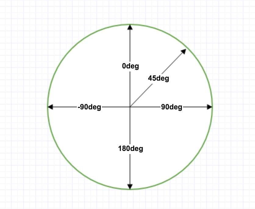
Note, however, that many browsers (Chrome, Safari, fiefox, etc.) use the old standard that 0deg creates a bottom-to-top gradient and 90deg creates a left-to-right gradient. Conversion formula 90 - x s y where x is the standard angle and y is the non-standard angle.
The following example shows how to use angles on a linear gradient:
Linear gradient with specified angle:
background: -webkit-linear-gradient(180deg, red, blue); /* Safari 5.1 - 6.0 */
background: -o-linear-gradient(180deg, red, blue); /* Opera 11.1 - 12.0 */
background: -moz-linear-gradient(180deg, red, blue); /* Firefox 3.6 - 15 */
Background: linear-gradient (180DEG, Red, Blue); / * Standard Syntax * /
}
Try it out . . .
Use multiple color nodes
The following example shows how to set multiple color nodes:
Linear gradients from top to below with multiple color nodes:
background: -webkit-linear-gradient(red, green, blue); /* Safari 5.1 - 6.0 */
background: -o-linear-gradient(red, green, blue); /* Opera 11.1 - 12.0 */
background: -moz-linear-gradient(red, green, blue); /* Firefox 3.6 - 15 */
Background: linear-gradient (red, green, blue); / * Standard syntax * /
}
Try it out . . .
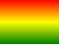
The following example shows how to create a linear gradient with rainbow colors and text:
/* Safari 5.1 - 6.0 */
background: -webkit-linear-gradient(left,red,orange,yellow,green,blue,indigo,violet);
/* Opera 11.1 - 12.0 */
background: -o-linear-gradient(left,red,orange,yellow,green,blue,indigo,violet);
/* Firefox 3.6 - 15 */
background: -moz-linear-gradient(left,red,orange,yellow,green,blue,indigo,violet);
/ * Standard grammar * /
background: linear-gradient(to right, red,orange,yellow,green,blue,indigo,violet);
}
Try it out . . .
Using Transparency
The CSS3 gradient also supports transparency, which can be used to create effects that weaken and fade.
To add transparency, we use the rgba() function to define color nodes. The last argument in the rgba() function can be a value from 0 to 1, which defines the transparency of the color: 0 for full transparency and 1 for complete opacity.
The following example shows a linear gradient starting from the left. The starting point is completely transparent, slowly transitioning to a completely opaque red:
Linear gradient from left to right with transparency:
background: -webkit-linear-gradient(left,rgba(255,0,0,0),rgba(255,0,0,1)); /* Safari 5.1 - 6 */
background: -o-linear-gradient(right,rgba(255,0,0,0),rgba(255,0,0,1)); /* Opera 11.1 - 12*/
background: -moz-linear-gradient(right,rgba(255,0,0,0),rgba(255,0,0,1)); /* Firefox 3.6 - 15*/
Background: linear-gradient (to Right, RGBA (255, 0), RGBA (255, 0, 0, 1))); / * Standard Syntax * /
}
Try it out . . .
Repeated linear gradients
The repeating-linear-gradient() function repeats the linear gradient:
A repeating linear gradient:
/* Safari 5.1 - 6.0 */
background: -webkit-repeating-linear-gradient(red, yellow 10%, green 20%);
/* Opera 11.1 - 12.0 */
background: -o-repeating-linear-gradient(red, yellow 10%, green 20%);
/* Firefox 3.6 - 15 */
background: -moz-repeating-linear-gradient(red, yellow 10%, green 20%);
/ * Standard grammar * /
background: repeating-linear-gradient(red, yellow 10%, green 20%);
}
Try it out . . .
CSS3 radial gradient
Radial gradients are defined by its center.
In order to create a radial gradient, you must also define at least two color nodes. C olor nodes are the colors that you want to render a smooth transition. Y ou can also specify the center, shape (round or oval), and size of the gradient. By default, the center of the gradient is center (for the center point), the shape of the gradient is ellipse (for the ellipse), and the size of the gradient is farthest-corner (for the farthest corner).
Examples of radial gradients:
Grammar
Radial gradient - color nodes evenly distributed (by default)
Radial gradients with evenly distributed color nodes:
background: -webkit-radial-gradient(red, green, blue); /* Safari 5.1 - 6.0 */
background: -o-radial-gradient(red, green, blue); /* Opera 11.6 - 12.0 */
background: -moz-radial-gradient(red, green, blue); /* Firefox 3.6 - 15 */
Background: radial-gradient (red, green, blue); / * standard grammar * /
}
Try it out . . .
Radial gradient - Color nodes are unevenly distributed
Radial gradients with unevenly distributed color nodes:
background: -webkit-radial-gradient(red 5%, green 15%, blue 60%); /* Safari 5.1 - 6.0 */
background: -o-radial-gradient(red 5%, green 15%, blue 60%); /* Opera 11.6 - 12.0 */
background: -moz-radial-gradient(red 5%, green 15%, blue 60%); /* Firefox 3.6 - 15 */
Background: radial-gradient (RED 5%, Green 15%, Blue 60%); / * Standard Syntax * /
}
Try it out . . .
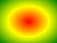
Set the shape
The shape parameter defines the shape. I t can be a value circle or ellipse. W here circles are round and ellipse is oval. The default is ellipse.
Radial gradient with a circular shape:
background: -webkit-radial-gradient(circle, red, yellow, green); /* Safari 5.1 - 6.0 */
background: -o-radial-gradient(circle, red, yellow, green); /* Opera 11.6 - 12.0 */
background: -moz-radial-gradient(circle, red, yellow, green); /* Firefox 3.6 - 15 */
Background: Radial-gradient (Circle, Red, Yellow, Green); / * Standard Syntax * /
}
Try it out . . .
Use of keywords of different sizes and sizes
The size parameter defines the size of the gradient. It can be the following four values:
-
closest-side
-
farthest-side
-
closest-corner
-
farthest-corner
Radial gradients with keywords of different sizes and sizes:
/* Safari 5.1 - 6.0 */
background: -webkit-radial-gradient(60% 55%, closest-side,blue,green,yellow,black);
/* Opera 11.6 - 12.0 */
background: -o-radial-gradient(60% 55%, closest-side,blue,green,yellow,black);
/* Firefox 3.6 - 15 */
background: -moz-radial-gradient(60% 55%, closest-side,blue,green,yellow,black);
/ * Standard grammar * /
background: radial-gradient(60% 55%, closest-side,blue,green,yellow,black);
}
#grad2 {
/* Safari 5.1 - 6.0 */
background: -webkit-radial-gradient(60% 55%, farthest-side,blue,green,yellow,black);
/* Opera 11.6 - 12.0 */
background: -o-radial-gradient(60% 55%, farthest-side,blue,green,yellow,black);
/* Firefox 3.6 - 15 */
background: -moz-radial-gradient(60% 55%, farthest-side,blue,green,yellow,black);
/ * Standard grammar * /
background: radial-gradient(60% 55%, farthest-side,blue,green,yellow,black);
}
Try it out . . .
Repeated radial gradients
The repeating-radial-gradient() function is used to repeat radial gradients:
A repeating radial gradient:
/* Safari 5.1 - 6.0 */
background: -webkit-repeating-radial-gradient(red, yellow 10%, green 15%);
/* Opera 11.6 - 12.0 */
background: -o-repeating-radial-gradient(red, yellow 10%, green 15%);
/* Firefox 3.6 - 15 */
background: -moz-repeating-radial-gradient(red, yellow 10%, green 15%);
/ * Standard grammar * /
background: repeating-radial-gradient(red, yellow 10%, green 15%);
}
Try it out . . .