Chrome Development Tool Edit Styles and DOM
May 26, 2021 Chrome A guide to developing tools
Table of contents
Edit styles and DOMs
Brief introduction
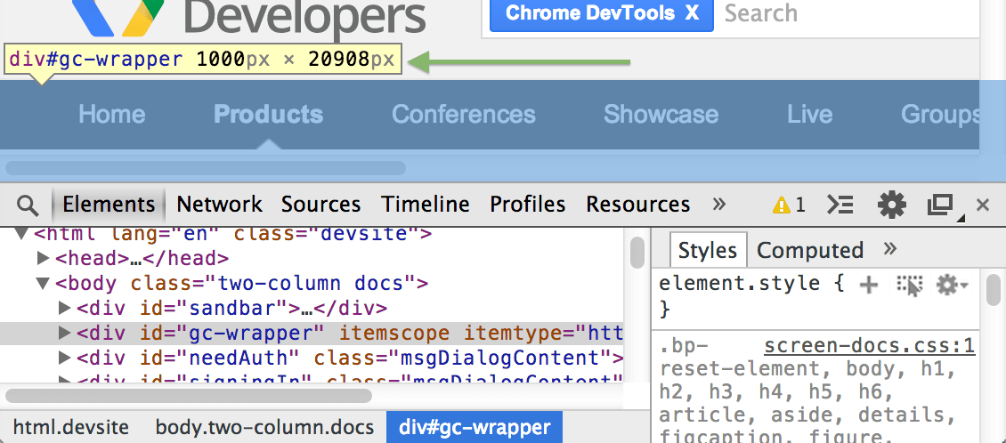
The Elements panel allows you to explore the structured information of the current page, and in today's app, the HTML tags that load services for the initial page are not necessarily what you see in the Document Object Model (DOM) tree. Real-time display of page styles can be a very useful feature when debugging and creating Web pages.
You can use element panels to do a variety of things:
- Check the HTML and CSS elements of a Web page
- Test different layouts
- Edit CSS in real time
If you want to make the most of your screen space, follow these tips for working intervals:
- Turn off the panels you don't use very often.
- Adjust the dividing line between the DOM tree and the sidebar.

Dom
The DOM tree window shows the DOM structure of the current page. T he DOM tree is actually a tree of DOM nodes, and each node represents an HTML element, such as the body label and the p tag. For ease of reading, the DOM tree window uses HTML element tags instead of DOM nodes, for example, p-tags instead of HTMLParagraphElement.
The DOM tree view shows the current state of the tree, which may not match the HTML page originally loaded for the following reasons:
- You may have modified the DOM tree using Javascript.
- The browser engine may be trying to fix invalid tags, resulting in a DOM tree that does not match expectations.
Review elements
The review element interface shows the DOM nodes and CSS style sheets that are responsible for rendering the elements displayed in the browser.
Elements can be reviewed in a variety of ways:
-
Use the right-click to click on any element on the page, and then select I nspect Element.
-
Press Ctrl-Shift-C (on Mac is Cmd-Shift-C) to open DevTools in review element mode, and then click on an element.
-
Click inspect Element button at the top of the DevTools
Inspect Element button then go into review element mode and select the element.
-
Use the
inspect()theinspect(document.body)Refer to the Command-Line API for information on how to use inspect
Use the mouse or keyboard to locate doM elements
You can use the mouse or keyboard to position in the DOM structure.
-
If you want to
 expand a shrinking node, double-click the node or press
the right button of the keyboard.
expand a shrinking node, double-click the node or press
the right button of the keyboard.
-
If you want to
 hide an expanded node, double-click the node or press
the left button of the keyboard.
hide an expanded node, double-click the node or press
the left button of the keyboard.
Expanding a node automatically selects its first child node, so you can expand a deeply nested structure by pressing the right button multiple times.
As you locate, the element panel displays the browse path at the bottom:
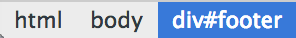
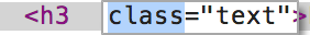
The currently selected node is highlighted in blue, and the downward positioning on the structure expands the tail:
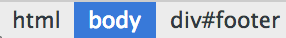
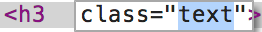
Positioning up along the structure moves the highlighted part:
The end of the DevTools path displays as many entries as possible:
If the entire path does not appear in its entirety in the status bar, an odd sign (...) is used. to represent the omitted path, clicking on the oddity will show the hidden element.
When you are free, you can look at this shortcut table
Edit doM nodes and properties
The element panel allows you to modify doM elements:
- Edit doM nodes like HTML.
- Add or remove DOM nodes separately.
- Edit the property name and value.
- Move the DOM element.
Updating the DOM tree in memory does not modify the source file, and when the page is reloaded, all changes on the DOM tree disappear.
Edit the DOM node
For a DOM node, double-click to open the element tag (H2, section, img). The field can now be edited and renamed, and when you rename, closing the label automatically updates the label information.
Edit the property
For DOM properties, DevTools distinguishes between property names and property values, and clicks on the appropriate sections of these elements to enter the edit state.
-
Double-click
 the property name to edit the property name, a process that is independent of the property value.
-
Double-click
 the property value to edit the class appearance of this section without affecting the property name.
When edit mode is active, you can loop between property values by pressing tab. Once the last property value is reached, pressing Tab creates a new property field.
Using Tab is not the only way to add and edit properties, it's just a common pattern, in fact, in the context menu of the DOM node, there are entries that specifically add and edit properties.
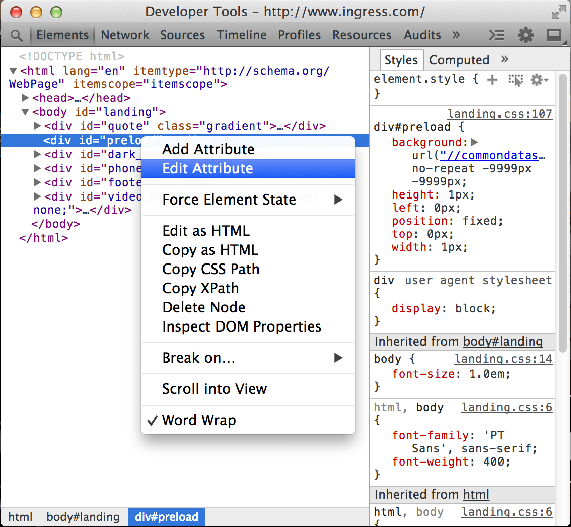
- Select Add Attribute to add a new field at the end of the open label.
- Select Edit Attribute to modify an existing property. This action is context sensitive, and the part you right-click will determine which part of the node will go into editable state.
Edit doM nodes like HTML
If you want to edit doM nodes and their children the same as HTML:
-
Right-click on the node and select
Edit as HTML
(under Windows, press
F2the currently selected node to edit state)
Use editable fields to complete your modifications.
- Click outside the editable domain to complete the modification of the DOM node
Press
Esc
roll out edits without modifying the node.
Move the element
You can rearrange the DOM tree nodes in the element panel to test the state of the page under different arrangements.
Drag the node in the element panel to move it else in the DOM tree.
Delete the element
Use these tips to remove doM nodes:
- Right-click on the node and select Delete Node.
-
Select the node and press
Deleteis, delete the key).
You can also remove the appropriate label in the Edit as HTML menu to remove the element.
If you accidentally delete an element, go back to the
Z
with the
Ctrl
key combination.
(Or press
Cmd
plus Z under
Z
Swipe to the appropriate position in the view
When you hover over a DOM node or a DOM node is selected, the corresponding elements rendered in the browser's main window are highlighted. If the element appears off-screen, the edge of the browser window will have a prompt telling you that the selected element is outside the screen.
If you want to slide the screen until the element appears on the screen, right-click the element and select Scroll into View.
Set the DOM break point
The DOM break point is similar to the break point in the source panel and is used to pause JavaScript code that runs under certain conditions.
JavaScript
break point is associated with a specific row of the
JavaScript
file and is triggered when it is executed to that line.
The DOM break point, on the other, is associated with a specific DOM element and is triggered when the element is modified in some way.
When you're not sure which part of the JavaScript script updates a given element, you can use doM break points to debug complex JavaScript applications.
For example, if your JavaScript script is used to change the style of a DOM element, you can set a DOM break point that is triggered when the properties of the related element are modified.
The modification of the sub-tree
When a child element is added, deleted, or moved, a child tree modification break point is triggered. For example, if you set a sub-tree modification break point on the 'main-content' element, the following code triggers a break point:
var element = document.getElementById('main-content');

//修改元素的子树

var mySpan = document.createElement('span');

element.appendChild( mySpan );
Property modification
Property modification occurs when the properties of an element (class, id, name) change dynamically:
var element = document.getElementById('main-content');

// 元素的 class 属性被修改

element.className = 'active';
The node is removed
When the node mentioned in the question is removed from the DOM, the node removal modification is triggered:
document.getElementById('main-content').remove();
In the demo above, here are a few steps:
- The user enters data in the search box, and the size of the input box changes.
- The user sets a property modification break point on the search box.
- The user continues to enter data in the search box, triggers a break point, and stops execution.
- The user hovers over the JavaScript variable, and the details of the variable are shown.
Both the element and the source panel contain a panel that manages DOM break points.
To view your DOM break point, click the extension arrow next to the break point to display the break point panel. For each break point, its element identifier and break point type are displayed.
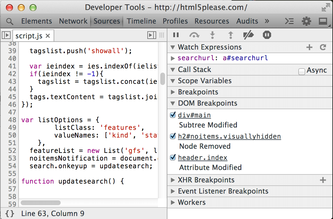
There are several ways you can interact with break points:
- Hover on the element marker to show where the element is located on the page (and hover on nodes in the element panel is similar).
- Click an element to jump to its position in the element panel.
- Switch check boxes to enable or disable break points.
When you trigger a DOM break point, it is highlighted in the DOM break point panel. The Call Stack panel shows why the debugger paused:

View the element event listener
View the JavaScript event listener associated with the DOM node in the time listener panel.
The top-level items in the Event Listener panel show the type of event that the registered listener listens to.
Click the expand arrow next to the event type to see a list of registered event processors, each marked by the CSS selector, as if the element marker "document" or "button#call-toaction" and so on. If more than one processor is registered for the same element, the element is listed repeatedly.
Click the expand arrow next to the element identifier to see the properties of the event processor, and the event listener lists the following properties for each listener:
- Handler: Contains callback methods. R ight-click the method and select Show Function Definition to see where the method defines. (if source code is available)
- isAttribute: True is returned if the event is registered through the DOM property. (e.g., onclick)
- LineNumber: Contains the line number of the event registration.
- ListenerBody: A string that represents a callback function.
- node: The DOM node registered by the listener. Hovering here shows its position in the page view.
- SourceName: The URL path of the source file that contains the event listener.
- Type: The type of event registered. (for example, click)
- useCapture: A Boolean value that indicates whether the useCapture flag in addEventListener has been set.
By default, the registered event processor displays the following types of elements:
- The element currently selected.
- The ancestor node of the element is currently selected.
If you feel that there are too many event processors displayed on the view after including those registered with event
delegates, you
can click
Filter
 and select Select Node Only in the menu list to display only those event listeners registered on the node.
Note: Many chrome extensions add their event listeners to the DOM as well.
If you find event listeners that aren't set by your code, you might want to reopen your page in incognito mode, where the browser prevents the extension from running by default.
Style
CSS defines the level of content for your page. You can view or modify the claims of those CSSs that act on the current page element, cascading (in cascading style sheets) and inheritance can be understood as for developing and debugging workflows:
- Cascading involves declaring a given weight for the CSS to determine which one takes precedence if different rules have a re-union.
- Inheritance involves getting HTML elements to inherit related properties (ancestors) from the elements contained in the CSS.
If you would like to learn more, refer to W3C's documentation on cascading and inheritance: http://www.w3.org/TR/CSS2/cascade.html
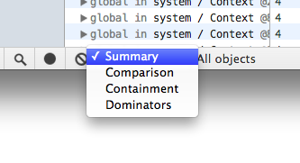
Style panel
The style panel shows the CSS rules for the selected element in order of priority from high to the end:
- The element style that is used directly for the element style property (or used in DevTools).
- Matching CSS rules include any rules that match the element. F or example, the CSS selector span corresponds to the HTML element.
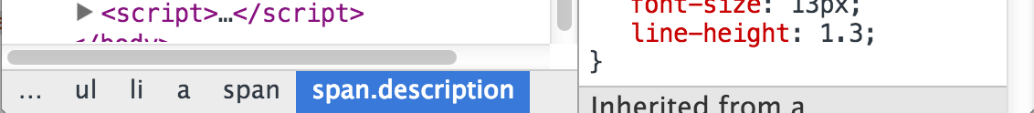
- Inherited styles include any inheritable style rules that match the ancestor nodes of the yu-selected element.
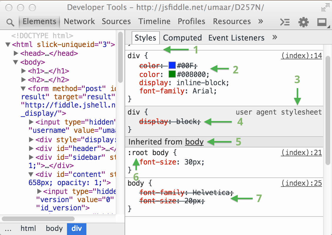
The number markers in the figure above are explained below.
- The style associated with the selector that matches the element.
- Cascading rules indicate that if the start, weight, and attributes of both rules are the same, the rule closest to the element definition takes precedence. In this case, the second element property takes precedence, and the first element property appears in the text as a drawn deletion line, indicating that it has been rewritten.
- User agent stylesheets are clearly marked and are usually overwritten by CSS on your Web page.
- The cascade here shows that the author's style takes precedence over the consumer's proxy style, so the style display:inline-block overrides the user-defined style display:block.
- The style of inherited is displayed under the column "Inherited from .node". C lick on the DOM node in the bar to locate its position in the DOM tree. (The property sheet for CSS 2.1 indicates which properties are inheritable)
- Selector: Root body is more specific than pure body, so its style declaration takes precedence.
- Font-family in body is rewritten. Font-size is a similar situation (override due to selector specificity).
Selectors separated by commas have different colors, depending on whether they match the DOM nodes in the selection.
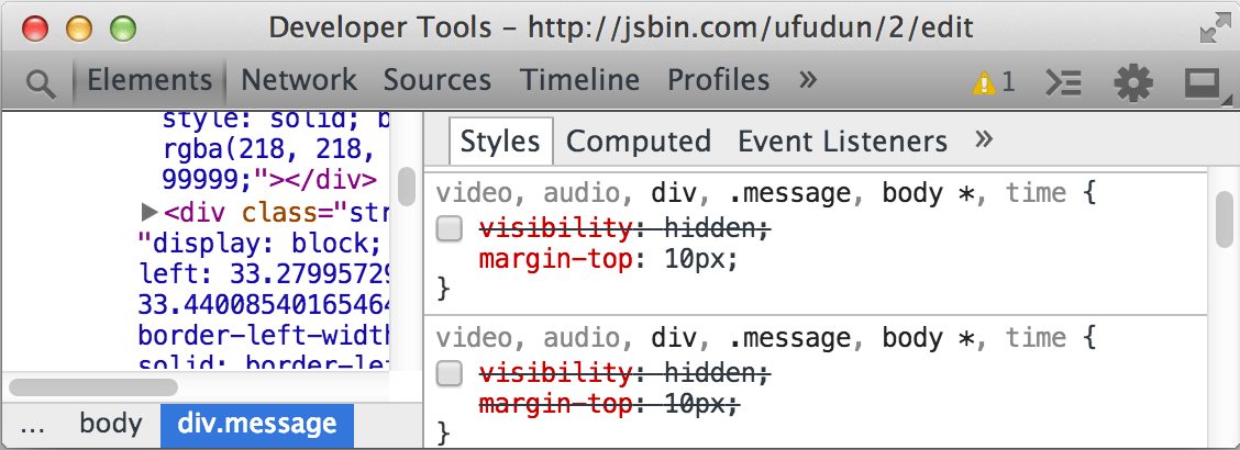
Gray selectors, such as audio and video, are not applied to selected nodes. The above rules correspond to the following CSS source code:
video, audio, div, .message, body *, time {
  /* visibility: hidden */
  margin-top: 10px;
}
If the visible declaration is commented out, it appears disabled in the Style panel.
Using the
Ctrl
click (or on Mac with
Cmd
plus click) the CSS property or property values in the style panel, you can locate them in the source code and switch to the source code panel.
Edit and create styles
You can add or modify styles on the style panel in the element panel. A ll styles are editable except that the area containing the style information is grayed out (as is the case with user agent stylesheets). You can edit styles in the following ways:
- Edit an existing property name or property value.
- Add a new property declaration.
- Add a new CSS rule.
If you want to enable or disable a style's declaration, check or cancel the box next to it.
Edit an existing property name or property value
Click on the name of the CSS property to edit its name:

Click on the property value to modify its value. If you are modifying the property name, press Tab or Enter to start editing the property value.
默认情况下,你对 CSS 做出的更改都是暂时的,重新加载页面的时候所有修改都会复原。想要自定义相关行为,可以参考 <a href=""">WorkSpace
When editing a CSS with a property value, you can use the following shortcuts to increase or reduce the value of the CSS property:
-
according to
UporDownTo increase or decrease the corresponding value 1. (if the current value is between -1 to 1, each change is 0.1) -
according to
Alt+uporAlt+DownLet the corresponding value increase or decrease in 0.1. -
according to
Shift+Up/DownorPageUp/PageDownLet the corresponding value increase or decrease 10. -
according to
Shift+PageUp/PageDownTo increase the corresponding value or decrease 100.
Use color picker
You can modify or set the color already existing in the current page style panel by using the color selection.
Add new attribute declaration
Click on the blank area that meets the editable CSS rules to create a new style, at which point the edit mode applies to the current CSS property field, you can enter a new property.
To add a new property and view the code prompt in the CSS Properties field, perform the following steps:
- Enter content in the CSS property field, the suggestion is displayed in the drop-down box.
-
according to
UporDownCome to select some suggestions. -
To accept recommendations
TabKey, right click orEnterkey.
When you select an effective CSS property, move the cursor to the CSS property value field for advice on the CSS value of the used.For example, for attributes display , Recommended value block , flex , none and many more.
use
Ctrl
+
V
(Or use on Mac
Cmd
+
V
To paste the CSS into the style panel.Attributes and their values will be parsed and placed in the correct field.
Add style rules
You may feel in one New selector Add a style in the middle.Click the plus sign in the head bar of the style panel to create a new CSS rule.
Trigger a pseudo class on the element
You can use the pseudo-class selector to provide dynamic styles for your UI elements, such as: Hover.However, these dynamic elements are difficult to debug.So devTools allows you to manually set pseudo classes for each element.
You can trigger any combination of the following four pseudo classes:
- :active - Suitable for links during activation (for example, before single machine).
- :hover - Suitable for when the mouse hover is above the elements.
- :focus - Elements suitable for obtaining focus (for example, by tab keys to get focus).
- :visited - Suitable for links that have been viewed in your browser.
If you want to set the state of the element:
-
Click on the style panel
New Style Rule
 nearby
Toggle Element State
nearby
Toggle Element State
 Button.
- Right click on a DOM node in the element panel and then check Force Element State 。
Change history (local modification)
The local modification contains modifications to source file code, such as JavaScript and CSS.
Use the following way to find the local modified panel:
- Open Source panel 。
-
Right button (or use on Mac
Ctrl+ Mouse click) Click on a source file in the sidebar. - choose Local modifications 。
To make a modification, modify the source code in the editor of the Source panel.
To make a modification of a CSS rule derived from an external style sheet, pay attention to changes in the local modified panel.
Note: When you use New Style Rule
When the button is used, the new CSS rules are not in the existing style sheet.DevTools Add it to a special monitor style sheet, which can be modified in the source panel like other files.
About local modified panels:
-
Expand the top file name, you can view the time that changes occurred.
- Expand the second level of items to view the corresponding modified the difference (Before and after).Pink background represents the deleted portion, a line of green background represents the added part.
- Click on the file name revert To revoke all modifications to this file.
You can also use
Ctrl
+
Z
(Or use on Mac
Ctrl
+
Z
) To quickly revoke the fine changes to the DOM or style on the element panel.
Metrics panel
The Metrics panel is intuitively explained how the style affects the CSS box model.
The Metrics panel shows a set of rectangles representing the box dimension to represent the CSS box model.The internal content box shows the size of the content area, the outside border, such as the boundary border, indicates the value of each edge: Border-Top, Border-Right (right box), Border-Bottom, Border-Bottom,And Border-Left (left border).
If the edge does not have a set value, it will be replaced by a broken number (English).
Note: If you provide a non-statically value to the CSS location property, the location of the tag is displayed in the Metrics panel.
Boxes (Box) The content displayed may be (from the outside):
- Position (location)
- Margin (margin)
- Border
- Padding (inner margin)
- Content Box (content box, innermost, no marker)
Use the metrics panel by the following techniques:
- The mouse hover is over the box to highlight the corresponding area in the browser window.
- Edit the field in the box (if there is no value, use a broken number with a broken number), which will reflect in the Element.style section.