Bootstrap drop-down menu
May 04, 2021 Bootstrap
Table of contents
Bootstrap drop-down menu (Dropdowns).
This chapter focuses on the Bootstrap drop-down menu. T he drop-down menu is switchable and displays the linked context menu in a list format. This can be done by interacting with the Dropdown JavaScript plug-in.
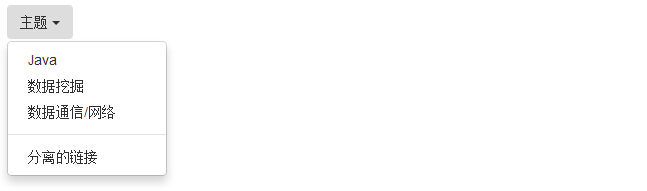
To use the drop-down menu, simply add the drop-down menu to class .dropdown. The following example demonstrates the basic drop-down menu:
<!DOCTYPE html><html><head>
   <title>Bootstrap 实例 - 下拉菜单(Dropdowns)</title>
   <link href="//cdn.bootcss.com/bootstrap/3.3.6/css/bootstrap.min.css" rel="external nofollow" target="_blank"  rel="external nofollow" target="_blank"  rel="external nofollow" target="_blank"  rel="stylesheet">
   <script src="//cdn.bootcss.com/jquery/2.1.1/jquery.min.js" rel="external nofollow"  rel="external nofollow"  rel="external nofollow" ></script>
   <script src="//cdn.bootcss.com/bootstrap/3.3.6/js/bootstrap.min.js" rel="external nofollow"  rel="external nofollow"  rel="external nofollow" ></script></head><body><div class="dropdown">
   <button type="button" class="btn dropdown-toggle" id="dropdownMenu1"
      data-toggle="dropdown">
      主题      <span class="caret"></span>
   </button>
   <ul class="dropdown-menu" role="menu" aria-labelledby="dropdownMenu1">
      <li role="presentation">
         <a role="menuitem" tabindex="-1" href="#">Java</a>
      </li>
      <li role="presentation">
         <a role="menuitem" tabindex="-1" href="#">数据挖掘</a>
      </li>
      <li role="presentation">
         <a role="menuitem" tabindex="-1" href="#">
            数据通信/网络         </a>
      </li>
      <li role="presentation" class="divider"></li>
      <li role="presentation">
         <a role="menuitem" tabindex="-1" href="#">分离的链接</a>
      </li>
   </ul></div></body></html>
The result is as follows:
Options
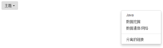
Aligned
Align the drop-down menu to the right by adding class .pull-right to the .dropdown-menu. The following example demonstrates this:
<!DOCTYPE html><html><head>
   <title>Bootstrap 实例 - 向右对齐下拉菜单</title>
   <link href="//cdn.bootcss.com/bootstrap/3.3.6/css/bootstrap.min.css" rel="external nofollow" target="_blank"  rel="external nofollow" target="_blank"  rel="external nofollow" target="_blank"  rel="stylesheet">
   <script src="//cdn.bootcss.com/jquery/2.1.1/jquery.min.js" rel="external nofollow"  rel="external nofollow"  rel="external nofollow" ></script>
   <script src="//cdn.bootcss.com/bootstrap/3.3.6/js/bootstrap.min.js" rel="external nofollow"  rel="external nofollow"  rel="external nofollow" ></script></head><body><div class="dropdown">
   <button type="button" class="btn dropdown-toggle" id="dropdownMenu1"
      data-toggle="dropdown">主题      <span class="caret"></span>
   </button>
   <ul class="dropdown-menu pull-right" role="menu"
      aria-labelledby="dropdownMenu1">
      <li role="presentation">
         <a role="menuitem" tabindex="-1" href="#">Java</a>
      </li>
      <li role="presentation">
         <a role="menuitem" tabindex="-1" href="#">数据挖掘</a>
      </li>
      <li role="presentation">
         <a role="menuitem" tabindex="-1" href="#">
            数据通信/网络         </a>
      </li>
      <li role="presentation" class="divider"></li>
      <li role="presentation">
         <a role="menuitem" tabindex="-1" href="#">分离的链接</a>
      </li>
   </ul></div></body></html>
The result is as follows:
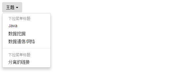
Title
You can use class dropdown-header to add a title by pulling down the tab area of the menu. The following example demonstrates this:
<!DOCTYPE html><html><head>
   <title>Bootstrap 实例 - 下拉菜单标题</title>
   <link href="//cdn.bootcss.com/bootstrap/3.3.6/css/bootstrap.min.css" rel="external nofollow" target="_blank"  rel="external nofollow" target="_blank"  rel="external nofollow" target="_blank"  rel="stylesheet">
   <script src="//cdn.bootcss.com/jquery/2.1.1/jquery.min.js" rel="external nofollow"  rel="external nofollow"  rel="external nofollow" ></script>
   <script src="//cdn.bootcss.com/bootstrap/3.3.6/js/bootstrap.min.js" rel="external nofollow"  rel="external nofollow"  rel="external nofollow" ></script></head><body><div class="dropdown">
   <button type="button" class="btn dropdown-toggle" id="dropdownMenu1"
      data-toggle="dropdown">
      主题      <span class="caret"></span>
   </button>
   <ul class="dropdown-menu" role="menu" aria-labelledby="dropdownMenu1">
      <li role="presentation" class="dropdown-header">下拉菜单标题</li>
      <li role="presentation" >
         <a role="menuitem" tabindex="-1" href="#">Java</a>
      </li>
      <li role="presentation">
         <a role="menuitem" tabindex="-1" href="#">数据挖掘</a>
      </li>
      <li role="presentation">
         <a role="menuitem" tabindex="-1" href="#">
            数据通信/网络         </a>
      </li>
      <li role="presentation" class="divider"></li>
      <li role="presentation" class="dropdown-header">下拉菜单标题</li>
      <li role="presentation">
         <a role="menuitem" tabindex="-1" href="#">分离的链接</a>
      </li>
   </ul></div></body></html>
The result is as follows:
Tip: You can also refer to the "Bootstrap drop-down menu menu title" section for the settings for the title in the Bootstrap drop-down menu!
Extended reading
Want to try out more practice with drop-down menus? Then you can read the "CSS drop-down menu" section of this site.