Bootstrap button
May 04, 2021 Bootstrap
Table of contents
Bootstrap button
This chapter will show you how to use the Bootstrap button through examples. A ny element with class .btn inherits the default appearance of the fillet gray button. But Bootstrap provides some options to define the style of the button, as shown in the following table:
The following styles can be used on the elements of the .
| Class | Describe | Instance |
|---|---|---|
| .btn | Add a basic style to the button | Give it a try |
| .btn-default | Default/Standard button | Give it a try |
| .btn-primary | Original button style (not actioned) | Give it a try |
| .btn-success | Represents a successful action | Give it a try |
| .btn-info | This style can be used for buttons to eject information | Give it a try |
| .btn-warning | A button that indicates that you need to operate with caution | Give it a try |
| .btn-danger | The operation of a button that represents a dangerous action | Give it a try |
| .btn-link | Make the button look like a link (still retains the button behavior) | Give it a try |
| .btn-lg | Make a big button | Give it a try |
| .btn-sm | Make a small button | Give it a try |
| .btn-xs | Make an ultra-small button | Give it a try |
| .btn-block | Block button (stretched to 100% width of parent element) | Give it a try |
| .active | The button is clicked | Give it a try |
| .disabled | Disable the button | Give it a try |
The following example demonstrates all of the above button class:
<!DOCTYPE html><html><head>
   <title>Bootstrap 实例 - 按钮选项</title>
   <link rel="stylesheet" href="//apps.bdimg.com/libs/bootstrap/3.3.0/css/bootstrap.min.css" rel="external nofollow" target="_blank"  rel="external nofollow" target="_blank"  rel="external nofollow" target="_blank"  rel="external nofollow" target="_blank"  rel="external nofollow" target="_blank" >
   <script src="//apps.bdimg.com/libs/jquery/2.1.1/jquery.min.js" rel="external nofollow"  rel="external nofollow"  rel="external nofollow"  rel="external nofollow"  rel="external nofollow" ></script>
   <script src="//apps.bdimg.com/libs/bootstrap/3.3.0/js/bootstrap.min.js" rel="external nofollow"  rel="external nofollow"  rel="external nofollow"  rel="external nofollow"  rel="external nofollow" ></script></head><body>
<!-- 标准的按钮 -->
<button type="button" class="btn btn-default">默认按钮</button>
<!-- 提供额外的视觉效果,标识一组按钮中的原始动作 -->
<button type="button" class="btn btn-primary">原始按钮</button>
<!-- 表示一个成功的或积极的动作 -->
<button type="button" class="btn btn-success">成功按钮</button>
<!-- 信息警告消息的上下文按钮 -->
<button type="button" class="btn btn-info">信息按钮</button>
<!-- 表示应谨慎采取的动作 -->
<button type="button" class="btn btn-warning">警告按钮</button>
<!-- 表示一个危险的或潜在的负面动作 -->
<button type="button" class="btn btn-danger">危险按钮</button>
<!-- 并不强调是一个按钮,看起来像一个链接,但同时保持按钮的行为 -->
<button type="button" class="btn btn-link">链接按钮</button>
</body></html>
The result is as follows:

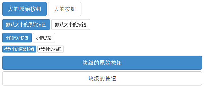
The size of the button
The following table lists the classes for getting buttons of various sizes:
| Class | describe |
|---|---|
| .btn-lg | This will make the button look relatively large. |
| .btn-sm | This will make the button look small. |
| .btn-xs | This will make the button look particularly small. |
| .btn-block | This creates a block-level button that will cross the entire width of the parent element. |
The following example demonstrates all of the above button class:
<!DOCTYPE html><html><head>
   <title>Bootstrap 实例 - 按钮大小</title>
   <link rel="stylesheet" href="//apps.bdimg.com/libs/bootstrap/3.3.0/css/bootstrap.min.css" rel="external nofollow" target="_blank"  rel="external nofollow" target="_blank"  rel="external nofollow" target="_blank"  rel="external nofollow" target="_blank"  rel="external nofollow" target="_blank" >
   <script src="//apps.bdimg.com/libs/jquery/2.1.1/jquery.min.js" rel="external nofollow"  rel="external nofollow"  rel="external nofollow"  rel="external nofollow"  rel="external nofollow" ></script>
   <script src="//apps.bdimg.com/libs/bootstrap/3.3.0/js/bootstrap.min.js" rel="external nofollow"  rel="external nofollow"  rel="external nofollow"  rel="external nofollow"  rel="external nofollow" ></script></head><body><p>
   <button type="button" class="btn btn-primary btn-lg">
      大的原始按钮   </button>
   <button type="button" class="btn btn-default btn-lg">
      大的按钮   </button></p><p>
   <button type="button" class="btn btn-primary">
      默认大小的原始按钮   </button>
   <button type="button" class="btn btn-default">
      默认大小的按钮   </button></p><p>
   <button type="button" class="btn btn-primary btn-sm">
      小的原始按钮   </button>
   <button type="button" class="btn btn-default btn-sm">
      小的按钮   </button></p><p>
   <button type="button" class="btn btn-primary btn-xs">
      特别小的原始按钮   </button>
   <button type="button" class="btn btn-default btn-xs">
      特别小的按钮   </button></p><p>
   <button type="button" class="btn btn-primary btn-lg btn-block">
      块级的原始按钮   </button>
   <button type="button" class="btn btn-default btn-lg btn-block">
      块级的按钮   </button></p></body></html>
The result is as follows:
Button status
Bootstrap provides class for activation, disable, and other button states, which are explained in more detail below.
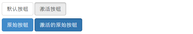
The activation status
When activated, the button appears as a pressed appearance (dark background, dark border, shadow).
The following table lists classes that activate button and anchor elements:
| element | Class |
|---|---|
| Button element | Add to .active Class to display it is activated. |
| Anchor element | Add to .active class 到 <a> 按钮来显示它是激活的。 |
The following example demonstrates this:
<!DOCTYPE html><html><head>
   <title>Bootstrap 实例 - 按钮激活状态</title>
   <link rel="stylesheet" href="//apps.bdimg.com/libs/bootstrap/3.3.0/css/bootstrap.min.css" rel="external nofollow" target="_blank"  rel="external nofollow" target="_blank"  rel="external nofollow" target="_blank"  rel="external nofollow" target="_blank"  rel="external nofollow" target="_blank" >
   <script src="//apps.bdimg.com/libs/jquery/2.1.1/jquery.min.js" rel="external nofollow"  rel="external nofollow"  rel="external nofollow"  rel="external nofollow"  rel="external nofollow" ></script>
   <script src="//apps.bdimg.com/libs/bootstrap/3.3.0/js/bootstrap.min.js" rel="external nofollow"  rel="external nofollow"  rel="external nofollow"  rel="external nofollow"  rel="external nofollow" ></script></head><body><p>
   <button type="button" class="btn btn-default btn-lg ">
      默认按钮   </button>
   <button type="button" class="btn btn-default btn-lg active">
      激活按钮   </button></p><p>
   <button type="button" class="btn btn-primary btn-lg ">
      原始按钮   </button>
   <button type="button" class="btn btn-primary btn-lg active">
      激活的原始按钮   </button></p></body></html>
The result is as follows:
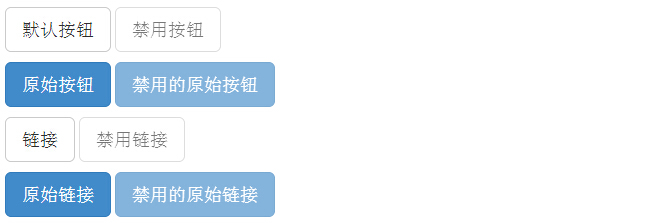
The state is disabled
When you disable a button, its color fades by 50% and you lose the gradient.
The following table lists classes that disable button and anchor elements:
| element | Class |
|---|---|
| Button element | Add to disabled Attributes 到 <button> 按钮。 |
| Anchor element |
Add to
disabled
class
到 <a> 按钮。
注意:该 class 只会改变 <a> 的外观,不会改变它的功能。在这里,您需要使用自定义的 JavaScript 来禁用链接。 |
The following example demonstrates this:
<!DOCTYPE html><html><head>
   <title>Bootstrap 实例 - 按钮禁用状态</title>
   <link rel="stylesheet" href="//apps.bdimg.com/libs/bootstrap/3.3.0/css/bootstrap.min.css" rel="external nofollow" target="_blank"  rel="external nofollow" target="_blank"  rel="external nofollow" target="_blank"  rel="external nofollow" target="_blank"  rel="external nofollow" target="_blank" >
   <script src="//apps.bdimg.com/libs/jquery/2.1.1/jquery.min.js" rel="external nofollow"  rel="external nofollow"  rel="external nofollow"  rel="external nofollow"  rel="external nofollow" ></script>
   <script src="//apps.bdimg.com/libs/bootstrap/3.3.0/js/bootstrap.min.js" rel="external nofollow"  rel="external nofollow"  rel="external nofollow"  rel="external nofollow"  rel="external nofollow" ></script></head><body><p>
   <button type="button" class="btn btn-default btn-lg">
      默认按钮   </button>
   <button type="button" class="btn btn-default btn-lg" disabled="disabled">
      禁用按钮   </button></p><p>
   <button type="button" class="btn btn-primary btn-lg ">
      原始按钮   </button>
   <button type="button" class="btn btn-primary btn-lg" disabled="disabled">
      禁用的原始按钮   </button></p><p>
   <a href="#" class="btn btn-default btn-lg" role="button">
      链接   </a>
   <a href="#" class="btn btn-default btn-lg disabled" role="button">
      禁用链接   </a></p><p>
   <a href="#" class="btn btn-primary btn-lg" role="button">
      原始链接   </a>
   <a href="#" class="btn btn-primary btn-lg disabled" role="button">
      禁用的原始链接   </a></p></body></html>
The result is as follows:
Button label
You can use the button class on the elements of the . However, it is recommended that you use the button class on the element to avoid cross-browser insistency.
The following example demonstrates this:
<!DOCTYPE html><html><head>
   <title>Bootstrap 实例 - 按钮标签</title>
   <link rel="stylesheet" href="//apps.bdimg.com/libs/bootstrap/3.3.0/css/bootstrap.min.css" rel="external nofollow" target="_blank"  rel="external nofollow" target="_blank"  rel="external nofollow" target="_blank"  rel="external nofollow" target="_blank"  rel="external nofollow" target="_blank" >
   <script src="//apps.bdimg.com/libs/jquery/2.1.1/jquery.min.js" rel="external nofollow"  rel="external nofollow"  rel="external nofollow"  rel="external nofollow"  rel="external nofollow" ></script>
   <script src="//apps.bdimg.com/libs/bootstrap/3.3.0/js/bootstrap.min.js" rel="external nofollow"  rel="external nofollow"  rel="external nofollow"  rel="external nofollow"  rel="external nofollow" ></script></head><body><a class="btn btn-default" href="#" role="button">链接</a><button class="btn btn-default" type="submit">按钮</button><input class="btn btn-default" type="button" value="输入"><input class="btn btn-default" type="submit" value="提交"></body></html>
The result is as follows:

Extend the exercise
After learning the above, you must have a deeper understanding of Bootstrap buttons, then now you can try to see how to use Bootstrap responsive single button!